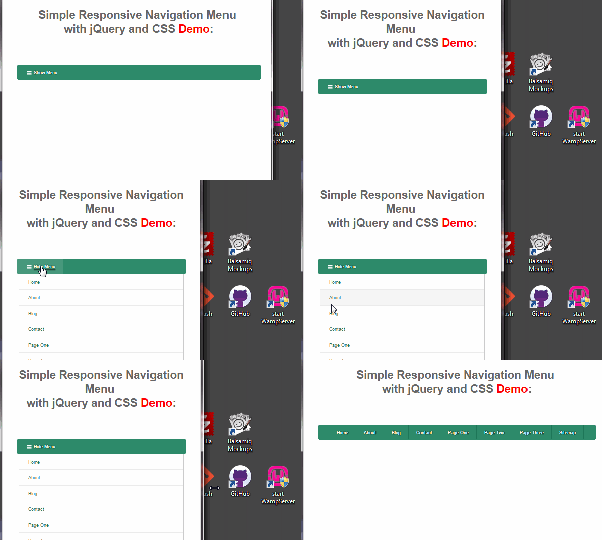
Follow this tutorial to create your own responsive navigation menu without a plugin.
So far one of the hardest parts of designing a responsive website is the dreaded navigation menu. I know because I’ve always struggled with it. I’ve seen plenty of plugins that convert your menu into a drop down list, or a fancy side menu that pushes your content to the left. But I wasn’t happy with them. So I decided to write one of my own.
View Demo

Nothing fancy here. I just want to simply hide the horizontal menu, show an icon and when clicked – have the “mini-navigation” show as a standard list – pushing the rest of the content down. Ready to get started? Let’s begin.
The Problem
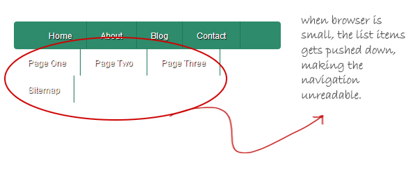
Most navigation menus is marked up with list items that are floated left. While this is good with desktop resolutions, it doesn’t work well when the view port is for small screens.

As I’ve mentioned above, we’ll get our way around this problem by hiding the original menu and showing a new one. This can all be achieved by CSS and a little jQuery. Take a look at the existing markup for the menu.
code taken out – due to problems with my plugin
Create the Media Query
Let’s add a media query in our CSS for max width of 796 pixels. We then hide the list items by setting a “display none” inside the query.
@media (max-width: 796px) {
 .navigation.responsive ul li {
   display:none;
}
Now try re-sizing your browser to less than 796 pixels and see that the contents of our menu disappears.
Add the Trigger and Empty Div into the Markup
We’re going to need a new anchor tag into our existing menu, also known as the “trigger”. We can simply add a last list item to our navigation menu – but set it to “display:none”. I’ve created a class in our CSS called “hidden”, to simply use that with our trigger.
Then add an empty DIV outside of our current navigation. I’ve named our new DIV “mini-navigation”. I also added the “hidden” class to this DIV, so both our trigger and mini-nav won’t be visible by default. Our markup should now look like below:
code taken out – due to problems with my plugin
Note the last list item and our empty DIV above.
Show the Trigger in our Media Query
Inside our media query, add these lines to our CSS:
.navigation.responsive ul li.hidden {
  display:block;
}
.navigation.responsive ul li.hidden:hover {
  border-radius:4px 0 0 4px;
}
.navigation.responsive ul li.hidden a{
  background:url('menu.png')no-repeat 0 -5px;
  padding-left:24px;
}
Note that the key code in the above is the “display:block”. This will make our trigger be visible. The rest of the code simply styles our trigger so it will look like below:

Add the Javascript
Now that we have our trigger, we need Javascript to handle what happens when it is clicked. First, make sure you’re hooked up with jQuery in your page.
Then let’s add the following code in a set of script tags. I’ll explain what it does after the source.
$(document).ready(function(){
	var trigger = $(".trigger a");
	var menu = $(".mini-navigation");
	trigger.on('click', function(){
		var html = $(".navigation.responsive").html();
		menu.html(html).toggle(0, function(){
		  if($(this).is(":visible")){
			trigger.html('Hide Menu');
				}else{
					trigger.html('Show Menu');
				}
			$('.mini-navigation li.trigger').remove();
			});
		});
		$(window).resize(function(){
			menu.hide();
			trigger.html('Show Menu');
		});
	})
Let me explain the code above. First we open the document.ready() function. We then set two variables: trigger(our trigger link) and menu(our hidden div). We bind the click event by using doing trigger.on(). Everything inside the .on() anonymous function is the heart of the code.
We create another variable called “hmtl” – which is the contents of our existing navigation. We then add it to our hidden div by doing: menu.html(html). So our hidden div (mini-navigation) now has our list items from the original menu.
We then chain the .toggle() function right after the .html(). This will show or hide our hidden div. We add an if else statement as a callback inside the .toggle(), just to change the label of our trigger from “Show Menu” to “Hide Menu”.
We also remove the last list item (which is the duplicate trigger).
Finally, we have window.resize() function – which simply resets our menu back to hidden and the label to “Show Menu” – which are the default states.
Style the Mini Navigation
This is of course, open to your customization. But what I’ve done is simply make our new menu a list item, with some bottom borders, appropriate padding and hover states.
.mini-navigation {
	border-left:1px solid #ccc;
	border-bottom:1px solid #ccc;
	border-right:1px solid #ccc;
	padding:0 0 0 0;
	margin-left:5px;
	margin-right:5px;
	border-radius:0 0 8px 8px;
}
.mini-navigation ul {
	padding:0 0 0 0;
	margin:0 0 0 0;
}
.mini-navigation ul li {
	margin:0 0 0 0;
	padding:10px 18px 12px 23px;
	list-style:none;
	border-bottom:1px solid #ebebeb;
}
.mini-navigation ul li:hover {
	background:#f6f6f6;
}
.mini-navigation ul li a {
	text-decoration:none;
	font-size:12px;
	color:#1e7759;
}
.mini-navigation ul li a:hover {
	text-decoration:underline;
}
.mini-navigation ul li:last-child{
	border-bottom:none;
	padding-bottom:15px;
}
.mini-navigation ul li:last-child:hover {
	border-radius:0 0 8px 8px;
}
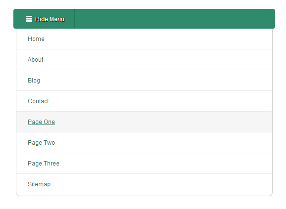
Our mini navigation should look like below:

Note that typically, the navigation is right above the rest of your content. When our menu appears – it simply pushes the rest of the content downwards. And when the new page loads – our menu returns to hidden by default.
Conclusion
And I believe that should do it. That’s as simple as it gets. Our very own responsive navigation menu system. Please leave your comments below.


Tried and almost had it but the menu does not size correctly and the mini menu does not appear…
do you have a url?
Recently I was REALLY low on money and debts were eating me from all sides! That was UNTIL I decided to make money on the internet! I went to surveymoneymaker dot net, and started filling in surveys for cash, and surely I’ve been far more able to pay my bills!! I’m so glad, I did this!! With all the financial stress these years, I really hope all of you will give it a chance. – uzqg
same here
what browser are you using?
Same here, the mini menu does not appear.
I use Mozila Firefox. Put your code into https://jsfiddle.net/ – does it work?
I take my comment back, now it works, I had forgotten to insert
LOL
Thank you.