What we’re building: An input field that can be duplicated (repeated) as part of a form. This is particularly useful when you want to capture information that you want to separate in different lines, and you don’t really want to use a textarea.
This way, we’re forcing our user’s to enter a value per input. In this scenario, we’re trying to grab a list a set of File Paths.
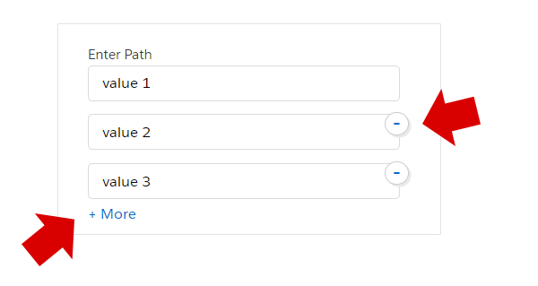
We’re using Lightning components, which is the framework Salesforce is using for their UI. A screenshot showing the pieces of what we want to accomplish is shown below.

See that we have inputs, a “More” link, and a “minus” sign – so we can remove the input directly.
Ready to build? Let’s begin.
Let’s start by defining an attribute in our .cmp file. Let’s call it “fileShares”, and its a “List” type. In Salesforce – a “List” is a an array in JavaScript. Here is how it looks
<aura:attribute name="fileShares" type="List" default="[]"/>Our array will hold a set of Objects, which reflects each of the input that we’re building.
Now we’re ready to create our markup. We’re using lightning:input – which is nothing but an “input” in HTML. We give it several attributes, which is defined below:
- aura:id with a value of fileShare.id
- value – with a value of fileShare.value
- label – with a value of fileShare.label
- class – with a value of “fileShares” (nothing to do with our object, but simply for styling)
We also want to wrap it inside a DIV with a class of “fileSharesItem“.
Now let’s wrap it inside a aura:iteration tag, which is how you loop through items in Lightning.
<aura:iteration items="{!v.fileShares}" var="fileShare" indexVar="ivar">
       <div class="fileSharesItem">
            <lightning:input
             aura:id="{!fileShare.id}"
             value="{!fileShare.value}"
             label="{!fileShare.label}"
             class="fileShares"/>
       </div>
</aura:iteration>
Notice that we’re looping through v.fileShares – which is the aura:attibute we first defined. We prefixed it with a “v.”, because in Lightning – this means “value provider”. We also have two important attributes in our iterator: var and indexVar. Our variable “fileShare” declared in “var”, while “indexVar” holds the index – we’re calling “iVar” (the counter).
Let’s move on to our controller. This is the JavaScript file, that we first initialize the value of v.fileShares. Add the code below (ideally inside an initialize method during load).
component.set('v.fileShares', {'label': 'Enter Path', 'value': '','id': 'fileShare1'});See that we’re using component.set() – and passing two parameters. The first is the property to set, then the value. In the case above, we’re setting up the ‘v.fileShares’ with an object. This means that we want just one field to show when the page loads.
Adding an Input
Let’s add the button that when clicked, a new input will be added to our form. Lighting supports data binding. This means that since we’ve binded our loop, all we worry about is the data. Remember our aura:iteration tag?
addMoreShareHandler : function(component, event, helper){
	var inputs = component.get("v.fileShares");
	var id = inputs.length+1;
	var obj = {
		'label': '',
		'value': '',
		'id': 'fileShare'+id}
		inputs.push(obj);
		component.set("v.fileShares", inputs);
},
Try it out and you should see our input repeated. Pretty neat right? How about removing the input? Let’s tackle that below.
The Remove Button
Let’s create an anchor tag – with a custom click handler. Also, let’s add a couple of attributes – so we know which one to remove. These attributes have to start with data- which is also known as “data-attributes“. I’ll explain more in our handler.
<a href="#" onclick="{!c.removeShareHandler}" data-idtoremove="{!fileShare.id}"
            data-index="{!ivar}" class=
Now in our handler, we simply start with event.preventDefault() – which stops the link from behaving like a normal link. We don’t want the page to jump and refresh upon clicking.
Next, we grab the event, along with a property called currentTarget. What the currentTarget holds is information about what anchor tag was clicked.
So to access “data-idtoremove“, we do “dataset.idtoremove“
removeShareHandler : function(component, event, helper){
		event.preventDefault();
		var selectedItem = event.currentTarget;
                var idtoremove = selectedItem.dataset.idtoremove;
		var inputs = component.get("v.fileShares");
		for(var i=0;i<inputs.length;i++){
			var obj = inputs[i];
			if(obj.id == idtoremove){
				inputs.splice(i,1)
			}
		}
		component.set("v.fileShares", inputs);
	}
Then we loop through the inputs once again – by grabbing it from our component. We use .splice() to remove it from our array of objects.
Finally, let’s make the styles for our links.
The CSS:
For the remove link, we’re really trying to make it look like a “minus” button. We’re doing that with border-radius: 50%, along with a background color and a faint box-shadow. The rest of the CSS is mainly for positioning and sizing.
.THIS .slds-form-element.fileShares {
  margin-bottom:-5px;
}
.THIS .fileSharesItem {
  position:relative;
}
.THIS .removeShare {
  position: absolute;
  z-index: 999;
  right: -8px;
  top: 15px;
  border: 1px solid #ccc;
  width: 21px;
  line-height: 17px;
  padding: 0 0 2px 0;
  text-align: center;
  border-radius: 50%;
  font-size: 22px;
  background: #fff;
  box-shadow: 2px 2px 0 #e9e9e9;
}
.THIS .removeShare:hover,
.THIS .removeShare:active,
.THIS .removeShare:focus {
  text-decoration:none;
  background:#ebebeb;
}
Finally, we’re setting some hover styles by using :hover, :active and :focus also known as “pseudo selectors”. We simply want the cursor to change into a pointer, along with a subtle background change.
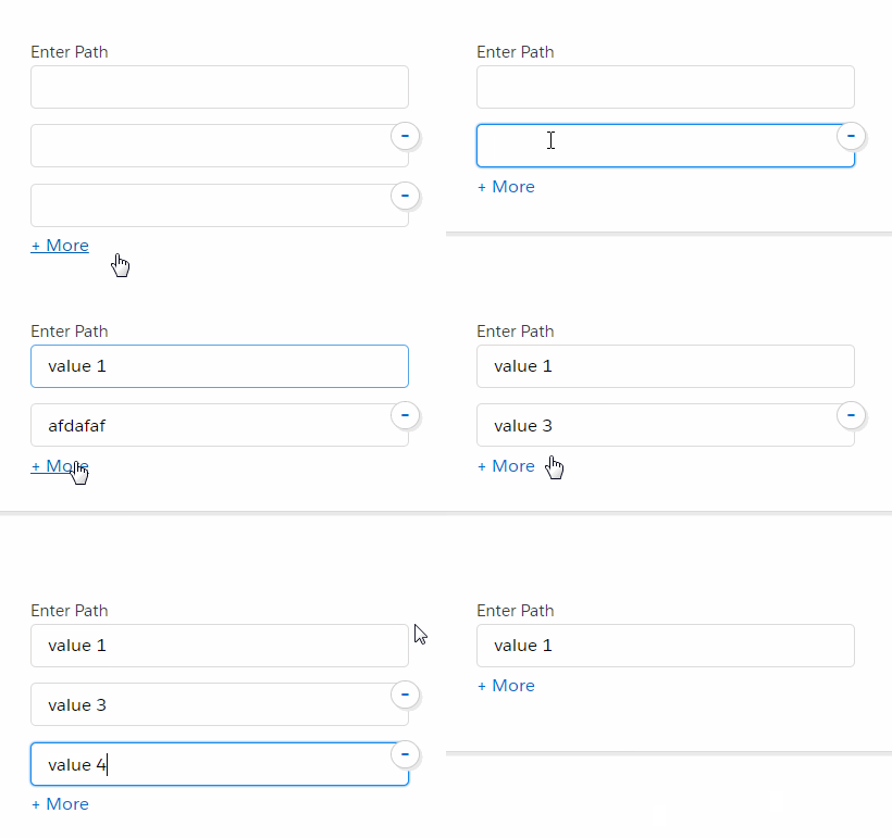
The final output:

So there it is. We just made a quick set of repeating inputs in Lightning. This also is a good crash course into Salesforce’s shiny new framework – which is gaining more popularity in the world of enterprise application development.
If you find this tutorial useful, or would like to see more – leave your comments below.


hi, this is awesome. Thanks! Just a quick question: Where does the remove input anchor go within the component?
I tried putting it in the div within the iteration but because the position is absolute, they all stack on top of each other rather than being relative to the box that it was created with.
Could you advise how you achieved this?
Thanks, Duncan
It is inside the div “fileSharesItem”. It’s the first child in it. Make sure you have the styles: “position: relative; margin-bottom: 15px;” in the div “fileSharesItem”
Thanks a lot for sharing this knowledge, Michael. I used it to spruce up my component and it not only works but is also aesthetically pleasing. Much appreciated.