Ahhh – so many choices when it comes to what open source software to use: Joomla, WordPress, Drupal…but aren’t they at times – a little overkill? For smaller web designers like myself, I still get the usual client who just wants a simple website to advertise their services. Most of the time they will have something existing – with cluttered content that isn’t even enough to fill a full page. This is where a single page portfolio comes handy. In this tutorial, we’re going to build a single page portfolio from scratch: a page with a feature section, testimonials, image gallery and a contact form.
View the Demo:
This tutorial is the first of three parts: 1) the Photoshop Mock up, 2) Coding the HTML / CSS and finally 3) Adding PHP / jQuery.

The Output
Below is a preview of what we’re building. The aim is to have a mock up that is fully layered, so we can optimize for the purpose of SEO and page performance. Ready to get started – Let’s begin:
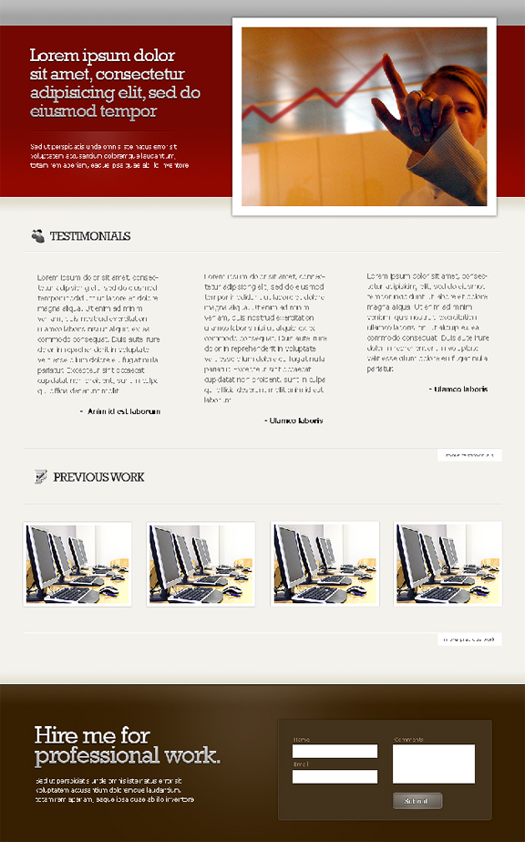
Part 1 – The Fold
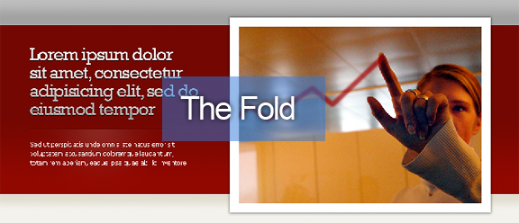
We’re going to design the page from the top to bottom. The fold is first part of a web page can see – without having to scroll downwards. In our case, this includes the header and the big red feature bar:
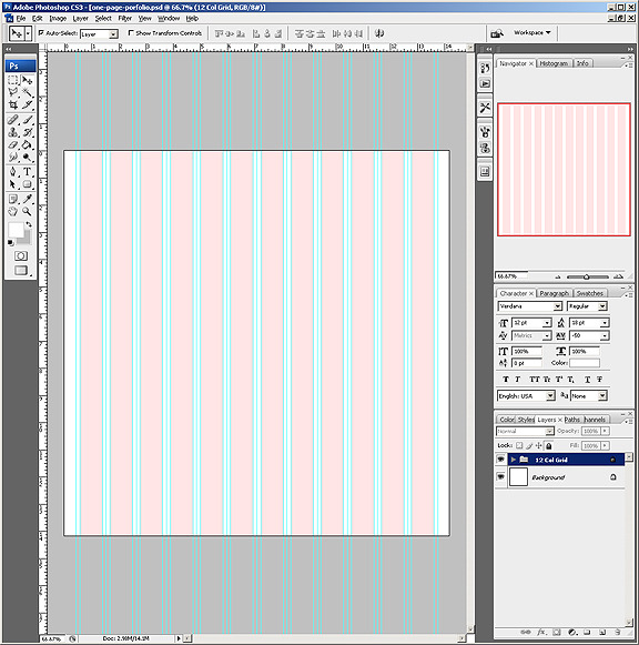
If you aren’t familiar with 960.gs – it’s a CSS framework that follows the standard 960 pixels page width rule. Download the photoshop template and check out the guides – we are building the page following the 960 grid rules:
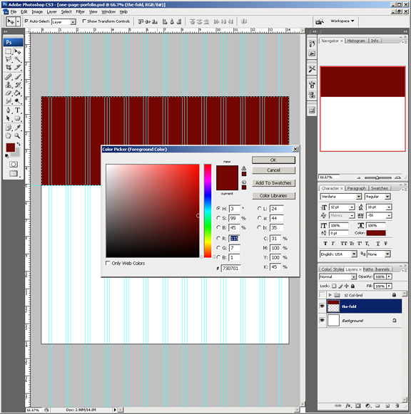
Create a new layer – this will be the fold layer. Select the full page width, with approximately 380 pixels in height. Fill it with a solid color – in my case I chose a bright red #730701:
Create another layer for the header bar, select the full page width and 48 pixels in height. Fill this with another solid color – in my case, #bcbcbc for light grey.
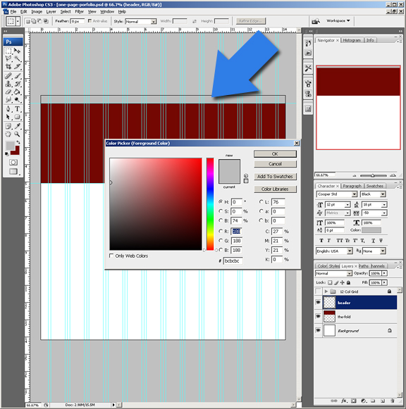
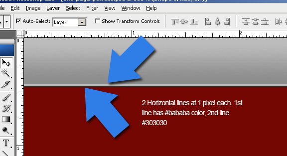
Where the header bar and the fold meet, we want to add an “etched” effect. We achieve this by using 2 lines using the “line” tool. Create 2 horizontal lines at 1 pixel each (make sure you hold the “Shift” key) as you drag it across the page. Nudge one line so that they sit just on top of one another. The rule is to use a lighter shade for one line, and a darker for the other (it is important that you play with the colors, and zoom out and test if the etched look is achieved). Add a subtle gradient fill for the header bar as well.
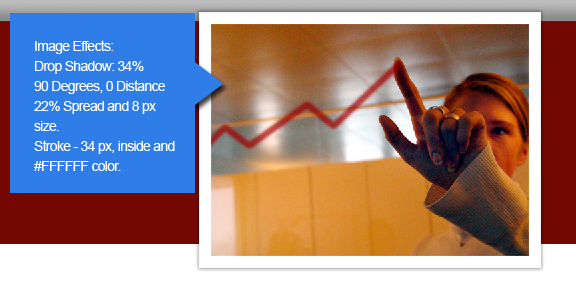
The next step is to add a large feature image. This sits on top of all the layers to give it that 3D effect. Place in at almost half the 960 pixel page width, overlapping some part of the header and pass below the fold. Include the effects as shown:
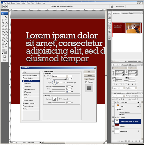
Immediately to the left of the feature image, add your large slogan text. This is to be your attention grabbing statement, and is important to be the most prominent. I chose Rockwell at size 36 pixels, with -50 tracking. Also add the following text effects:
- Drop shadow – Normal blend mode – #000, 90 degrees angle, 1px distance, 0 spread and 1px in size
- Inner Shadow – Normal blend mode – #FFF, 90 degrees angle, 1px distance, 0 choke and 0px size
- Gradient Overlay – use default settings, reduce opacity to 34% and 90 degrees in angle
Add a gradient effect to the background layer named the fold. The rule is to use a slightly lighter color than the existing background as one color, and the same background color as the secondary color. Fill by pressing the shift key and releasing simultaneously.
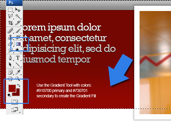
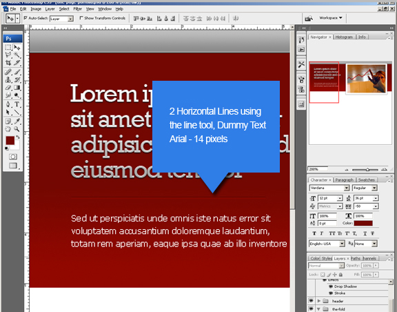
Add another 2 horizontal lines right underneath the slogan text. *Use the rule as described in the previous line tools used in the header and the fold separation. Add a smaller set of text – I used Arial with 14 pixels in size, #FFFFFF color.
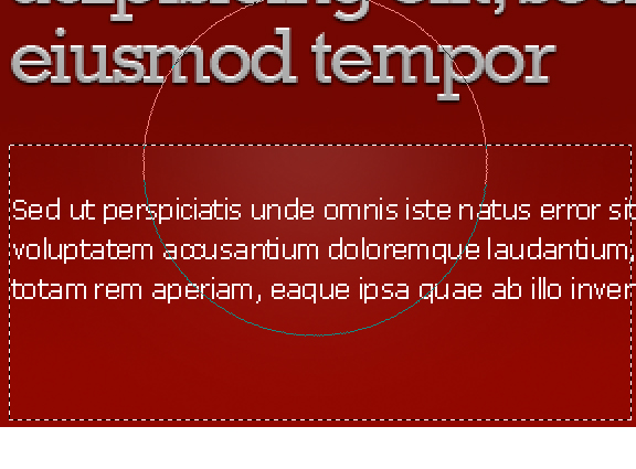
To complete the fold – we add a glow effect to the bottom area where the borders separate the large text and the small text. Select a small area (shown below), grab the brush tool, select white for the color, increase the brush radius (shown below) – reduce the opacity all the way to 12 percent and daub a quick light stroke.
Part 2 – Below the Fold
Below the fold technically includes everything under the fold. But for the sake of this tutorial – it includes all BUT the footer section. The reason is – this will be the only part that will need to grow. If there was additional content to be made – it will be inside this section. The fold and the footer remain static in height.
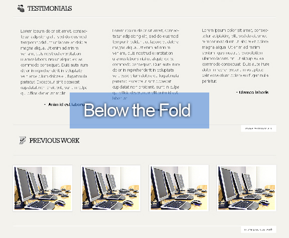
We start by creating a new layer. With the selection tool, select everything below the red feature section below. Fill this selection with #f3f2ed using the paint bucket tool. *Note that the large image layer should be placed on top of all the other layers.
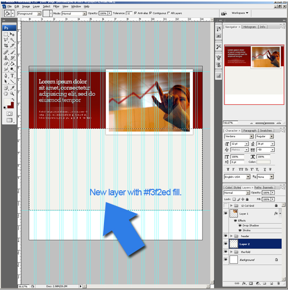
We then create a new horizontal guide. This guide should be right below our feature image (allow a few pixels extra for the added shadow effect). This guide’s main purpose is to know where we will slice our divs (which I will cover once we start coding) and where our gradient ends. Grab the selection tool once more and start from where the red area ends – down to the new guide. Using the gradient tool, select #e1decf primary color and #f3f2ed and fill with a straight line (hold shift).
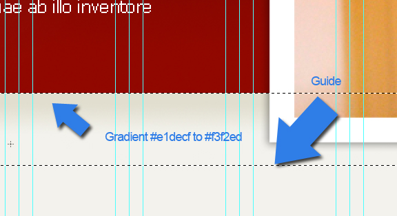
We then add that same “etched” look where the two layers meet. The same technique is used – create two lines with one darker and one lighter. In this case the upper line has #670600 fill and the second #faf9f3.

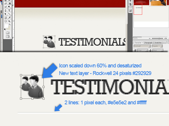
Next step is to create the sub heading. With the type tool, choose the Rockwell font at 24 pixels in #292929 color and type the word “TESTIMONIALS”. Directly to the left of the text – I imported the “users_two_48” icon from WeFunction and scaled the image down to 60 percent and desaturize (Ctrl + U, slide the saturation all the way to the left). Add two horizontal 1 pixel lines (#e5e5e2 and #FFFFFF) directly underneath (by this point of the tutorial, I’m going to assume you have this technique down already).
*Tip – Create a group called “sub headings” and add all the above elements in it. We will be duplicating this sub heading in following sections.
Directly below the Testimonial subheading – we create 3 text boxes with some dummy text. I used Verdana at 14 pt, 20 pt leading. Make sure you allow enough padding and margin around each surrounding box. Align according to the grid. Note that this part of the design acts only as a marker. We will use actual text for these boxes.
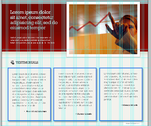
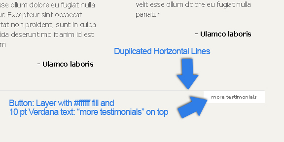
Duplicate the two horizontal lines from the sub headings section. Move these 2 lines right below the 3 text boxes that you have created. Create a new layer, select 124 pixels (width) x 25 pixels (height) and fill with #FFFFFF with the paint bucket tool. Move this layer right below the two horizontal lines. Using the text tool, use 10 pt Verdana, color # 6b6b6b and type the words “more testimonials” – move this directly on top of the new layer we’ve just created. This acts as end marker for the testimonials section with a button that displays more testimonials.
*Tip – create a new group for the above elements and name it “end marker”.
Next, we add a “Previous Work” section. Remember that we created a group called “sub headings” a little while back? Duplicate this group and name it “sub headings 2”. Using the down cursor in your keyboard, move the new group approximately 560 pixels downwards. Change the text to say “PREVIOUS WORK” and use another icon, scale it down and desaturate.
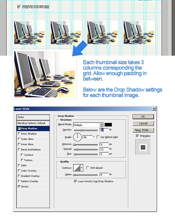
An image gallery will showcase our portfolio’s “Previous Work” section. Similar to the testimonials area, we are dropping some dummy thumbnails in our photoshop file, just for mock purposes. We are going to span 4 thumbnails across at 210 pixels each in width. Make sure the thumbnails align to the grid, taking 3 columns each with enough paddings in between each other. Add the following effects for each thumbnail: Drop Shadow (settings shown in below screenshot) and an inside stroke of 6 pixels and #FFFFFF fill color.
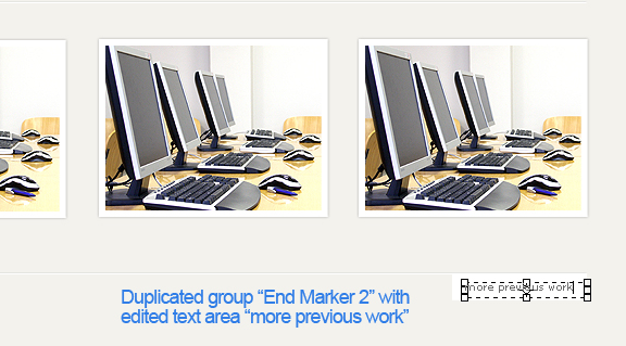
To complete the “Below the Fold” section – we create an end marker for the “Previous Work” area. Duplicate the group “end marker” and name it “end marker 2”. Move this newly created group approximately 380 pixels downwards. Change the text in the button to say “more previous work”. Our next quest is the Footer. Keep going!
Part 3 – The Footer
And now we come to the final piece of the design process – the Footer. I enjoy designing footers because they represent completion; they’re also the most overlooked section of a page that I feel that it deserves the same attention as the other parts.
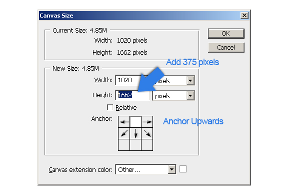
The height of the footer is approximately 375 pixels. If you haven’t already done so – extend your canvas size to an additional 375 pixels – but be sure to click the anchor all the way to the top.
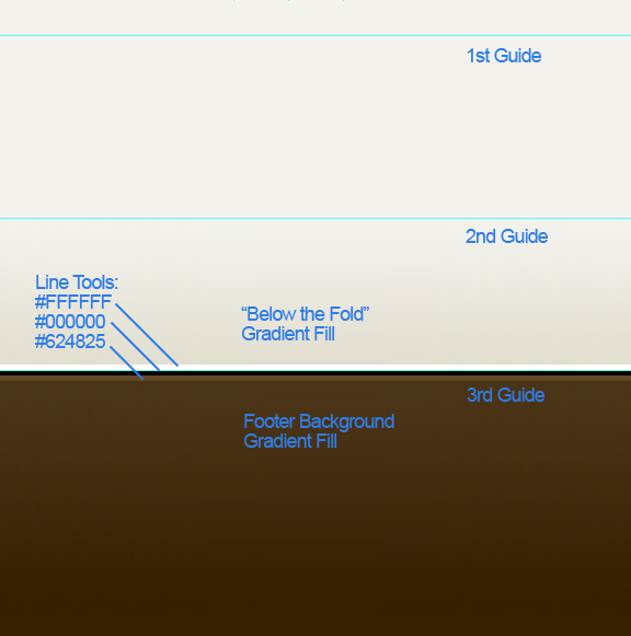
Create 3 new horizontal guides: first is where the “Below the Fold” background ends, then approximately 35 pixels below, and third – another 30 pixels down (this is where the footer background layer starts). Make a selection from the first guide to the next one down, make sure you’re on the “Below the fold” background layer, and do a gradient fill: primary color #e3e0d2, secondary #f3f2ed. Next, create a new layer for the footer background and add a gradient fill: primary color is #361f01 and secondary #493215. Do 80 percent for the primary fill. Finally, create 3 horizontal lines with the line tool at 1 pixel each with the following fills (in the following order): #ffffff, #000000 and #624825. Line them according the last guide you’ve created (see below).
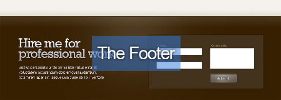
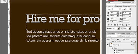
Duplicate the text layer for the slogan (The Fold), change the content to say “Hire me for professional work”, drag downwards to the footer, and place on the left half of the footer area. Add another text area, use Verdana, 12px #ffffff, enter some dummy text, and place directly below the large text.
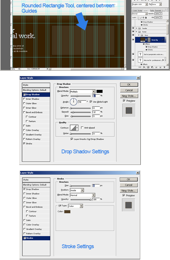
On the right half of the footer, we’re placing a rounded rectangle for the background of the contact form. Using the Rounded Rectangle tool – create a rectangle, center between 6 columns in the grid. Add a drop shadow and stroke effect as shown below:
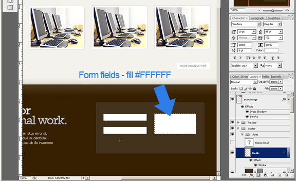
Create a new layer and make 3 rectangles inside the rounded rectangle we’ve just created. These will act as the form fields. Note that these are just as markers which will not really be used in the output. We’re using real form fields in the code. Fill these rectangles with #ffffff using the paint bucket tool.
What’s a contact form without a pretty submit button? Using the rounded rectangle tool – create a button and add an inner shadow (66 percent opacity) and a 1px inner stroke – #85827e. Add the text “Submit” on top of this button using “Rockwell” at 14px.

Finally, remember I said the footer should have the same detail as the other parts of the page? We’re going to add a nice glow in the background which will highlight our large text and the contact form. Select the footer background with the selection tool. Next, pick a soft round brush at 500 pixels, select color #ffffff and decrease the opacity of the brush to 10 percent. Center the brush horizontally and halfway above the footer – click once and Voila – instant glow in the background!
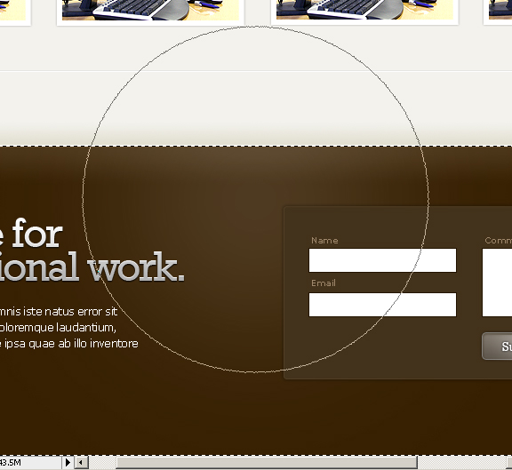
And there you have it. We’ve just created a full page mockup in Photoshop. Next will be coding the HMTL and CSS – so stay tuned!
You can download the .psd from this link


i appreciate your work. well explained. great images.
Gracias amigo por el tutorial, lo seguiré al pie de la letra.
Thanks a Lot
nice tutorial! thank you.