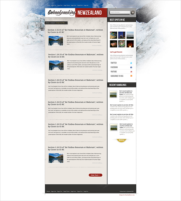
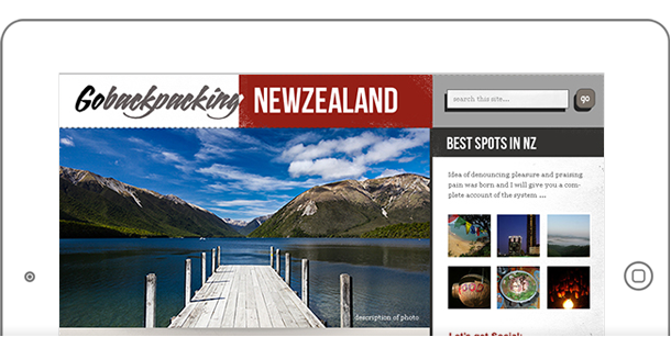
Go Backpacking New Zealand is a tourism website built to showcase the best hiking spots in the beautiful country in New Zealand. The concept was to have a blog style layout showcasing large imagery of the landscape.
My role in this project is both t design and develop the WordPress theme.
Splashes and Textures
I wanted to give the site that feeling of “unfinished” look. I used plenty of dashed, hand-drawn lines as borders, as well as textures of “paper” for the background.

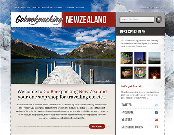
The page background has a faded out photo of the New Zealand alps – quite ideal since the snow works as a good mix with the white background. All of the visuals have to be done in Photoshop and sliced into images – since CSS doesn’t support fading borders and “no pattern” patterns in textures.
Home Page
The home page has a small slideshow right above the fold. Just a simple carousel that cycles through photography. A large welcome message tells user what the site is about, along with a link to the “about” page if you want to learn more.

The site logo is a bit unconventional, with strikingly different font treatments for the words. A bold red for the background color enhance the “New Zealand” in the logo as well.
Inner Pages
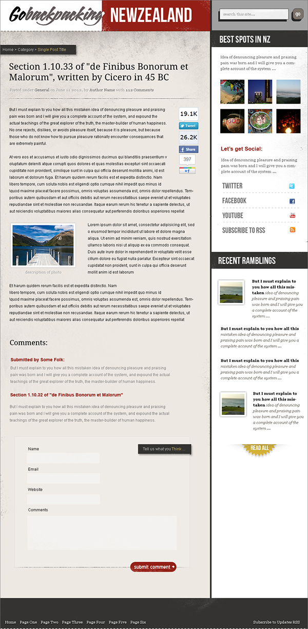
Fonts used are a combination of block styled fonts known as “League Gothic” and “Droid Sans”. More subtle textured borders and backgrounds can be seen throughout the layout such as the sidebar, ribbons and the content area itself.

You will notice the page texture effect – giving more of that “unfinished” or “unplanned” look. It’s a “boxed-style” layout so things are contained within borders – and the borders themselves span all the way to the edges of the main container. Social feeds along with recent posts are in the sidebar, comments and “ribbon” styled meta data for the single posts.
