LenderFi is a home loans company based in Santa Clarita California. The owner came to me and asked to redesign their old outdated website. My main role was a designer, and all I had to do was a facelift of their homepage.
Logo Design
Although graphic design is not my specialty, I was able to come up with a decent logo for LenderFi. An “L” and an inverted “F” with the color scheme of my choice was applied. The finished logo looks like below:

A combination of “Arial Rounded” and “Verdana” was used for the logo.
The Homepage
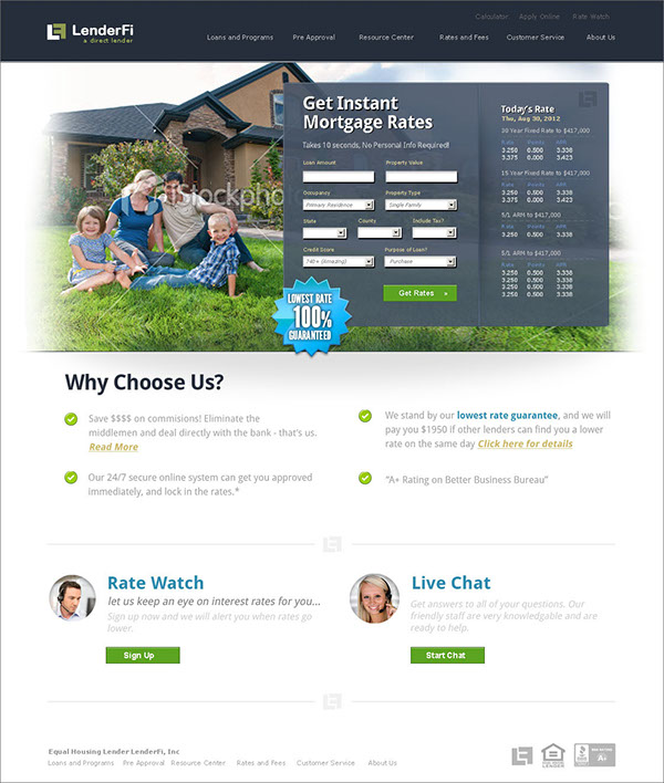
It is ultimately the homepage that drives the rest of the design. In LenderFi’s case, the page below was the driving factor for the “feel” of the rest of the site.

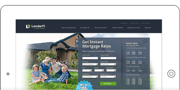
A custom form is a transparent overlay that sits on top of the large hero background image. Plenty of fades and textures were used to create the final output.
Additional Elements
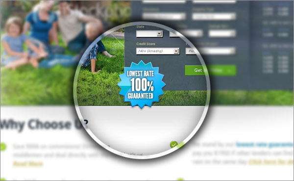
Apart from the form and the background, elements such as the “ribbon” and icons were used to make the page “pop”. The ribbon alone took a bit of time to create, which involved plenty of masking and shadow techniques in Photoshop.

Icons are using CSS sprites, and the image of the phone support have strokes and inner shadows for added effect.
