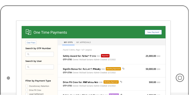
A lot of business processes have been developed in-house to stream line employee’s daily activities. One such application is One Time Payments (OTP) – a system that makes it easy for employees to submit – well, payments. These payments can vary from bonuses, awards, tuition reimbursements and so forth.
My involvement on this project was lead developer, as well as UX engineer.
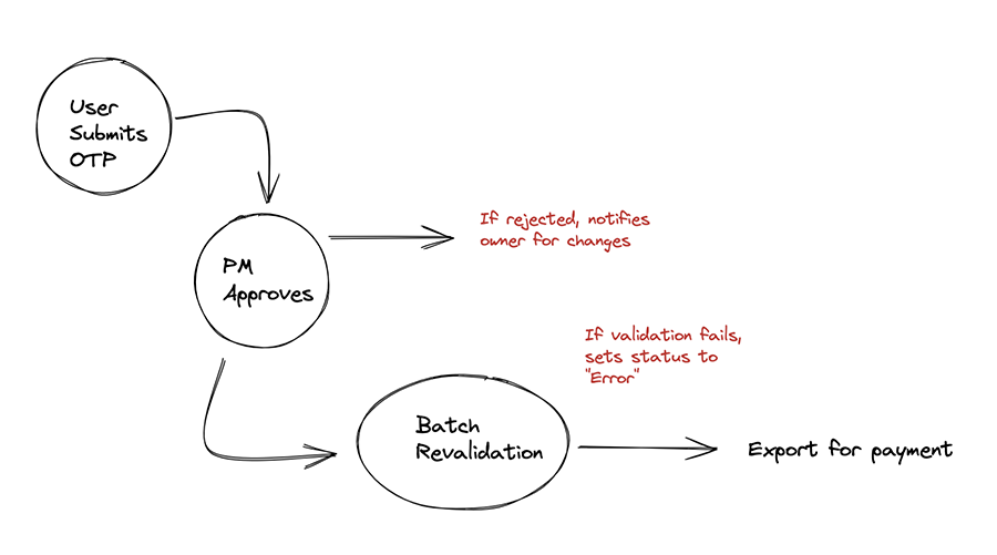
The simplified workflow is shown below:
Behind the Scenes
As much as I like working on the front end of things, most of the development is in the backend. There are countless “Batch Jobs” that run on a schedule that ensures that each record follow specific guidelines. This includes if employees (both submitter and payee) are in good status. There are specific codes that trigger a warning – if one do not pass. Another check is making sure that the timeline aligns with specific pay sheets, as well as making sure the currency matches.
A separate process also makes sure that the manager is reminded for approval. The notification system is via email, so a check has to be done if the manager has taken action – or else, we bug them again. A whole separate process happens when an OTP gets rejected.
Once the record makes it to the end of the validation, it gets processed for payment. This means we have to created a file and store in a central location, for another software to pickup.
The Front End
This is the part that I enjoy building the most. The planning started with a series of wireframes. The wireframes are done in Figma, with iterations and approvals with the stakeholders. We use Jira to keep these conversations flowing.
A simplified version of the form entry is shown below:
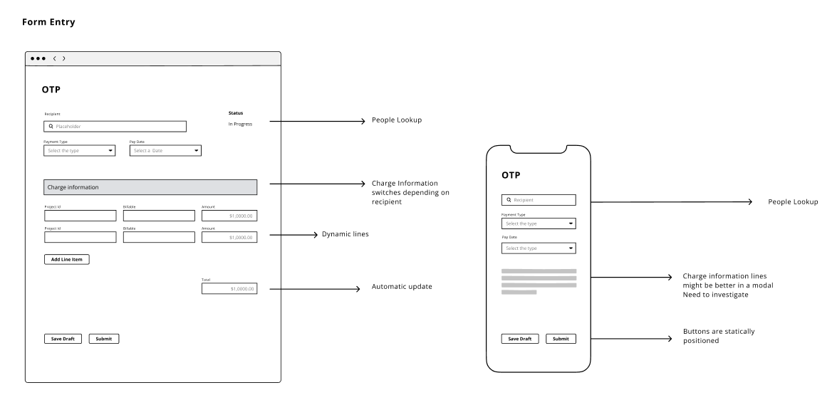
The form is all JavaScript driven. It’s a single page application that talks to a couple of API endpoints. To support the form design, a master-detail relationship has to be done with the data. For each record, you can add multiple charge codes, as well as header approvals. So in total, three main tables are required.
The screenshot below shows the ability for users to add multiple charge codes per OTP.
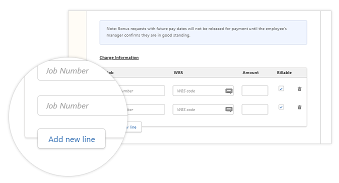
We used a framework called LWC, which has a design system attached to it. And while a lot of components are available and ready to use, I ended up having to build a lot from scratch. Things like custom fields with ajax validations, file uploads, people pickers, modals etc.
The Landing Page
Set aside the form for a minute and let’s talk about the landing page. So many users create OTPs so much – that they need a landing page to see the status of their records. This basically becomes the “home” of the application, with their records showing in a list format.
From this page, they can filter records, do a search by name or record id. They can also launch a new payment from here.
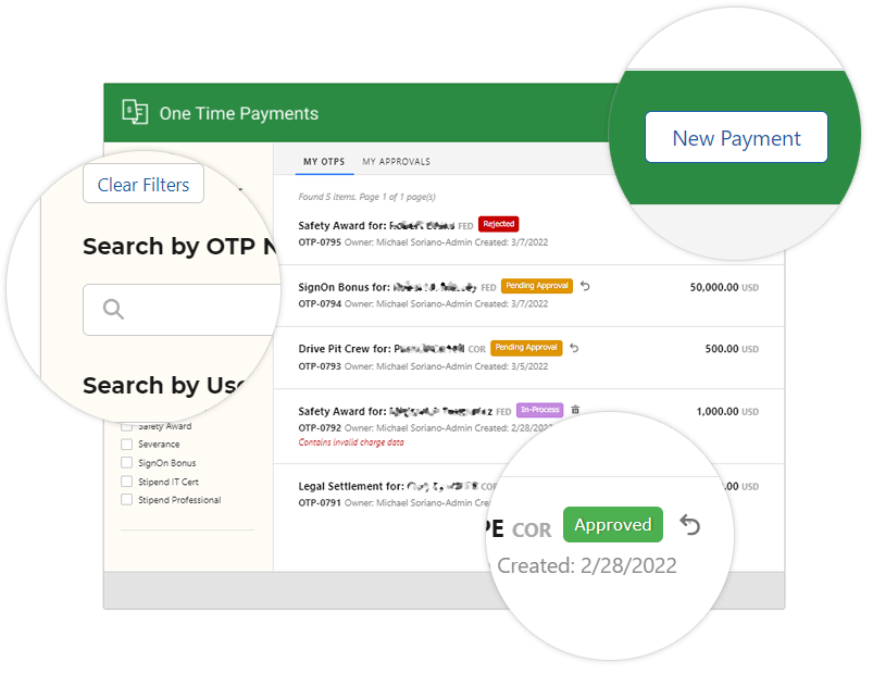
Quick actions are also added such as “recall” and “delete” so users don’t have to bring up the record. They can simply do it from this page.
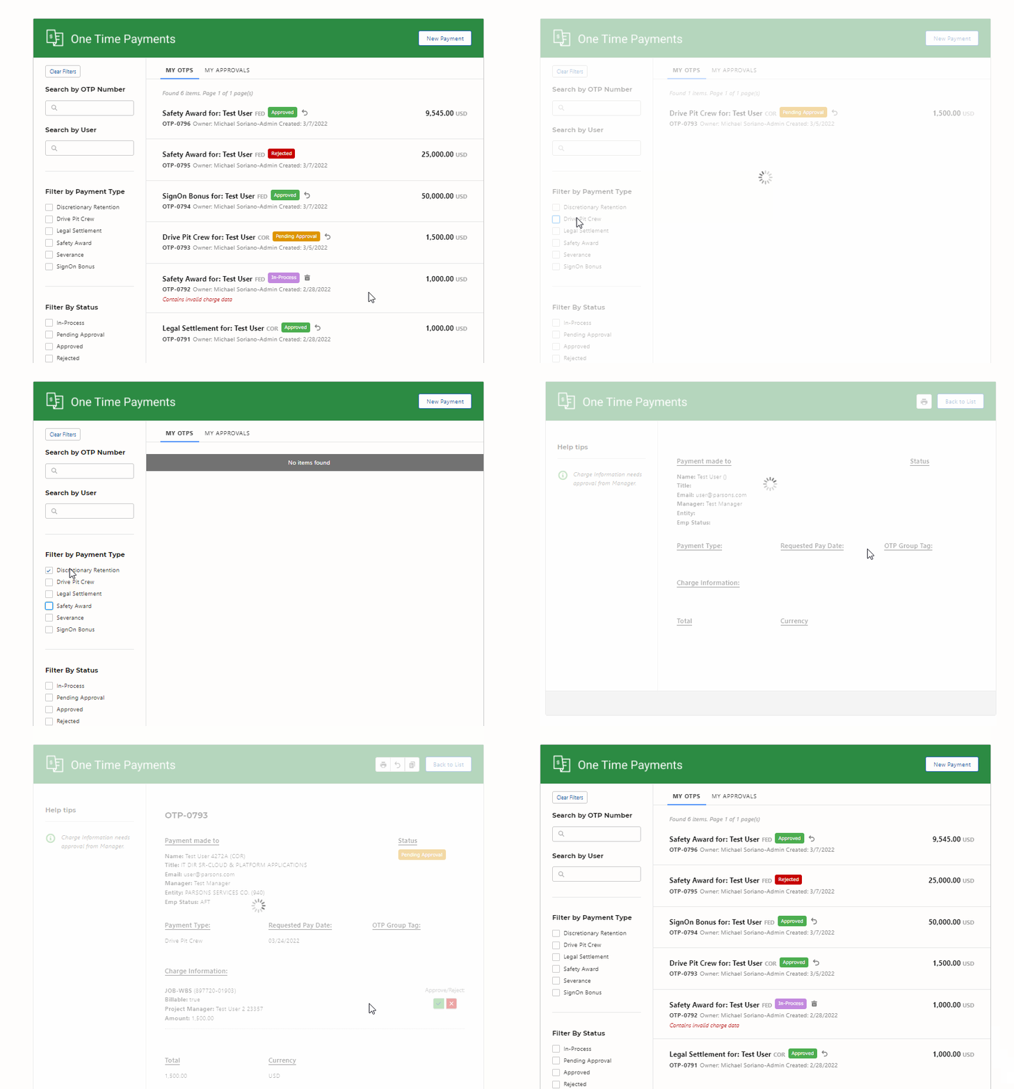
Pagination and tabbed views are also added for ease of use. The animation below shows a brief overview of what the application can do:
Summary View
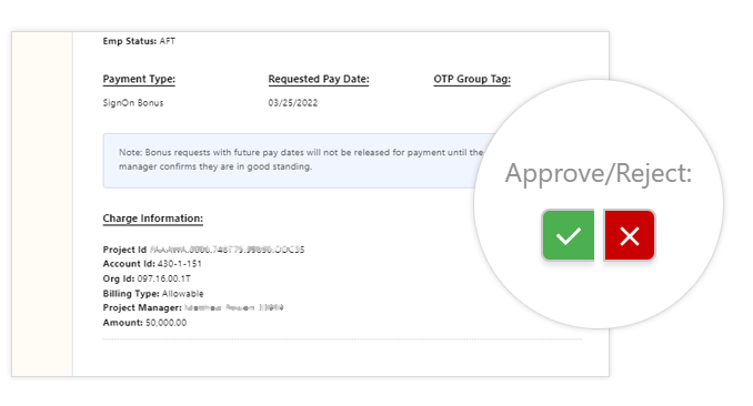
For each OTP, each charge codes require a manager’s approval. This can be just a single person, but most if the time, its different managers. There’s a view of the form that all the fields are read only, with action buttons for each line item. This view is smart enough to know who the current viewer is, and for which line he/she has access to click.
Note that front and back end validation is in place for security. So even if the viewer is savvy enough to hack the view, the server side knows who the current user is – and extra checks are in place so the approvals can’t be overridden.
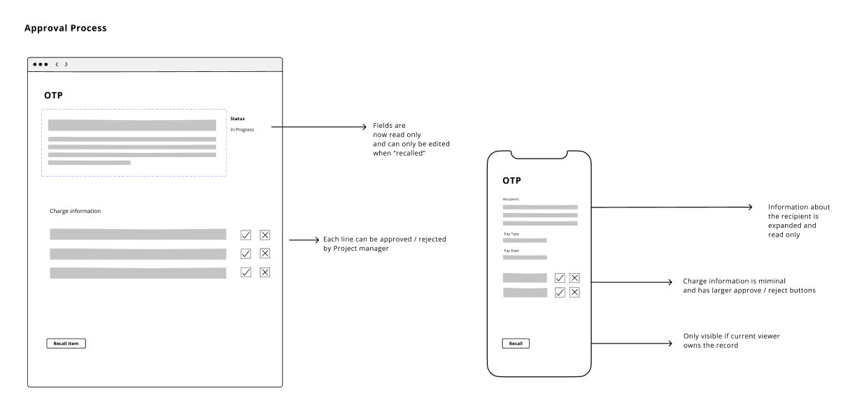
A simplified version of the wireframes is shown above. Also worth noting – that each view is mobile friendly and thoroughly tested with modern phones.
An actual screenshot of how the action buttons look, if the user has access to it.
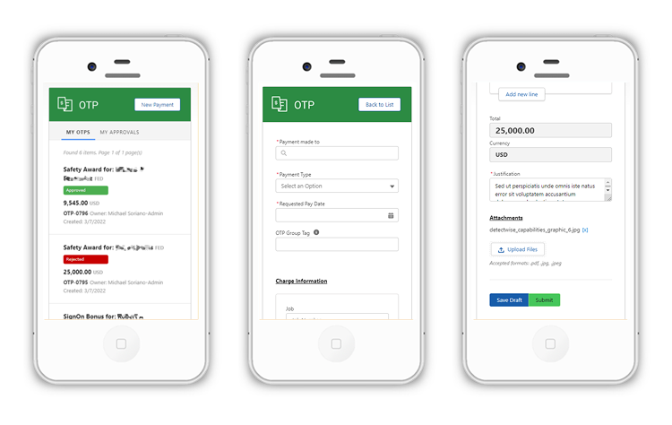
A few more screenshots of how the application looks in a mobile device. Even though most of OTP’s users are using desktop, the full functionality is available in mobile. In addition, there are a few customizations that have been built to handle mobile users.
Overall, the project was a great success. Many users consider OTP a huge time-saver. It ultimately replaced quite a few legacy systems we used in the past. Many especially liked the UX and the details that went into the process.
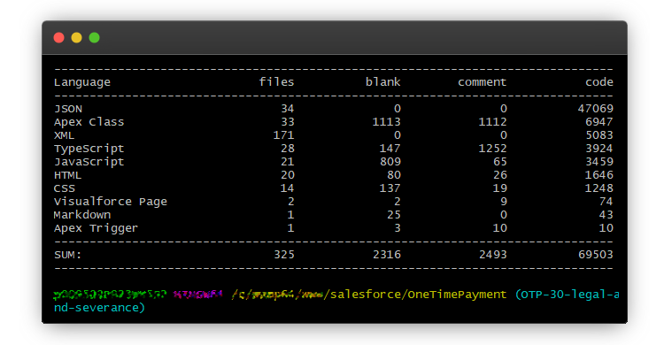
Finally, below is a screenshot of the files and how many lines of code that makes up the application. As mentioned, most of the code is server side (Apex) and the rest is front end languages such as JavaScript, CSS and HTML.
