Palm palace is a chain of Mediterranean cuisine in Michigan, USA. They needed a website that conveys their colorful and savory dishes. The owner had consulted me to design their site. So my primary roles were both to design and develop at the same time
Homepage
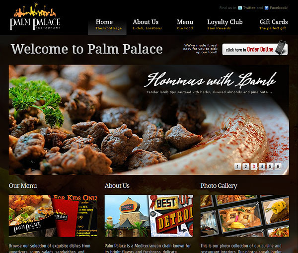
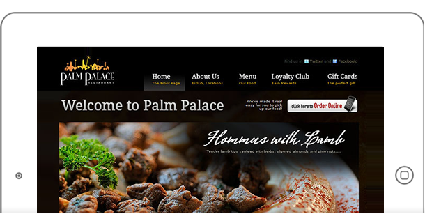
The homepage has a carousel with large photos of the restaurant’s main dishes. A bit of text as well as a quick description is also embedded with the photos. I always follow the “rule of thirds” when building pages and you can clearly see that in the design.

The typography is a mix of script fonts and thick serif headings. At the time, font technologies were not popular, so images were used for these special fonts. You may not notice but the homepage sits on top of more photography in the background.
Online Menu
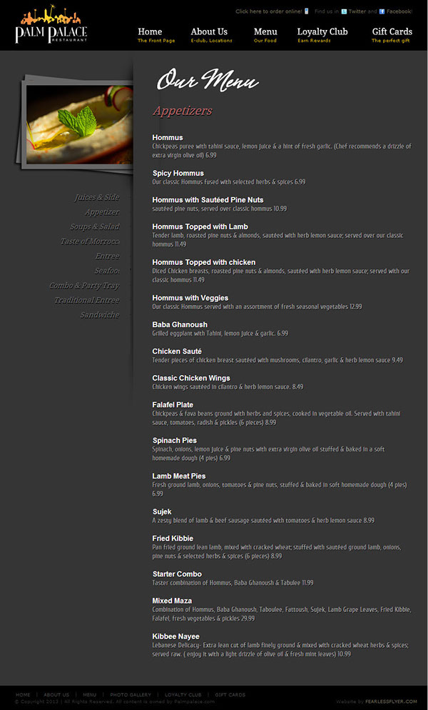
The menu was pretty straightforward. I had included a left side navigation, for quick access to which part of the menu you wanted. The restaurant didn’t have photos for each of the food item, so I simply added a photo to the left nav – highlighting the current menu category.

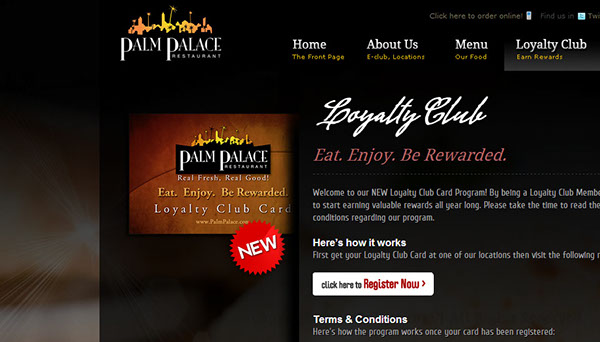
Again, the rule of thirds is applied. Some text shadows are also added to the menu items to bring out the text a bit more. Other pages of the site included a gift card section, an about us, a loyalty club page as well as a photo gallery.

The rest of the pages followed the same format as the menu pages, giving the site a more consistent feel. The technology used was HTML and CSS with PHP as the backend code.
