I had a chance of working with the people from Spend Smart Now in creating a few mock up pages for their new website. The plan was a website where people can create accounts, shop and save money online. The concept where somewhere along the lines of eBates.com and Amazon. My role was strictly a web designer.
Homepage
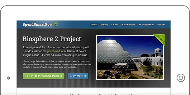
The home page (above) consist of a large feature area which will display their hero message, a slogan and a couple of call to action buttons.
My ideas were bold, modern, sleek and sharp. I came up with the consistent dark header and footer. The body of the pages remain white – blending with entire background.
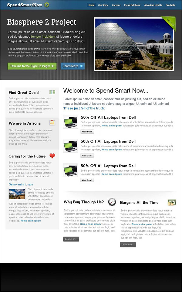
The homepage features a large carousel, with their most recent projects showing. Right below are their featured “specials” or “coupons”.
The Login Page
A login page is the entry way for your members. It is important that the branding of the entire site remains intact.
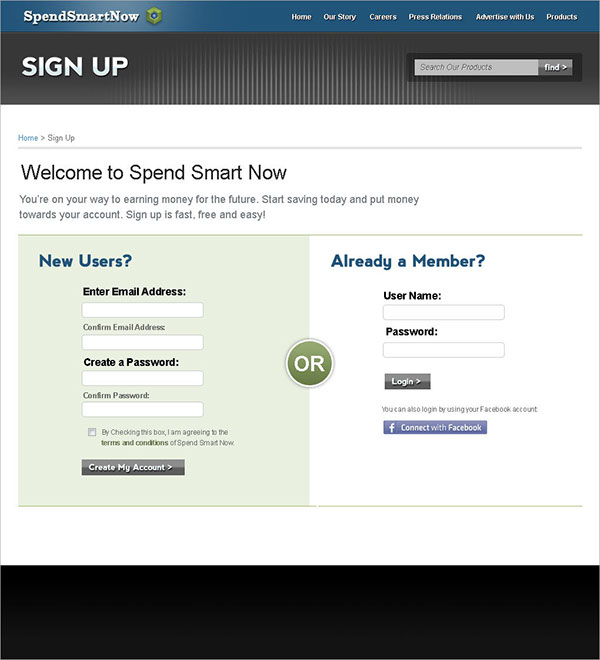
I’ve also split up the page into two forms – new users AND existing. I believe it is a chance to welcome both groups in one page.
Product Detail
Spend Smart Now had the concept of individual products. Not so much like an e-commerce site, but the coupon / or discount that they have on a particular product that can be bought elsewhere.
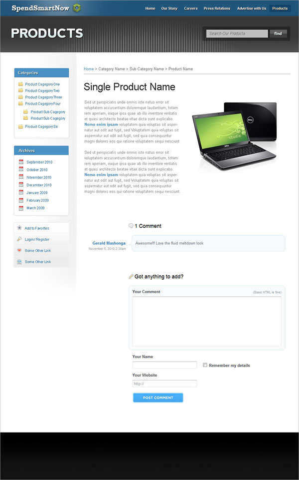
A simple page with a review and commenting system is mocked up in the above. Friendly messaging as well as navigation on the left side for the remaining of their items. The product archive is shown below.
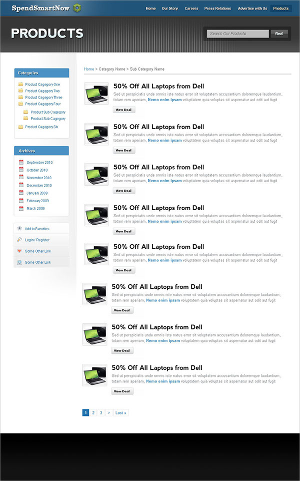
Again, the navigation on the left remains, with paging in the bottom.
Inner Pages
Spend Smart Now had plenty of external activities that they would like to add to their website. Many are events that they would like to build entire stories on. Sort of like a blog.
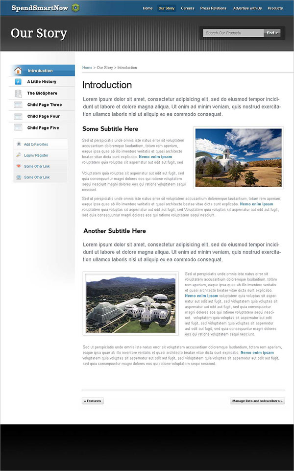
Almost similar to the product pages, but without a commenting area. The navigation on the left is also slightly different – with small icons and fade out containers. There is also a page pagination in the bottom for quick access to next / previous pages.
