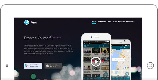
The creators of VimiChat had approached me to design their public www website. Vimi is a “computer on phone” application that is designed to consolidate all of your files, programs and websites onto a single user interface: the VimiChat app.
Simple and Clean
What I especially liked about the Vimi project was I got to design it. There are plenty of material online on creating app websites – which includes icons, phones and tablets. The Vimi people wanted the site simple and clean – so that’s what I intended on doing.
![]()
The screenshot above is a set of icons describing what the VimiChat application can do. This was featured right below the hero image in the homepage and was good match.
Keeping the Brand
Part of the challenge was to match the website with the actual Vimi app. The logo, typography as well as the colors – all were kept to provide that sense of brand. Below is an example of the application colors + icons – matching the colors and typography to the right.
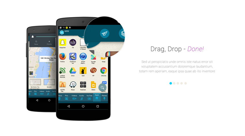
Brand is important to the Vimi team, so I made sure the experience of the website was holistic and complements the brand.
WordPress Please.
The Vimi team specifically asked for WordPress because of it’s simplicity and ease of use. On top of that – WordPress powers about 25 percent of the world’s websites – so it’s easy to get support at time of need.
I have plenty of PHP and WordPress experience – so of course, I did this part as well.
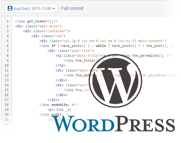
The best thing about designing and coding – is I feel that I built that whole thing. From “soup to nuts” – Photoshop and my code editor was open together the entire time. Switching from design to code made things fast and enjoyable.
Below shows the ideal “sidebar” template for the internal pages. A “Search” form that still adheres to the color palette of the site.
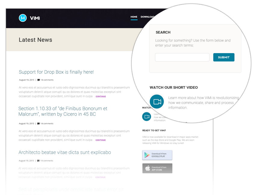
Note the titles, links, headers and navigation also matched the company brand.
The Vimi folks also wanted to start their “blog”. This was not a problem with WordPress. As you may already know, WordPress IS a blog. Developers such as myself – just figured out ways to make it into a CMS. With the right skills – WordPress will do the job, and do it well.
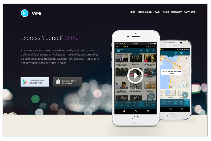
Finally, the hero section above is for the homepage. Notice that the site is centered around the Vimi app – with call to actions to the downloads in Google or Mac store. In addition, the site is fully responsive. So the site is fully accessible in different resolutions – desktops, tablets and mobile devices.
