Now we have come to part 2 of this series on how to create a single page portfolio from scratch. This part focuses on the HTML and CSS mark up to convert our .psd file to a living web page. The tools we need for this is of course – Photoshop, an HTML editor (in my case I’m using Dreamweaver) and multiple browsers for page testing. We’re also going to toggle between these tools a lot so be prepared to switch programs by using alt + tab often.
View the Demo:
This tutorial is part 2 of three parts: 1) the Photoshop Mock up, 2) Coding the HTML / CSS and finally 3) Adding PHP / jQuery.
To preview what we are going to build – see the demo page. Just in case you missed the first tutorial, click here. So are you ready to get started? Let’s begin:

The Wrap, Header and Feature Divs
First of all, you will notice that our layout doesn’t really have anything in the header. This is because I’m sure you will use your own logo for your design – so I left that out. Second, is there really is no need for a navigation bar because we’re only building a single page. Although we may include some anchors in this area so we can quickly jump from one section of the page to another. Also important to recognize that most modern websites now have a large “feature” section which packs the main message of the website. This effect is proven to be pretty effective – that’s why we’re applying the same concept to our portfolio site.
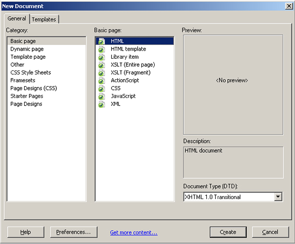
In Dreamweaver, create a new HTML page, name it “index.html” and save it.
Create a CSS document – name it “styles.css” and save it in the same location as “index.html”. Link to the stylesheet from index.html by using a link tag:
Now, we create the main DIV – we’ll call this the “wrap”. In this DIV we’ll house almost all of our elements (all but one: the footer – which I’ll explain later). In index.html, enter the code:
Next, we grab the body style of our page. Go to Photoshop and open our mockup. Flatten the image (“Layer” > “Flatten Image”) and grab a piece of background:
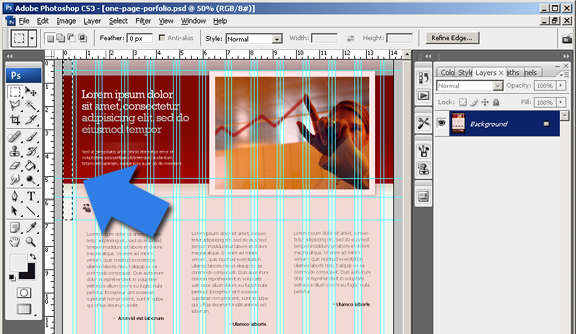
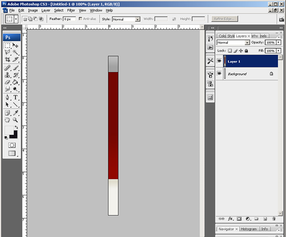
Still in Photoshop, press Ctrl + C to copy the selected area, create a new document – and paste (this will be our HTML body background that will span horizontally). Save this file as “body-bg.gif” inside a folder called “images” in our root directory.
Next is we apply some fixin’s to our CSS:
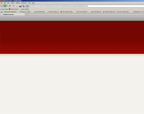
The above code tells everything to reset to 0 padding and 0 margin. It also applies the body background to the image we just created, repeat it horizontally and apply the color #f3f2ed everywhere else. View your file in the browser, you should have something like below:
Now remember we created the main div? That is just sitting in somewhere in the page. Let’s apply some standard measurements to it and align it so it settles perfectly in the middle of our browser.
Note that in the beginning of this tutorial – I was going to use the 960.gs framework, but feel as though I’m cheating because the tutorial calls for “from scratch”. So I decided, I’m not using the framework and code everything by hand, hence – “from scratch”.
Add this code to your style.css:
This centers our wrap in the middle of the page, as well as set the default 960 pixels width. The background color and the minimum height properties are added temporarily so we can tell from the browser what we’re working with. Refresh your page and you should have something like below:
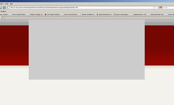
Go back to index.html and add the header div inside the wrap div:
Back to our style.css – add this piece of code:
Refresh your browser – and you can see where our header sits nicely on top. The background color again is temporary.
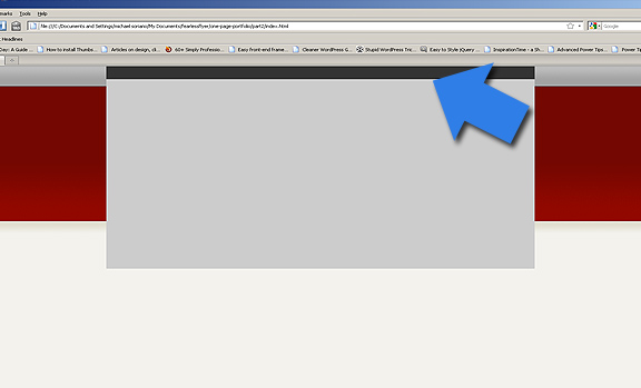
Next is our feature div. Create a new div tag in your index.html with the id of “feature”, place in between the “feature” divs. Add two paragraph tags inside with your own text. In my case – I’m using the default Lorem latin filler text:
Notice the first paragraph tag has an id of “slogan”. This is because this is the primary text that we are going to style with an image. We are treating it as regular text for SEO purposes.
Go back to your mock up in Photoshop and press “Step Backward” (ctrl + z + alt) several times until you get the fully layered version once again. Make sure the guides are showing – select the feature section like below:
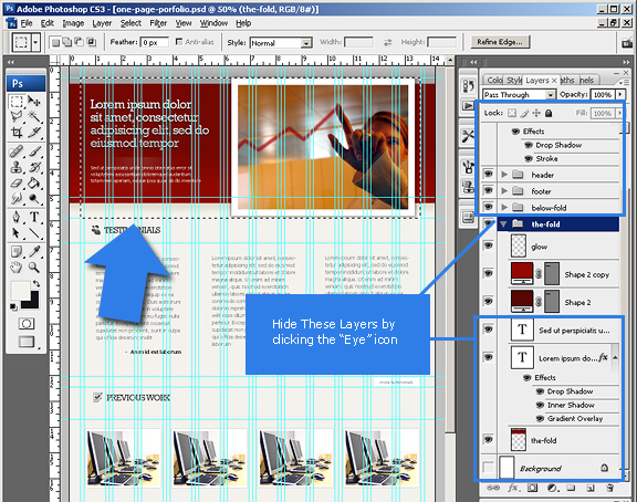
In your layers panel, make sure you hide all the layers that shouldn’t be shown. This includes all the background layers and text elements. The only layer that should remain is the large feature image and the borders and glow to the left. Select the feature area and hit crop (“image” > “crop”). Save this as “feature.png” inside our images folder. This will be our feature div background image:
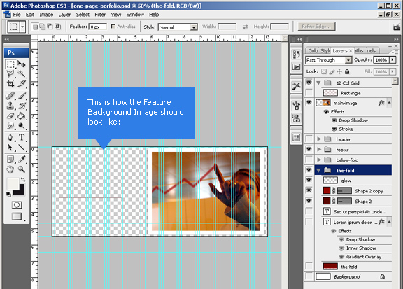
Now in our styles.css – add the following code:
Go back to your mockup and click “Step Backward” (“Edit” > “Step Backward”) to uncrop. Unhide the slogan layer and select it according to the guides. Crop once again and save this as “slogan.png”.
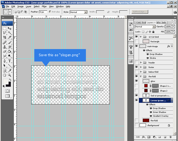
Now add this code to your styles.css:
The above code styles the two paragraph tags inside the feature div. The first one with a background image, and the next one as plain text. Now when search engines crawl our page – it still thinks both are plain text – which is a good thing.
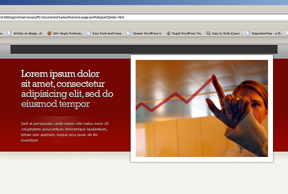
I’ve also taken out the color property in our wrap div to see how our feature looks like. Another thing to remember is that since our feature sits in its own div – it will be easy to add a slideshow or something to that effect as replacement.
Now that our wrap, header and feature is in place, we’re ready to move to the next sections: Testimonials and Previous Work:
Testimonials and Previous Work Sections
If the feature section is our hard hitter – a testimonials area is our “counter punch”. Testimonials are a sure fire way of telling our viewers: “we’re good – read what others are saying about me!”. Also another proven way of increasing business, it is also the reason why we’re putting testimonials right below our feature section. Ready to continue coding? Let’s keep going.
In our index.html, add the code for our testimonials. Place this directly below our feature div:
Of course, you substitute real testimonials and authors in its place. Notice the “first” and “last” additional classes to the columns – we need this to fix our margins in our css. Next, go back to Photoshop and go backwards again so you get back to the original uncropped file. Select the Testimonials title all the way to the rightmost guide. Crop and save as “testimonials-title.jpg” inside our images folder.
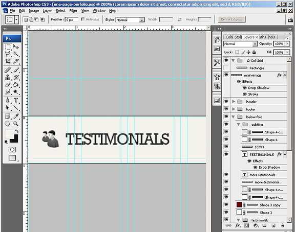
Inside styles.css, append the below code:
This code adds the background image that we just created to the main testimonials div. It also adds proper styling to the columns inside the div, and fixes to the margins so it remains inside our imaginary grid.
The optional “more” tab
The more tab is only necessary if you have more than 3 columns of testimonials that you would like to show. The point is just show 3 columns at first, and by clicking the “more” tab – more testimonial columns will slide below – most likely to be achieved by jQuery (I haven’t gotten there yet – remember – I’m writing this tutorial as I go!).
To add a more tab – add this code to your HMTL, right underneath the last column div:
Note that we used a class for our div instead of an id. This is because this div can actually be reused in another section of our page.
Go back to your Photoshop file – click “Step Backwards” to the uncropped version – select the section that shows the “more testimonials” border and button according to your guides. Remember to hide the text layer over the button.
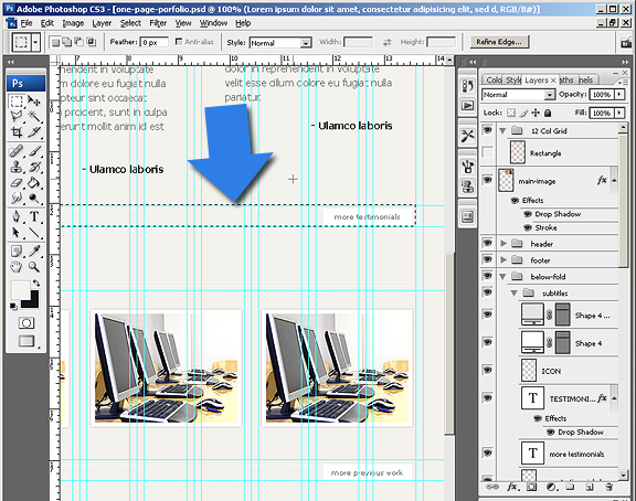
Crop and save this as “more-bg.jpg” inside the images folder. Add the code below to your .css file:
For the “Previous Work” section – it’s pretty much the same process as testimonials. The difference is – we are actually using an unordered list instead of div columns. Add the following code inside your HTML:
The thumbnail sizes are going to be 200 pixels width by152 pixels height. My sample code contains dummy thumbnails along with temporary images for the bigger image. We are incorporating a light box effect in the final product so users do not actually leave the page when viewing your gallery. Notice the addition of the “more” tab – which is again, purely optional.
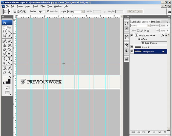
For the “Previous Work” title – you do the same exact process in Photoshop as you did previously in the Testimonials title. Save this image in the images folder – name it: “previous-work-title.jpg”.
Now we add some styling to the list items, thumbnails and the entire div section:
I also created a couple of thumbnail image backgrounds for the active and hover states. Again this is purely optional and I won’t go over in this tutorial.
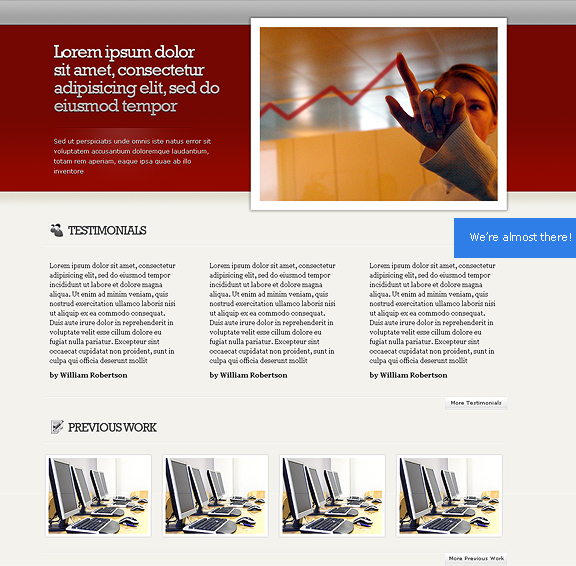
Now refresh your page in your browser. You should have something like the image below. It is also good practice to start viewing your page in different browsers. This way – you can start fixing bugs this early in the development process. Next stop is the footer.
The Footer
Let’s go back to our Photoshop file – you may have to go back in history a couple of times to get you to the uncropped, fully layered version. Another thing to remember is NOT to save your original mock up file. This file is to stay in its original form – we are just cropping, hiding layers as we go to get the parts we want. But in the whole, this mockup .psd file remains in its original state. Select the footer area – starting from the guide a few pixels above the dark brown area.
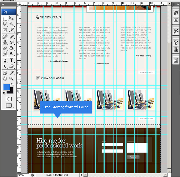
Once selected – crop the selection – but don’t save as of yet; we’re going to save a couple of images from this selection – one is the footer wrap, the other is the actual footer background.
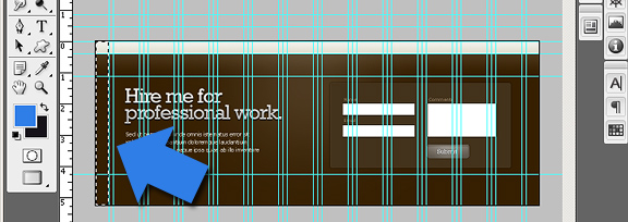
Once cropped, select the first 20 pixels from the left and crop once again. Save this file as “footer-wrap.gif” inside our images folder. Now go back to the Photoshop file and step backwards a couple of times to bring us to entire cropped footer image. Hide the layer group named “form”, as well as all the text layers in the footer area.
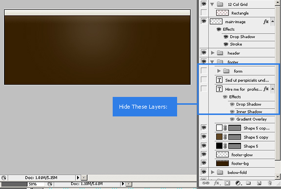
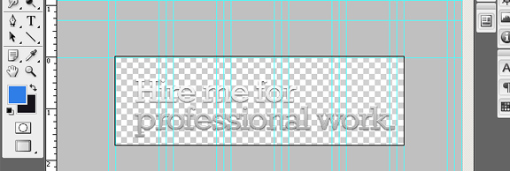
Save this file as “footer.jpg” in the images folder. Unhide the text layer that says “Hire Me for Professional Work”, and hide all the background layers so you get full transparency. Select the text area using the rectangular marquee tool and crop. Save this file as “slogan2.png” in our images folder.
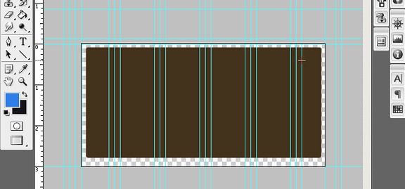
Now hit “Step Backward” (ctrl + alt + z) a couple of times to get to the uncropped footer image and unhide the “form” group of layers. Make sure you hide all the layers inside the form – all we need is the rounded container that embodies the form. Select this area, crop and save this file as “form-bg.png” in our images folder.
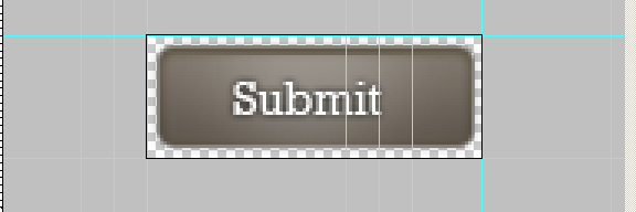
Finally, unhide the button text, shape and glow. Create guides that surround the button image and select accordingly. Crop and save as “submit.png” in our images folder.
Now go back to our index.html, add the following code right underneath the entire wrap div.
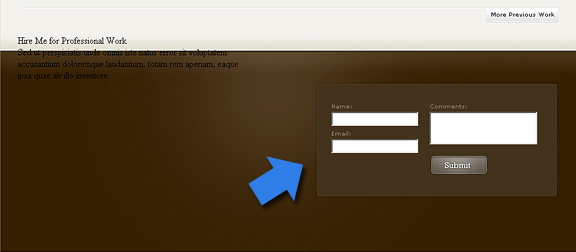
The above code sets up all the content in the footer. This includes the two paragraphs on the left side and the contact form. Note that the form is still static. We will be converting this into a working form once we convert this to PHP.
Next up, is to style the contact form. Add the following code to your styles.css:
The above code sets up our footer wrap to span the entire width of the page with its own background image repeating horizontally. Now you understand why we excluded this from the main wrap div? The rest of the code applies the styling to the footer and contact form – tied to the images we created in the previous steps.
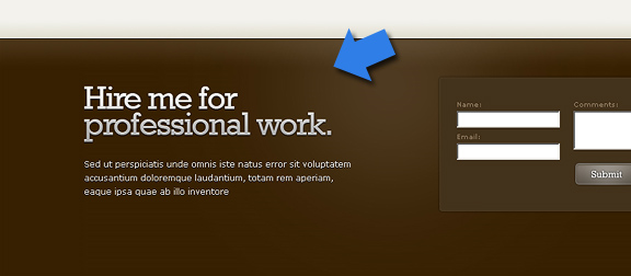
Finally, we add the final touches to the two paragraph tags on the left side. Add this code to your styles.css:
That concludes are HTML and CSS tutorial on our single page portfolio. Remember, we still have the scripting side to do – which is handled by PHP and jQuery, which we’ll cover in the next series. Click Here to see the DEMO Version of what we just created. The source code is also available to download – which includes all the files covered in this tutorial.

Fantastic! I’ve been doing sites for years and its great to see the workflow of someone who really knows their stuff.
Also, I learned about ctrl-alt-z in photoshop! How did I NOT know that!?? LOL I always hated having to leave the KB to click on a history state. Pretty dumb that I just lived with that frustration for as long as I did, but it makes me really appreciate that you take the time to include the small details that can really make a big difference.
Thanks so much for your fantastic tutorials, designs and general awesomeness! :^)
Great post again.
I wish my working methods were as organised as yours but I am from the old school Fireworks days where I rarely used layers but if I get a chance I am going to set aside a morning to work through this tutorial (part 1 mainly) and see if that might speed up my development work in the future.
Hi,
Are you using the 960 Grid framework for the designing the same?? if yes are you using the same in the coding as well??
Thanks,
Avi
I planned on using the 960 framework, but since I titled the article “creating from scratch” – I decided to rewrite everything from “scratch“. So no – I’m not using 960. (It is 960 pixels wide though)
hi i managed to finish your tutorial: Create a Single Page Portfolio from Scratch. but i’m having a problem with Double Float Margin Bug with IE its appearing near the footer.. please help me.. and after finishing this portfolio can I use this?
create a conditional ie css to clear the double float. yes you can use.