This tutorial will walk you through how I created my new logo. It’s nothing fancy – just a group of fonts appearing to overlap each other – giving it that three dimensional effect. It’s fun and friendly – just how I want my brand to be. The best part about it is: it’s very easy to do. The image above is the final product. Are you ready to start? Here we go:
Step 1: Set the groundwork
In Photoshop, create a new document, 800 pixels width x 340 pixels height. Add a new guide – 70 percent from the top border of the document:
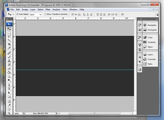
Add a dark background (I chose #292929), add a text layer and type out your words. The text settings are: 100 pt in size, color #ffffff, and type is “Myriad Pro – Black Italic”. Note that if you don’t have the same font – use something a similar italic, block type font.
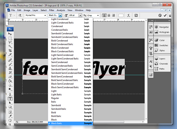
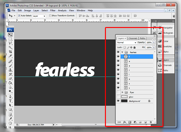
Now, delete all the letters in your text layer and duplicate the layer for each letter. What we’re trying to do is have a layer in its own layer like below. Nudge each letter so they’re quite close to each other:
Step 2: Create the Text Effects
Now we’re ready to create the text effects. Double click the first letter and apply the following effects:
Drop Shadow:
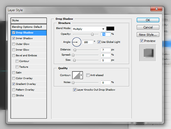
Inner Shadow
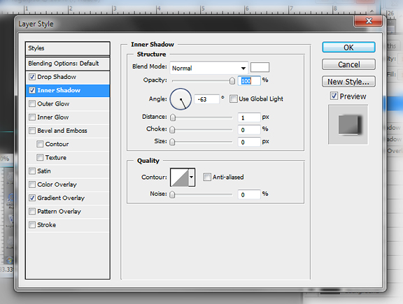
Gradient Overlay
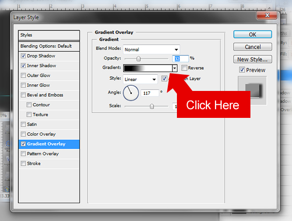
Add the following colors for the gradient (to do this click the gradient box from above). Move the color handles in the bottom bar to the position indicated. Leave the colors at #000000 and #ffffff.
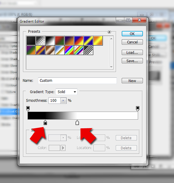
Step 3: Copy and Paste the Layer Styles
Right click the first letter layer, select “Copy Layer Style”
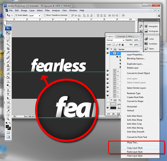
Go to the next letter layer, right click and select “Paste Layer Style”
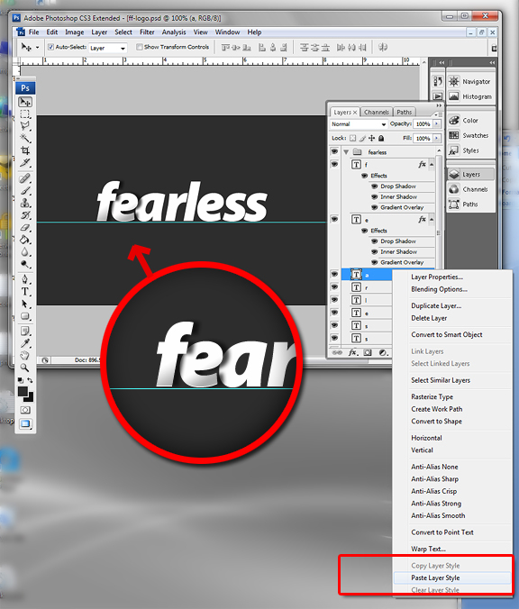
Continue doing this process to all the layers.
Step 4: Final Touches
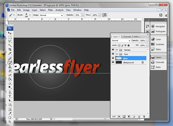
Adjust your letter positioning according to your text content. The point is to just have enough spacing for subtle shadows to appear onto the next letter. I also decided to change the font color to the word “flyer” to #d30000 to match my color schema – choose your own color for yours.
Finally, create a new layer just above the background layer. Using the brush tool with these presets: (choose a really soft tip, adjust to 300 pt, with color #ffffff, opacity level to 24 percent). With just one click – daub right in the center of the document to give it that really soft glow in the background.
Conclusion
There you have it, a simple yet beautiful logo from nothing more than layers of text subtly overlapping each other. Play with the effects to your heart’s desire. You can even adjust the vertical positioning of each letter – just to add a bit more kick. Feel free to Download the PSD file.


I suck at Photoshop, this helps a lot 🙂
Great job 😀
Your creativity is really fantastic. Thanks for sharing this very useful tip! One cup of coffee coming your way man. Outstanding stuff…
Brother, Its Really Nice & Pretty……..
Thanks for Share With Us……….
Well to all photo shop lover’s out there here is a great tips for us!! Thanks for the post… i’m gonna tell my friends about this..☺☺
Thanks, bro! I have just walk through your tutorial, even if i am not good at Photoshop, i have done it. I guess, i am gonna use this logo for own blog, too. Thanks again!
WoW superrr THENX :))
Thank you, i’ve done it in AI files, though the styles got different styles but i liked it ..
Thank you very much…
one of the tutorials for me !
thanks !
“Now, delete all the letters in your text layer and duplicate the layer for each letter.” This part is really confusing.
nicely done and simple.
thanks for sharing it dude 🙂
I am starting to learn Photoshop because it is of essence especially in maintaining a website. Banners and headers are a headache if you do not know PS and it’s wasting so much job opportunities.
One of the best choose by me. Thanks for give us this. I have really like this tricks.
Thanks for giving away the secrets and sharing your valuable knowledge. I would love to follow a new logo design tut in illustrator. A video would be great. What you say ?
The first thing I noticed in your website is your logo. Your logo is simple but cathes eyes and easy to remember too.
Wow nice tutorial. thanks dude 🙂
Nice one always love a good photoshop tutorial. Defintiely need the practice myself!