This tutorial will show you how to create that awesome technique we see in newer websites. It’s that diagonal text shadow effect usually seen in large header areas. The effect cannot be done in code (at least not yet), but it’s certainly possible using Photoshop. Below are some examples of what I’m talking about:
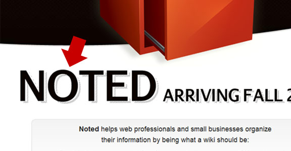


Notice the patterns they used that shadow the text. They’re usually best as diagonal lines. A screenshot of what we’re building is shown below:
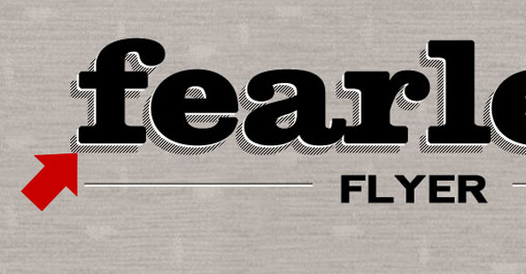
Ready to get started? Let’s begin:
Step 1 – Create your pattern
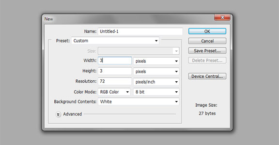
Fire up Photoshop and create a new file. The dimensions are 3 pixels wide and 3 pixels tall:
Ctrl + Shift + N to create a new layer – leave it untitled and click okay. Zoom in to the document as close as you can (by pressing Ctrl and + at the same time). Hide the background layer by clicking the “eye” icon from the layers palette:
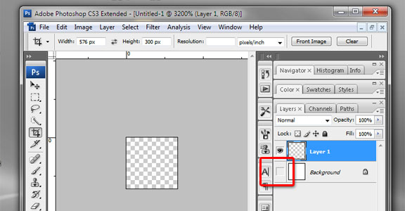
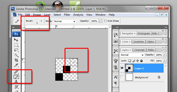
With the Layer 1 selected, grab the pencil tool – decrease the size to the smallest (1 pixel), set the color to black and click 3 times onto the layer (in a diagonal line). Not to worry about being perfect – it will snap into place:
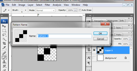
Go to Edit > Define Pattern. You can name you pattern and close the file without saving. Your pattern should be saved in your options palette.
Step 2 – Set the Background
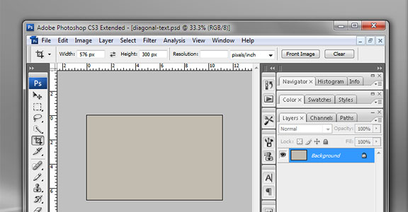
Create a new file in Photoshop – a good size is 800 pixels wide and 500 pixels height. Add a daub of color to the background layer – I chose #c8bcb2:
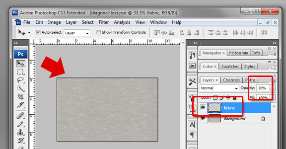
To amplify our text effects even more – I like to add some texture on top of our background layer. A new website called Tileables specializes in such textures. I grabbed the “Fabric” pack from the Tileables-Pack-04 collection – open the .psd file from the zip file and drag your desired texture into your file. Decrease the Opacity of this layer to about 20 percent:
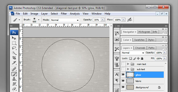
Create another layer. Select the paint brush tool – set the pixel size to 600, color to #ffffff, and Opacity to 31 percent. Click on the center of your document.
Step 3 – Create your Text
Using the text tool – type in your title, set the font size to real big (I’m using New Clarendon Font type and its set to 176 pixels, and bold type)
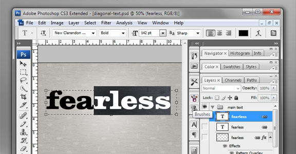
Right click on the layer and duplicate it. Nudge the layer downwards and rasterize it (right click the layer > “Rasterize Type”).
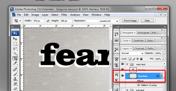
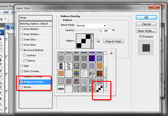
Double click on the rasterized layer and this will bring up the layer style window. Click on the “Pattern Overlay” option and select the pattern that we’ve created from Step 1 (should be the very last swatch).
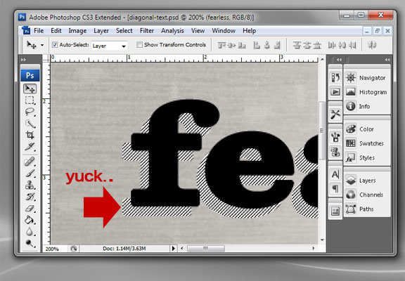
You should see our layer with our newly applied pattern. The problem is – the original white background bleeds through.
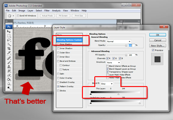
Double click on the layer again to bring up the styles. In “Blending Options” – make sure it’s on “Blend if Gray” and slide the first handle to the right all the way to the middle. This should take care of the white bleed:
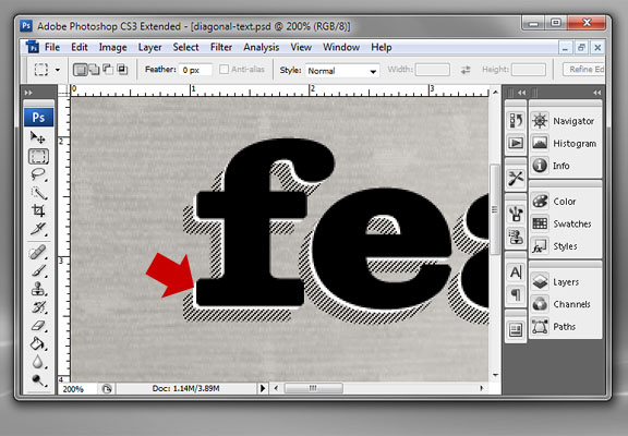
By now you should be a master of duplicating layers. Duplicate the original text layer once more, rasterize and fill with #ffffff. Nudge this layer downwards just a couple of pixels. This will give it a more dramatic outline effect:
Step 4 – Embellishments
The word “flyer” – will have an entirely different font type, partnered with a horizontal line with an etched effect. Here’s how that’s done:
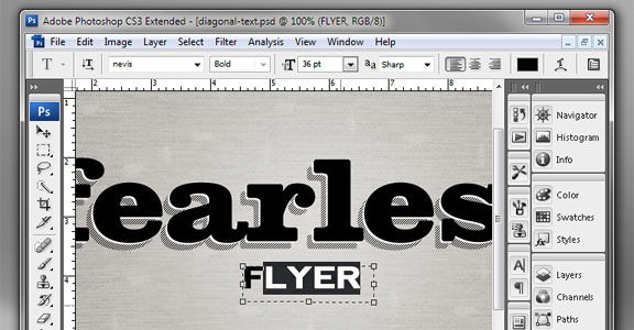
For the word “Flyer” I chose Nevis, and made it all capital letters. The font size is 36 pts, color is #000000.
Place the subtext directly in the center of the main heading:
Using the Line Tool, draw a line underneath the main heading (hold the shift key while drawing). Use a 2 pixel line with #000000 fill:
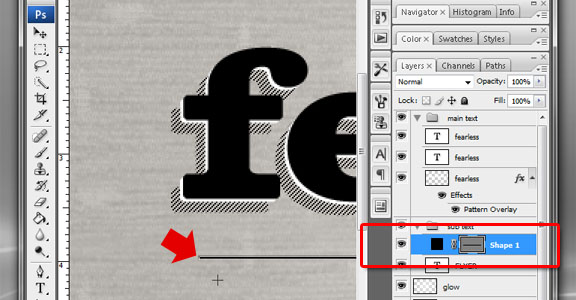
Duplicate that layer and change the fill to #ffffff; then nudge the layer a couple of pixels downwards.
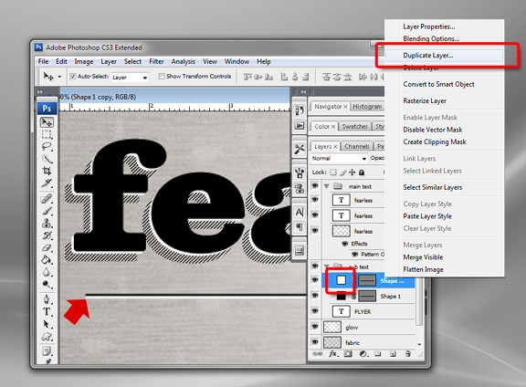
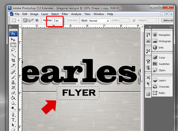
Combine both line layers by selecting them, right click and hit “Merge Layers”. With the selection tool, change the feather to 2 pixels; select over the word “Flyer” with just enough padding – then hit delete:
Conclusion:
And that’s it! Take a look at the screenshot below for the final product. You can download what we’ve just created – but it will contain rasterized text layers. I did this because chances are – you won’t have the fonts that I used. Feel free to leave a comment below.


Great photoshop tutorial Michael. I sure wish I had your skills.
By the way, I am still loving my theme!
Thank you!
That is super awesome, I am going to have to make some of my scrapbooking graphics using that technique. (Or as you say, “e-m-b-ell-ish-ments” – it is a fun word to say, lol)
How do we show the full post on the main page on the Apparatus theme? Comments are closed and it seems this question has been asked MULTIPLE times and you have not answered. Support would be appreciated.
open home.php – look for the_excerpt change to the_content
text shadows for the best software photo shop.this software in all method available.thanks for sharing……….
God Job. I like it. Hope you will be here continuously…………
Great tutorial for Photoshop. I was looking for this. Thank you
Thank you, it was helpful for me!
update – now you can create this effect in pure css: http://codepen.io/lbebber/pen/BzoHi
Photoshop is the best software for adding shadow to text document. It is a very good article for the beginners specially. Well done.
It was very awesome. You are a good site
Shadow is something which gives your product image more lucarative look. You can employ shadow with photoshop so that it embraces a an original look of any product for better display
Really Nice!! I found the best resource about it. Hope it will be helpful for others who search for the best resource like me. Thank you so much.