If you don’t know what a Hero Image is by now, you might be living under a rock. A hero image is the main image in carousels and slideshows. It or even as a background of the homepage. It can also be found in main product pages, a landing pages or more commonly: the homepage.
It is the big header image. Or the large background image with some messaging. May also be referred to as the huge banner image with text. A more official definition found in Wikipedia.
First, let us see what we are building:
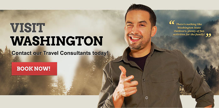
As you can see, it is a VERY important image. It is the first thing your users see. It leads to conversions; it tells a story; it welcomes people and it drives people’s emotions.
But before I start, let’s get one thing clear. This guide focuses on making good looking images. There may be other guides on how to increase conversions and such – but that’s an entirely separate discussion.
Also, let’s go over a few basic rules that I’ve followed through the years of designing hero images. They may be common knowledge, but Its important regardless and I think its worth mentioning.
Rule #1) Subject and Text Placement
When it comes to deciding where to put the copy and the subject (the main focal point of the photo), I generally keep these 3 scenarios in mind: 1) subject on the left copy on the right, 2) subject on the right, copy on the left or 3) copy in the middle (no subject).
Subject to the Left
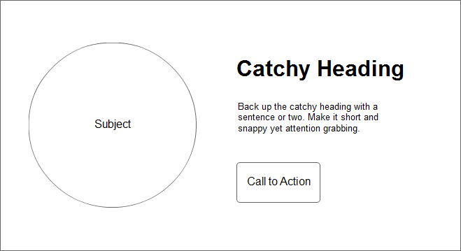
Keeps balance within the image. Notice that copy will most likely be left justified in order to look good. Proper alignment and spacing is very important.
Subject to the Right
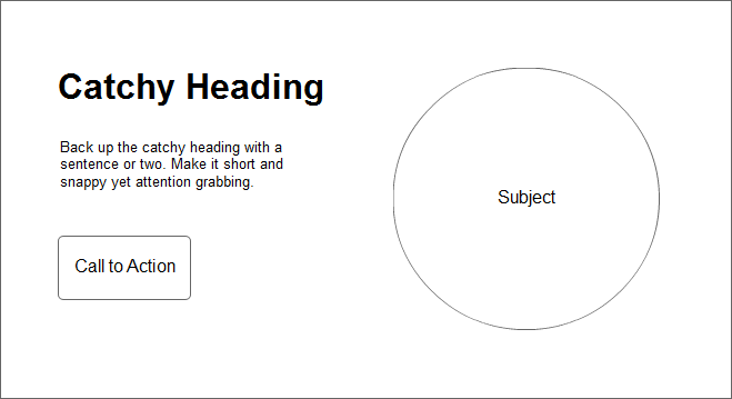
This also keeps the balanced in your image. The copy can be left or right justified – this really depends on the overall effect. Squinting your eyes to see the visual weight of the image really helps.
No Subject
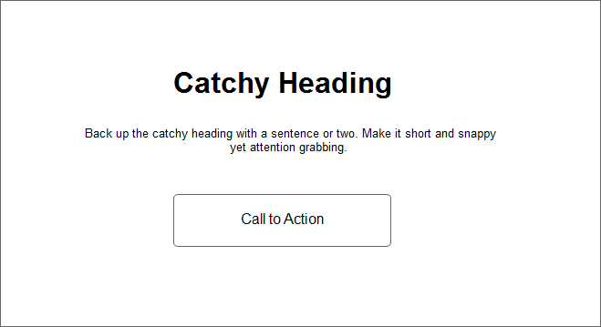
I call this “no subject” mainly because the focus remains on the text. The entire image in the background can actually be the subject, or it can just be a subtle background. We’ll go over how to fade or blur your background in our tutorial below.
It is important to know that the above scenarios are the most common ones. I’ve seen some hero images that do not conform to the above – but are quite rare.
Now this brings us to our next rule:
Rule #2) Know how to treat Backgrounds
Of course, a good designer already knows how to deal with backgrounds. Rule of thumb: you want to focus less on the background and more on the messaging. In many cases, backgrounds are treated with some kind of blurred filter to reduce the focus.
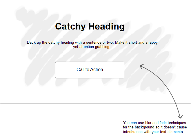
You also want to contrast the colors of your messaging and call to action buttons against the background in place.
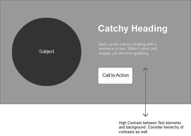
Either way – the rule is: focus on the text. Backgrounds are only for, well – backgrounds.
Rule #3) Always Use High Quality Images
Once again, a no-brainer. But you wouldn’t believe the number of websites that I come across that break this rule. I mean c’mon, this is face of your business. Your portfolio. Your online identity.
Using high quality images is a definite must.
Size down – but Never size Up!
I’ve seen this so many times. A designer grabs a photo from Google, re-sizes the image bigger – to accommodate the slideshow. Now, any idiot knows that blowing up the jpeg degrades the photo. Drastically!
Avoid Stock Photos
Okay – this may not be a deal-breaker, but stock photos are so 90’s. How many times have we seen that business woman with a headset and a big smile? Fine if you really must use a stock photo (like I’m doing in this tutorial) – at least choose one that doesn’t look like one.
So enough about rules I say and get down to the nitty gritty.
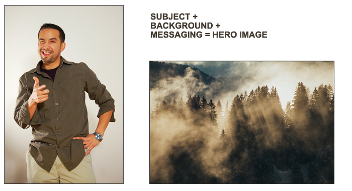
The photos we’re using is Money Shot and Sun shining through trees from Creative Market. We’re creating a fictional travel banner, so I think these images are good.
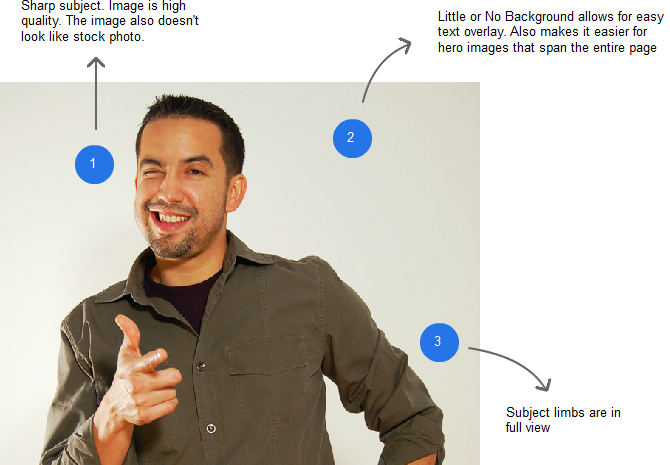
Take a look at our subject image. Notice that we’ve selected an image with little or no background at all. This makes it easy to manipulate in Photoshop. The man’s arms are also 100% visible – meaning, it’s easy to use for hero images that need to cover the entire web page.
Using Photoshop’s pen tool, you can easily trace an outline and remove the background from our subject. This will let us add the other image for our background, making the man look like he’s in the woods.
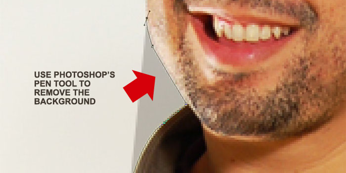
Remember to duplicate the layer – just in case we need to go back to the original.
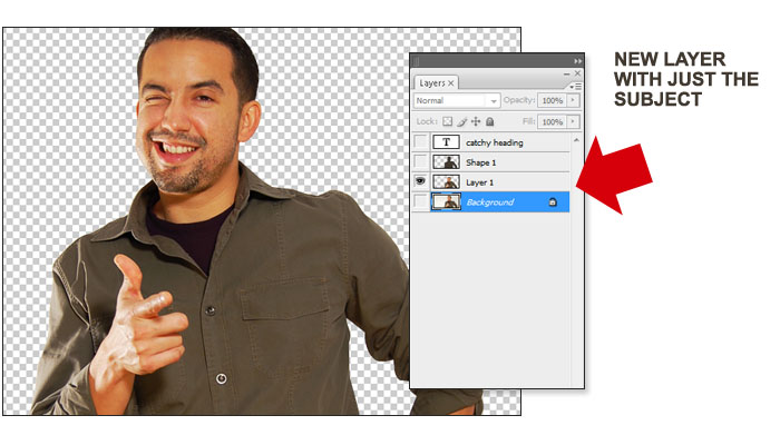
At this point, you can place your background underneath the select layer – you can also visualize what copy you need to add. Remember our scenarios above on where to place the text? Again, you may need to adjust a little bit depending on the image.
We’re not going into detail on how to style the text or the call to action – this will be totally up to you. Remember that text may have to be done in HTML code – so I won’t cover it in this tutorial.
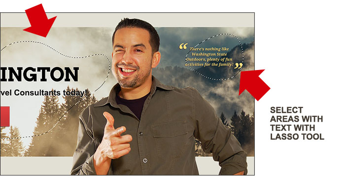
So as soon as you decide where text goes, let’s blur those spots in the background. Select with the Lasso tool – with a feather of 20%.
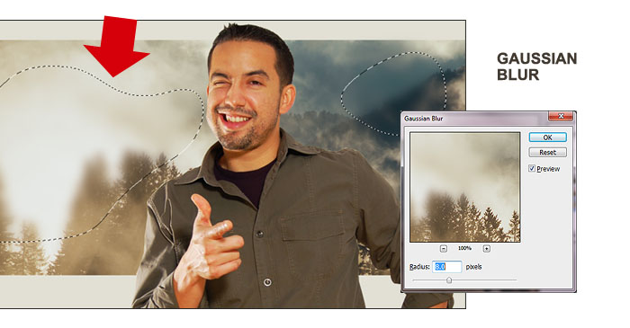
I like the “Gaussian Blur” because you can adjust the density of the effect. Feel free to try out the other blur effects. Note that blurring the background gives the text that overlays on top of it a bit more “importance” in visual hierarchy.
Finally, squint your eyes with the text overlay and call to action in place. Ask yourself these questions? Does the image feel “balanced”. Can you read the text clearly? Does the call to action button stand out enough? How about the colors – do they compliment each other? Contrast? Do they work well with the entire page?
Other Considerations
I mentioned that text is ideally handled through code. This is good practice when it comes to SEO. However, some text effects may not be handled as well in code than through an image. So this is one thing you need to consider more important.
Lastly, in today’s responsive world. Your hero image needs to render properly in different devices. This is definitely something to think about. Not only does the text need to move around (it might end up directly on top of the subject), but the subject itself will need to be handled accordingly. So responsive hero images is a topic that we’ll have to revisit.
So take a look at our final product – on an actual web page.

Again, this banner is completely fictional. We just picked a random website and slapped our hero image on top. I think it works well and does the job. I sure would love to click that big red button!
If you like this tutorial, kindly let us know in the comments below:


hi,
Really needfull for me article….
easy to change background
Thanks! I guess I was living under a rock, because I had to Google “hero image” and that’s how I found you. Nice work! And I appreciate the explanation, too. 🙂 But don’t you think that guy would have been easier to mask using channels?
Using channels may be a better way to go Leha. Could’ve saved me a ton of work. Thanks.
Great! Thanks
What should the dimensions be for a full screen hero be?
I believe the ideal width is still 1920 pixels.
Nice blog.
Thanks for sharing
grest blog.
Thanks for sharing such a fabulous info