There’s no real correct way on how a sidebar should look. But since the dawn of HTML, we’ve seen sidebars that span vertically in the left, right – twin column, triple column – heck – I’ve even seen them in the middle! (I guess that wouldn’t be a sidebar then would it?). Nonetheless, the sidebar to me is one of the more exciting components of a website. Furthermore, WordPress has given us the ability to “widgetize” our sidebars – which to a surprise, is very easy to style.
Note that you can “widgetize” almost any of your template files, but for the sake of this article, we will take a look at just the more common, single sidebar.
First of all – What are Widgets?
According to Automattic (the company behind WordPress), “they’re just things you can use to personalize your WordPress site without knowing HTML”. To elaborate further, widgets are like a fast way to plug in bits of code into your sidebar. Widgets are accessed via the admin panel, under “Appearance” > “Widgets”. Common widgets are Calendar, Meta, Recent Posts, the Tag Cloud and Text. Widgets are not to be confused with “plugins”. Although there are some plugins that become available as “Widgets” once you install them.
Why use Widgets?
For theme developers – it is almost a necessity for your theme to be widgetized. This means that you have to tailor your theme to non-savvy users to be able to customize your theme to use these small snippets of code without writing a bit of HMTL. It is a way to cater to their needs as well as expand and utilize the full capability of WordPress. Check out the screenshot below of the Widgets section from the admin panel:
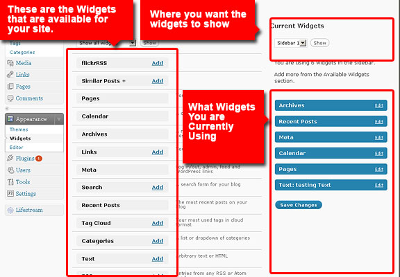
Now consider the user of your theme doesn’t know any web development – doesn’t this functionality come in very handy? This is why widgetizing your themes is always a good idea.
Styling Your Widgetized Sidebar
The Container Approach:
I’m sure you’ve seen this kind of sidebar. It’s one where widgets are compartmentalized or “boxed”. May it be sharp squares, faded edges or even rounded corners – the container approach is definitely one of the more popular sidebar styles around. Take a look at a typical container for a widget:
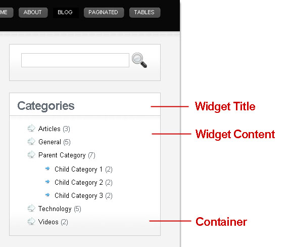
As you can see, the entire container can be drawn up by just one DIV. This is what the “before_widget” and “after_widget” name-value pairs are for in your functions.php:
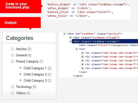
Note that declaring a “sidebar-column” div for the widget container – you are now able to style unordered list items, as well as their child elements. As with my example, I’ve designated bigger icons for the parent list-style property, and a smaller arrow button for the children.
Below are a couple of good example websites that use the container approach for their sidebars:

http://www.gomediazine.com
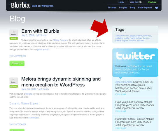
http://www.blurbia.com/blog
The Continuous Column Approach:
This approach preserves the notion of a sidebar being – just a real bar. May it be in the right side or the left, the continuous column sidebar remains classic, simple and if done right – timeless.
Take a look at the simplicity of this style:
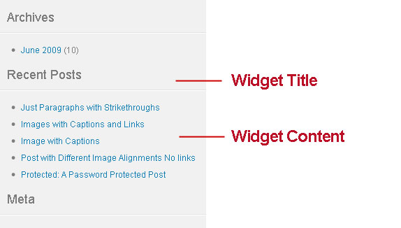
In this case, all I really styled is the headings of each widget. This is what the function.php’s “before_title” and “after_title” comes in handy. I used a regular H3 tag, assigning just the right font style, sufficient padding and a tiny bottom-border image – and it’s ready to go.
As mentioned, the continuous column approach gives your sidebar that “clean” look. It is used by many news and magazine style blogs in the conservative end. Two popular websites that employ the continuous column approach are:
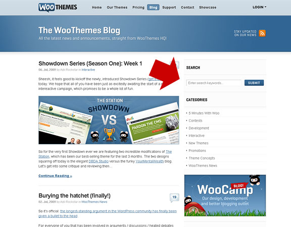
http://www.woothemes.com/blog/
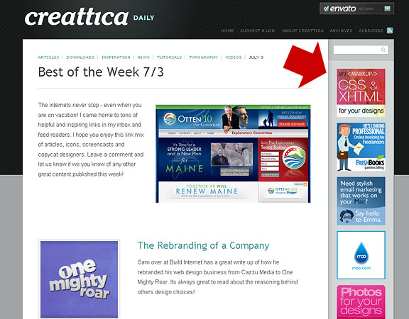
http://daily.creattica.com/
Anything Goes:
Anything goes is exactly what it implies. It is very random, no compartments, borders or even visible patterns. Although it is still a column, there is no definite distinction where widgets start or end. Note that this can only be achieved by combining the “fewest similar” widgets, along with static elements. By “fewest similar” I mean widgets that are visually different from one another. For example: “Recent Posts”, “Archives” and “Categories” widgets are all rendered as lists.
Remember – you can play with static elements and combine them with the more dynamic widgets, to give your sidebar a more arbitrary look:
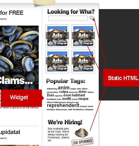
Take a look at these websites that have an “anything goes” style sidebar:
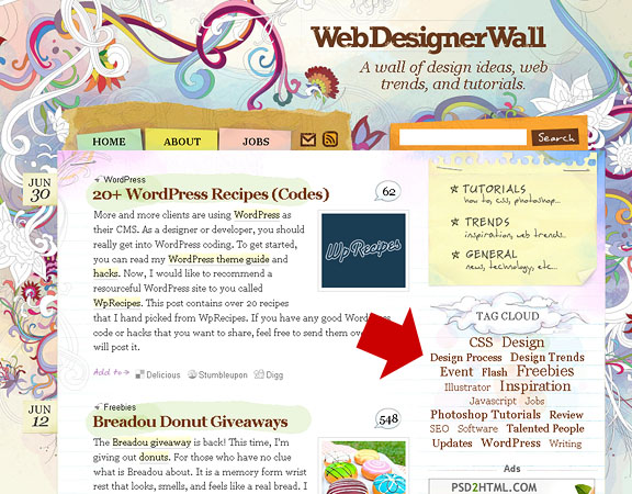
http://www.webdesignerwall.com/
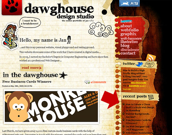
http://www.dawghousedesignstudio.com/
What about you? What’s your take on styling sidebars and widgets?

Good widget learning 🙂
Good article, Michael. Thanks for writing it.
I have seen a site that made the widget title an active link, but have not found an answer. Do you know how to do this?
Thanks.
that would be tricky. it would have to be coded into the widget itself, i don’t think it can be done in the theme layer.
OK. I’ll have to see if I can come up with something. I’ve tried some coding, but nothing has worked yet.
Thanks for your reply.
Is there a way to combine a customized sidebar + widgetized sidebar? Thanks! Nice tutorial. I wish to edit my site http://kalokohan.com to have this type of setup.
Of course – the trick is to embed the widgets section from within your custom content. if you need to alternate custom and widgets – just register another widget area in a new .php file. then include it in the sidebar.