Grid based web design is becoming an art that each web developer must master. News portals, magazine layouts as well as showcase websites all adhere to the intricacies of the grid – which when mastered, is definitely a good addition to your web skill arsenal.
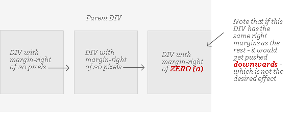
We all know that a typical grid design uses some kind of block containers to house content. This block container may be DIV or list that span a couple, three or four times across inside a parent DIV. Now with CSS – we simply apply the proper left or right margins to all the containers except the last one in the pattern:

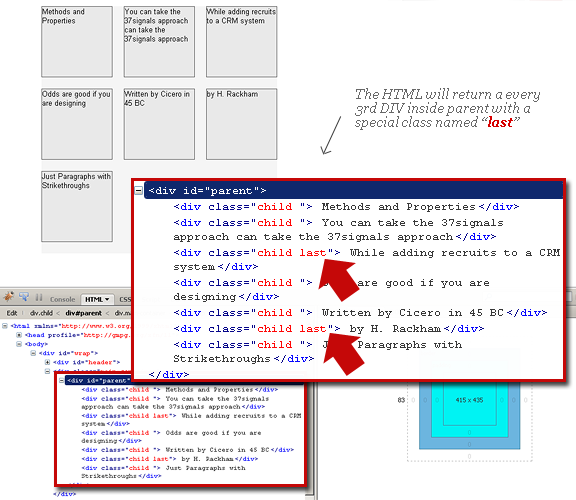
The result is the children containers line up perfectly inside the parent DIV. To achieve this effect we apply the same class to all the children DIVs, and append a unique class to the last one like below:
HTML
CSS
The Challenge:
Since content inside these containers are typically coded using a form of recursive technique such as “the Loop” in Wordress; how are we to designate that unique class to that second, third or fourth child DIV?
For instance, if we were to house our posts inside one of these children DIVs, the PHP would look something like below:
This block of code inside the parent DIV will just keep repeating for all posts with the same “child” class. We need to a way to select just the second, third or fourth child to not have that extra margin.
The Trick
A not so popular arithmetic operator known as the modulus – represented by a (%) symbol is what we’ll use to do the trick. The modulus operator is the same as division – but returns the remainder instead. Since we’re only targeting every “nth” div or child item, all we need to create is a pattern that has a multiple of some value in order to apply our special class. Take a look at the code below:
First we create a variable $r_count and initialize its value at 1 right before the loop starts. Right after the call for the posts, we add a conditional statement with the modulus operator for 3 is equal to 0 (since we want every 3rd element to have that unique “last” class), everything else returns empty. Lastly, we increment $r_count by one.
In our HTML, we call the regular “child” class, then we echo our special $r_class. The end result will be an alternating call of styles depending on what we define for our modulus operator:

Of course – depending on the number of columns you would like to display – all you have to do is change the modulus operand and you should get the same effect.


I really appreciate the effort you have put in to bring in this article. Very well put in.
Great article. Thanks for sharing.
Awesome post. I was looking for a way to do a grid pattern for a client’s wp blog but was stuck at the php part.
Really helped!
Very creative!!
You can also set the overflow of the element containing “parent” to overflow:hidden.
Then increase the width of “parent” to accommodate the right margin on the last element.
The excess width of ‘parent’ will be hidden by the overflow property assigned to the element containing ‘parent’.
Hope that makes sense…
thanks!
it really helps..
im using this php snippet in my blog template right now..
Nice technique, but does this only work for fixed width DIV’s or can they be percentages?
Thanks.
@Barton – never tried it with percentages
Very useful snippet. Thanks!
Please help me !! The actual site on which I am working – http://www.rexnordindia.in is under construction, so I m providing you the link of my another site – http://latestpricelistindia.in/wp-content/uploads/2011/11/Sample.jpg I want the content alignment as shown in the link. I have tried P-tag but no avail. Help me !!!!
Its really useful and thanks for sharing this.
Team S plus H
Very interesting details you have remarked, regards for posting.