When you think of User Experience (UX), what comes to mind? Most likely, it’s the visible elements within an application window – what you can see, click, or swipe. But there’s a crucial aspect of UX that often goes unnoticed: the URL in your address bar. Far from being a mere technicality, the URL is an extension of your application and, arguably, its most important part.
While we’re all familiar with the SEO benefits of a well-structured URL, this article focuses on something different: the user experience. A thoughtfully designed URL structure can provide users with a sense of cohesiveness, demonstrating that your application is well-organized and carefully considered.
And here’s the kicker: even if SEO isn’t a priority for your web application, you’re not off the hook. Good URL design is for everyone, because it directly impacts how users interact with and perceive your site.
As Richard Branson aptly put it, “When making experiences, attention to detail matters.”
Anatomy of a URL
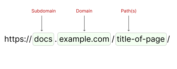
Before we dive into best practices, let’s break down the components of a URL:

While the “https://” protocol is pretty much a given these days, every other part of the URL deserves your attention. Even if you only have control over the path and beyond, understanding the entire structure will help you make better design decisions.
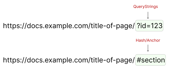
Don’t forget about the optional elements:

Towards the end, you might see a question mark (?) or a hash (#) and some characters after it. We’ll talk about these as well.
But first, lets look at the Golden Rules:
The Golden Rules of UX-Friendly URLs
When crafting URLs, keep these three cardinal rules in mind:
- Brevity is key: Shorter URLs are easier to remember, share, and type.
- Readability matters: If a human can’t easily understand your URL, it’s time to rethink it.
- Make it meaningful: Each element should convey purpose and context.
These rules aren’t set in stone, but they provide a solid foundation for creating user-friendly URLs.
Let’s explore how to apply them.
Mastering the Domain Game
Your domain is your digital real estate – make it count. For our examples, we’ll use the fictional company “Acme”:

Other options:
- acme.net
- acme.io
- acme.app
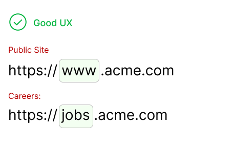
Notice how these domains are short, readable, and meaningful. With the proliferation of top-level domains, you have more flexibility than ever to create a memorable web address. In addition, with the wider array of available TLD’s (the .com or .net part of the domain) – you can make use of this as part of how you structure your organization. For example, “.com” will be for your public website, “.app” will be the “application” side. Otherwise, we can use subdomains:
The Subdomain Dilemma
While subdomains can break the brevity rule, they’re almost always necessary. Subdomains are also good since you only maintain one main domain. Still, use them judiciously for distinct sections of your site.

Remember: one subdomain level is usually sufficient. Anything deeper risks confusion and violates our first two rules.

In addition, having too many “.” (dots) is just annoying – agree?
SaaS URL Strategies
For SaaS products, consider offering “vanity” URLs that combine your main domain with a subdomain:
Good examples:
- acme.workday.com
- acme.salesforce.com
Avoid confusing structures like:
- na111.salesforce.com
- emea.online.salesforce.com
The goal is to create URLs that users can easily type and understand at a glance.
Perfecting the Path
The path is where you have the most control over your URL structure. Here are some best practices to keep in mind:
- Use hyphens as separators:
/user-profileis more readable than/user_profileor/userProfile. - Create logical hierarchies:
/products/electronics/smartphonestells a clear story. - Stick to lowercase:
/blog/latest-postsis less error-prone than/Blog/Latest-Posts. - Eliminate unnecessary words:
/aboutis cleaner than/about-us. - Use nouns for resources:
/users/123is more RESTful than/get-user/123.
Slash, Hash, or Query: Choosing Your Weapon
Each URL component has its purpose:
- Slashes (/): Perfect for hierarchical structure and main navigation.
- Hashes (#): Ideal for anchors within a page or client-side routing in SPAs.
- Query parameters (?): Best for optional or variable parameters.
Choose wisely based on your application’s architecture and the nature of the information you’re conveying.
Navigating the Browser Landscape
Good URL design supports intuitive browser navigation. Users should be able to use back and forward buttons effectively and understand their location within your site’s hierarchy just by glancing at the URL.
For Single Page Applications (SPAs), this means implementing proper routing and history management. Tools like React Router or Vue Router can help maintain a navigable history stack, even with dynamically loaded content.
The Art of Bookmarkability
One often overlooked aspect of URL design is bookmarkability. Users should be able to bookmark any page on your site and return to the exact same state later. This means:
- Avoiding session-specific information in URLs
- Using proper routing in SPAs to capture the application state
- Ensuring dynamically loaded content has a corresponding URL state
Conclusion: Small Details, Big Impact
While it’s easy to overlook URLs in the grand scheme of UX design, they play a crucial role in creating a cohesive, intuitive, and user-friendly web experience. By applying these principles and paying attention to the details of your URL structure, you’ll create a stronger, more navigable, and more professional web presence.
Remember, your URL is often the first point of interaction between your user and your application – make it count! Your users may not consciously notice good URL design, but they’ll certainly appreciate the improved usability it brings. In the world of UX, sometimes the smallest details make the biggest difference.


How can well-designed URLs improve user trust and navigation experience?