I was tasked with creating a custom component for our public website which runs on WordPress. Most commonly known as an “Accordion“, it is a section of a page where you can have a title and an expandable and collapsible directly underneath it. Usually a list of these items are blocked together – forming an “accordion” like pattern.
In HTML, this is easily achieved by the “Details” element. But of course, our users cannot write HTML. Similarly, a default block already exists in WordPress called “details“. The problem with this one is that our users do not find it intuitive. Also, they want to limit the formatting of the contents for each item.
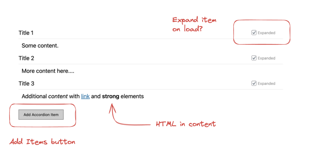
You see how each item is contained within a big block. A button will add a title/content pair to the list – along with a checkbox that allows for the section to be expanded or collapsed by default.
Register the Block
This is the “housekeeping” part of the codebase. There is a PHP part of this process – and it really depends if you’re putting this in a plugin or a theme. But main function is below:
register_block_type(
    'namepsace/my-blocks-accordion',  // Block name with namespace
    [
        'style' => 'accordion-style',
        'editor_style' => 'accordion-edit-style',
        'editor_script' => 'accordion-js'
    ]
);
...
Also, there are other parts of this such as enqueuing the styles and scripts for your blocks – which I’m not going to cover here. We’re mostly focusing on the “client” or JS side of things.
To read more about registering blocks in WordPress – see the codex.
For the JavaScript, create a file called index.js and start with the registerBlockType() function. If you’re not familiar with how to build blocks for WP – this is a good start Anatomy of a Block | Block Editor Handbook | WordPress Developer Resources.
registerBlockType(
    'namespace/accordion', {
      title: __('Accordion'),
      icon: 'list-view',
      category: 'my-blocks',
      attributes : {
        items : {
         type: 'array',
         default : []
     }
    ...
}
Pay extra attention to the “attributes” object. This is the main “context” of our application. Notice that we want an array called “items” inside attributes – this is where we’ll manage our data.
The “Edit” Component
So in Gutenberg Blocks, the two major components that we have to worry about is the “Edit” and “Save”. Edit is what you see during the editing of Posts or Pages. Let’s look at how to build this first – particularly the JSX section:
const { RichText } = wp.editor;
const { __ } = wp.i18n;

...

title: __('Accordion'),
icon: 'list-view',
category: 'my-blocks',
attributes : {
   items : {
     type: 'array',
     default : []
   }
},
edit ( {className, attributes, setAttributes} ) {

...

return (
<div>
{attributes.items && attributes.items.length > 0 ? attributes.items.map((item,i) => {
return (
<div>
    <div className={`${className}-item-title-wrap`}>
    <RichText
        allowedFormats={[]}
        tagName="div"
        placeholder="Enter Title"
        className={ `${className}-item-title` }
        value={ item.title }
        disableLineBreaks={ true }
        onChange={ val => updateItemTitle(val,i)}
    />
    <label>
    <input type="checkbox" data-index={i}
        checked={item.expand}
        onChange={e=>updateItemExpand(e)} />
        Expanded
    </label>
    </div>
    <RichText
        placeholder="Enter Content"
        allowedFormats={ ['core/bold','core/italic','core/link'] }
        multiline="p"
        tagName="div"
        className={ `${className}-item-content` }
        value={item.content}
        onChange={ val => updateItemContent(val,i)}
    />
</div>
)
}) : null}
<button
    className={ `${className}-add-btn` }
    onClick={addEmptyItem}>Add Accordion Item</button>
</div>
);

} //END EDIT
The HTML above is the UI for our editors. Notice that we’re going through out “items” and outputting it for action. We’re using the built-in RichText component for our editable sections (title and content). RichText is awesome – find out more about it. We’re also including a checkbox called expanded – that will allow our users to show the item expanded or collapsed.
Adding Items
When first using the block – all you see is a button that says “Add Accordion Item“. Clicking this button will execute below:
const addEmptyItem = () => {
    const items = [...attributes.items, {
      title : '',
      content : '',
      expand : true
    }];
   setAttributes({items})
}
This will add an empty object to our Attributes Items array, allowing our users to be able to edit our RichText components.
Click and Change Handlers
If you look in our JSX, we’ve mapped our inputs to event handlers. Add the code below”
const updateItemExpand= (e) => {
    const items = attributes.items.slice();
    const index = e.target.attributes.getNamedItem('data-index').value;
    items[index].expand = e.target.checked;
    setAttributes({items})
}
const updateItemTitle = (title,i) => {
    const items = attributes.items.slice();
    items[i].title = title;
    setAttributes({items})
}
const updateItemContent = (content,i) => {
    const items = attributes.items.slice();
    items[i].content = content;
    setAttributes({items})
}
The function names are pretty self explanatory. All we’re doing is manipulating the data in our Attributes. Also notice the setAttributes() function we’re using in each function. This is a “setter” that is very similar to React’s useState setters.
With all that in place, our Accordion block is ready for editing:
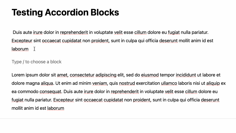
Typing “/accordion” will insert our block – ready for editing.
The “Save” Component
This is simply JSX that outputs our HTML for the public users. The code for this is quite simple – we’re simply using “details” and “summary“. This automatically has the expand and collapse functionality out of the box.
save( { attributes } ) {
    return (
        <div>
        {attributes.items && attributes.items.length > 0 ? (
            attributes.items.map(item => {
                return (
                    <details open={item.expand}>
                    <summary>{item.title}</summary>
                    <div dangerouslySetInnerHTML={
                       {__html: item.content}
                    } />
                    </details>
                )
            })
        ) : null}
        </div>
        )
    }
}
Notice the use of dangerouslySetInnerHTML – because we’re outputting HTML content from WordPress. If this can be done in other ways leave a comment below.
Styling the output with some CSS:
.wp-block-my-blocks-accordion {
    margin-bottom: 25px;
}

.wp-block-my-blocks-accordion details > summary {
    background:url('/images/arrow-down.png') no-repeat;
    background-size: 13px;
    background-position-x: right;
    background-position-y: 10px;
    font-weight: 500;
    border-bottom:1px solid #ebebeb;
    margin-bottom: 10px;
    padding-bottom: 6px;
    cursor:pointer;
}
.wp-block-my-blocks-accordion details[open] > summary {
    background:url('images/arrow-up.png') no-repeat;
    background-size: 13px;
    background-position-x: right;
    background-position-y: 10px;
}
.wp-block-my-blocks-accordion details > summary:hover {
    opacity: 0.6;
}
.wp-block-my-blocks-accordion details > summary > * {
    display: inline;
}
We’re simply overriding the default look of the details component – specifically the arrows. I prefer to see them in the right instead of left. Also, adding a subtle border to make it look better.
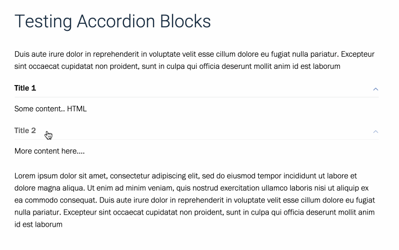
And with that in place – it should look like below when the post is saved:
There you have it. We’ve just made our own custom Gutenberg block. This was pretty fun to build – and learning about the Block API is quite straightforward. It’s very much like classic React – but simpler.
Be sure to leave your thoughts below.

Nice Article Enjoyed Reading It Great Work I like your high-quality blog site design plus your posting abilities.