Having a subscribe bar is almost a necessity for modern websites. This organizes your reader’s options on how to stay informed of your updates and new posts. May it be through Twitter, RSS, Email or even Facebook – you can display this bar in almost any part of your web pages.
![]()
The following will teach you how to create a subscribe bar from scratch using Photoshop and a CSS technique known as sprites.
View Demo
Part 1 – Creating the Image
In Photoshop, create a new image 432 pixels by 78 pixels. Add a title for your bar, and four icons of your subscription options. In our case, we’re using an RSS feed icon, Twitter, Email and Facebook. *Icons are from WeFunction Collection. Line them up and space them evenly.
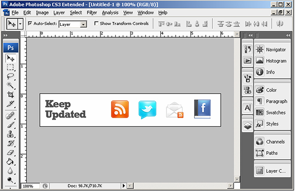
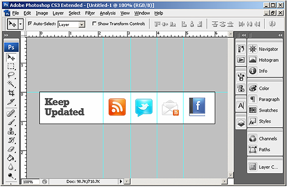
Add guides that divide each button. Also be sure to add a guide right on the top of the document. Lock the guides in place – you will need these dimensions when creating the CSS.
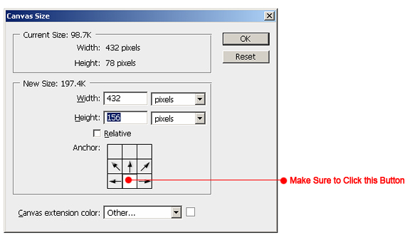
Multiply the canvas height by two. Make sure you click the button that keeps the canvas flushed to the bottom
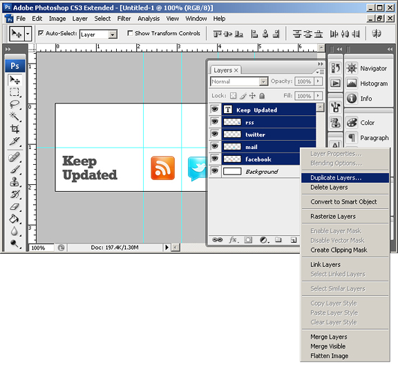
Select all existing layers and create a duplicate set. Merge all the layers in that set to create a single layer which we’ll use for the hover effect of the links.
Nudge the new layer upwards – make sure it’s lined up exactly as the bottom layers. To create a hover effect – I desaturate the layer all the way to the max – making it a grayscale layer.
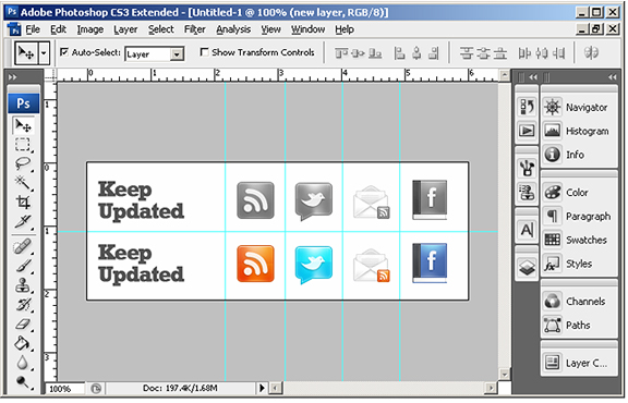
Make sure you hide the background layer and save the image as a .png.
Part 2 – The HTML
We’re going to need a single div and an unordered list of links to render the sprites. Make sure to add an id for each anchor tag. This is how we’ll match the image through our stylesheet.
Of course you have to replace the # with your links. Note that the first list item is not a link. This is just a placeholder for the title “Keep Updated” title.
Part 3 – The CSS
The first selector (#subscribe-div) can contain general properties of your bar. This includes overall padding, margins or positioning. The second selector (#subscribe-div ul#subsc li) – lets the browser know to display list items horizontally. The third (#subscribe-div ul#subsc li a) – calls our .png image.
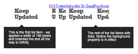
This styles our list item bar-title with the “Keep Updated” leftmost section of our .png image – hence the position of 0 0 (means coordinates of 0 and 0). Next is styling the normal state of the links:
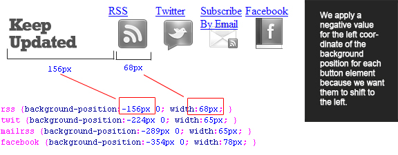
The above code reflects the normal state of the buttons in our list. The only properties applied are width and background position. To get the width of each button, you have to go back to your .psd (remember applying the guides in the beginning of the tutorial). Note that not all the buttons are identical in size, thus varying in widths. To get the background position, always remember: the first value is the left coordinate and the next value is top. Since we already know that our title is 156 pixels, we know our first button (rss) is going to have a background position of -156px.
Next is the hover state.
Notice I just copied the code for the normal state and re-pasted it. The only difference is the use of anchor pseudo class :hover is appended to the “a” selector, and the top value of background position is now 78 pixels. This is because we want the .png image to shift 78 pixels downward, once the mouse is hovered over each link.
The only thing left to do is to indent the text of the links. This is done in the #subscribe-div ul#subsc li a selector (text-indent:-9999px;).
And that’s it. We have finished creating a subscribe bar from an image in Photoshop, HTML and finally adding some styles with CSS. You can download the source code from here.


This really very helpful…will try on my blog
I do want to learn these things, and waiting more tut on wordpress
I really liked your tutorial. I’m still a newby to the coding side of things, though I’ve done a few websites already. I like the simple way you displayed and explained everything. Great website, too!
This is great! Check my blog to see what I did with it. I used the social coffee cup icons from Smashing Magazine.
Thanks so much for this!
The coffee cups looks amazing. Also – using sprites is speedier than multiple images. Good job!
I applied it to my personal website http://www.estebancampos.co.nr and it works perfectly on: Internet Explorer, Mozilla Firefox, Opera, Google Chrome and Safari. But it leaves a not good looking blue line on Netscape. Any suggestions?
Thanks for this great tutorial. It’s very well laid out and the pictures are very helpful as well.
I’m definitely going to work some of this into my own site.
Look forward to seeing more tutorials!
I am looking for a way to customize my email subscribe form…this is for customization of feeds etc but this surely help me …
I am learning while building and still do not have all the proper tools at my disposal. Is there a way to do this without using Adobe?
try gimp – its like photoshop – but free.