Horizon – Landing Page for Non-profits
Creating an engaging and effective landing page for a nonprofit organization is crucial in attracting donors, volunteers, and supporters. This design is called Horizon and its purpose is to be the digital fron door to your mission.
Meant for non-profits organizations – but can be modified to suit any type of website. Here are a few reasons that make Horizon the ideal starting point for your next design venture:
Visuals, CTAs, Stats and Messaging
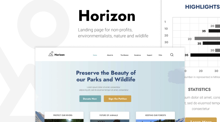
The first impression matters immensely. The use of large background imagery that spans the entire page creates a high-quality impression that resonate with the cause. Visuals tell a story. In our case, we’re showcasing a lake and forest – since the cause is related to just that: “saving the environment“.
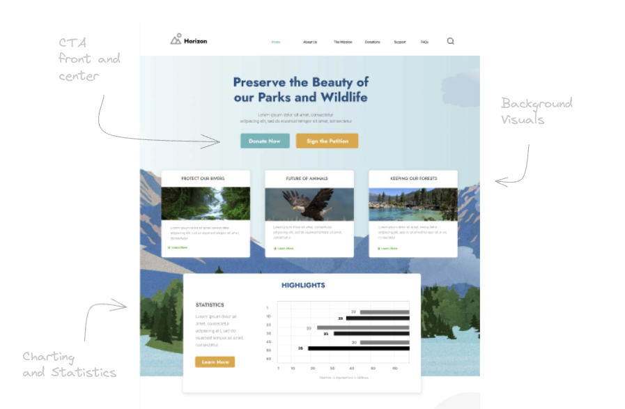
Clear and concise messaging is front and center – along with the Call to Action buttons. A brief paragraph that explains what the nonprofit does, why it matters, and how visitors can get involved. In this case, two large buttons letting users know what the next steps are.
The tree large boxes also highlight the non-profit’s achievement. The highlights section below contains charts and numbers that amplifies the message even more. This strategy of showing “Trust Signals” has proven effective for it shows users that the cause is working.
Latest news, Social Signals and Responsive Design
The area below the fold includes a list of News Articles. This keeps visitors of the website updated of the latest events about the organization including case studies. Quotes, videos, and recognitions are also particularly powerful and can be embedded in this section.
You will also notice the site logo layered into the background. This is completely optional, but can add to the overall effect of the design.
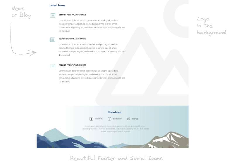
The footer area display trust badges, certification logos, and links to social media. Visitors are more likely to support organizations that are visible in other platforms and networks. This also allows for better marketing – reaching potential donors.
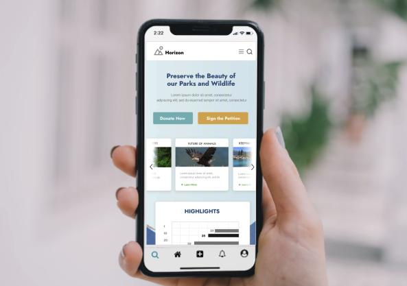
Horizon includes a frame for mobile. An effective landing page is almost always mobile-friendly. With a significant amount of web traffic coming from mobile devices, a responsive design that adjusts seamlessly to different screen sizes is essential. This enhances user experience and keeps visitors engaged, regardless of how they access the site.
Figma File Specifics
The Figma download is designed to be easy to work with. Below are some of the features that allow you to take the template and start editing right away.
Grouped Layers
One thing you’ll notice is that the use of Groups and Layers. Similar to Photoshop and other graphic design tool – each element is grouped together according to the section they belong it. The group and layer names are in order and is named to be as descriptive as possible.
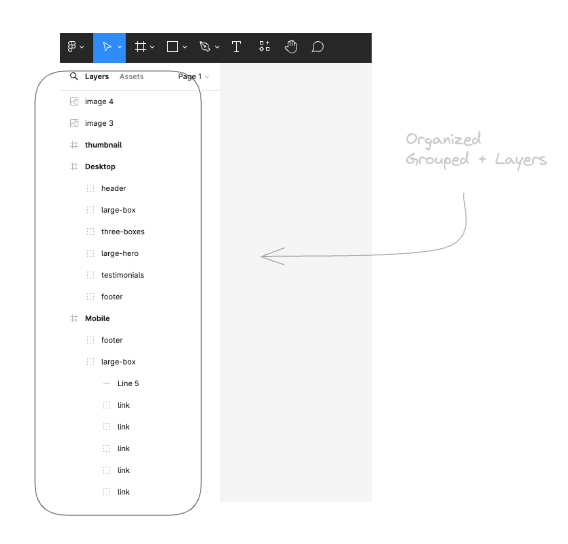
Frames are used per client viewport. This will be Desktop and Mobile – and in some cases Tablet. The thumbnail is also included in its own frame – in cases you want to include it as part of a presentation. Components are also utilized for reusable elements.
Grid Columns
To ensure that the elements conform to a grid system – all frames are equipped with a column grid. This acts as a guide so you don’t have to guess where the elements should line up. The layout grid settings can be accessed by clicking on the frame, and on the right you will see “Layout Grid“.
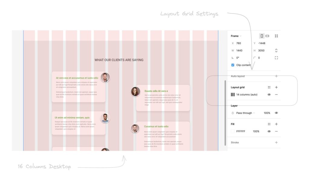
By default, desktop has a 16 column grid – which you can easily change. The opacity for the grid columns can also be adjusted – so you can get an obstructed view of the design.
Lastly, once you’ve signup – you will receive an email containing the download link. This is a .fig file that you can immediately import to Figma. Check out this post for more details on how that’s done.
Conclusion
A nonprofit’s landing page is a critical tool for engaging with supporters and furthering its mission. By focusing on compelling visuals, clear messaging, strong CTAs, and user-friendly design, nonprofits can create an effective online presence that drives action and fosters a deeper connection with their audience. Remember, the goal is to inform, engage, and inspire visitors to support the cause in meaningful ways. Download the Figma file today.