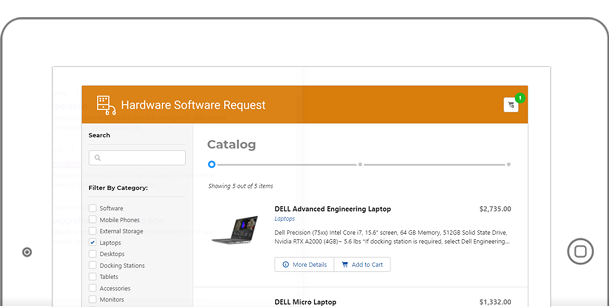
Every employee needs hardware. At Parsons, we needed an easy way for employees to order them. The old process was for each employee submit an online form, where they first they have to refer to a an approved list of items. When they find what they need from this list, they have to copy and paste the item code onto the form, then submit. This submission sends an email to the folks ordering the item, and they enter it manually to another system.
Yes – it was archaic.
The Hardware/Software Request system was created to replace this. My role was Lead Developer and UX engineer.
The diagram below describes how the system will work.
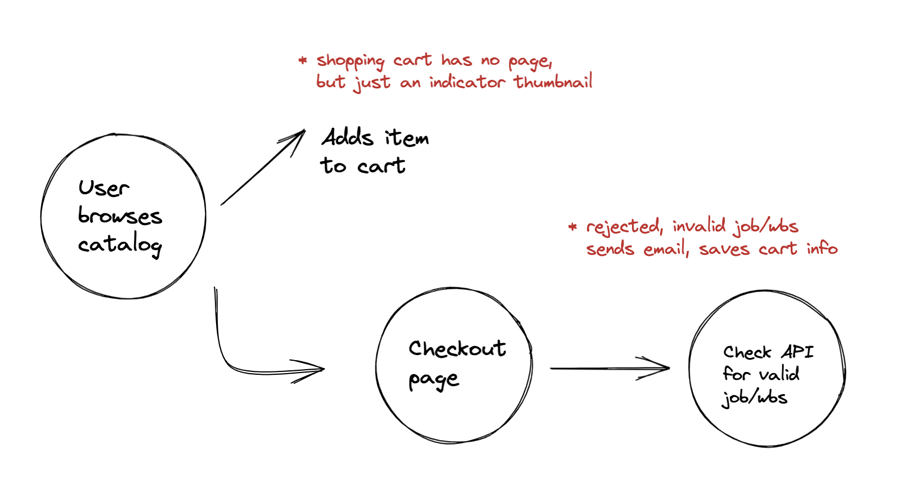
So we’re building a “Shopping Cart” system. Not a complicated one – just one that will work with our employees. So we didn’t need all the bells, nor the whistles of a full e-commerce site. The image below was taken from a series of wireframes done in Figma.
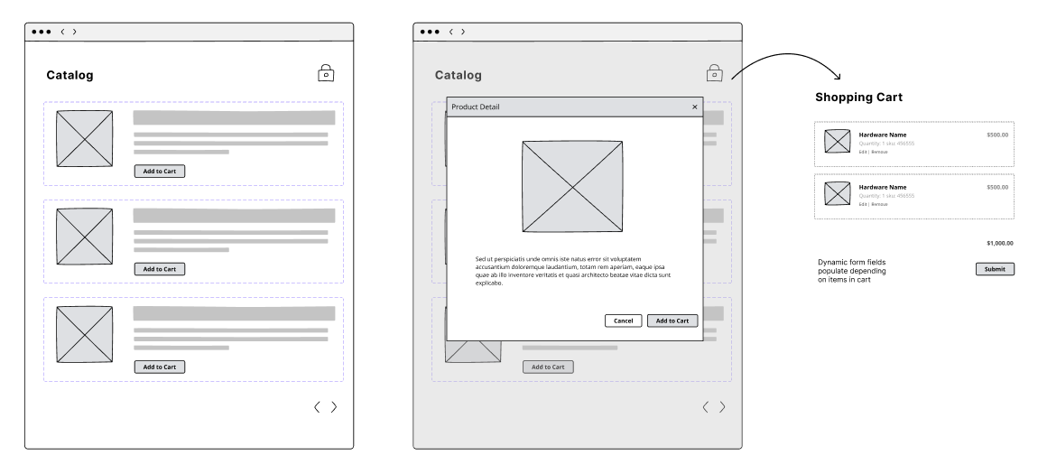
As you can see, the process is simple. Browse, add to cart and submit.
The Catalog
The design of the catalog is pretty straightforward. It will be two columns, with search and filters on the left, while the list of products in the main container.
I’ve also added small design elements such as a progress bar. This acts sort of like a “breadcrumb” – to let users become aware of the steps.
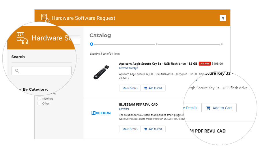
I’ve decided to bring the whole product dataset on load. This is against the regular pattern of grabbing small result sets at a time. But since I already know that there will never be a lot of products – I think it’s worth bringing the whole thing in.
The results are fast and snappy searches, filtering and paging.
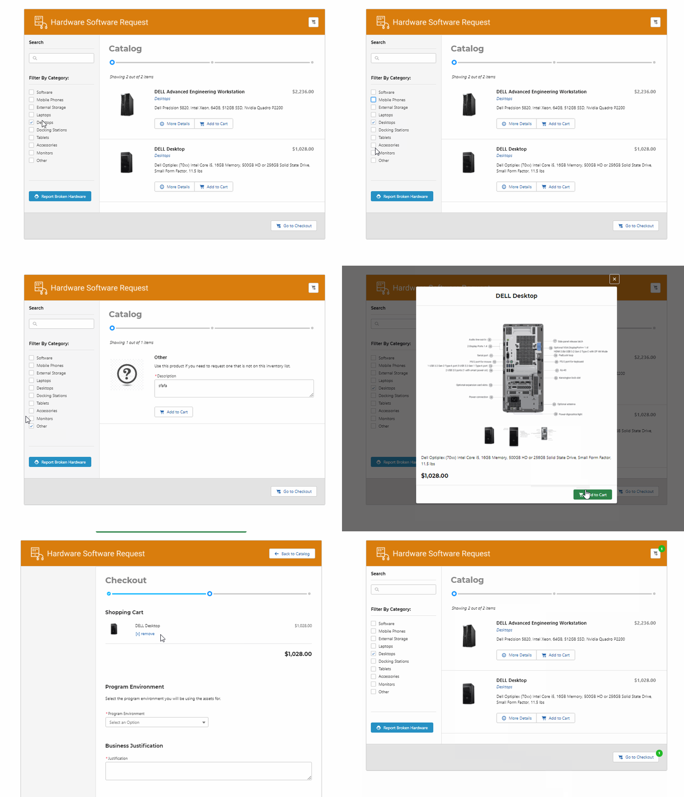
Details of the each product is also shown in a modal once clicked. This product detail has a mini carousel that shows the product images.
The Shopping Cart
Once the user goes to view the cart, the search and filters disappear and the progress bar advances to the next step. Directly below are the details necessary to complete the order. So its basically the shopping cart and checkout in one page.
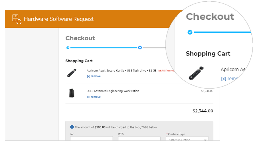
Just like a regular cart, users can update/remove the items in the cart. The price automatically adjusts accordingly.
There is no payment or credit card information necessary. We utilize “charge codes“, so the department pays for the order. The shipping address is pre-filled with the users information, but they also have a chance to change it.
Once the form submits, it writes to the tables, as well as another API is called to process the order.
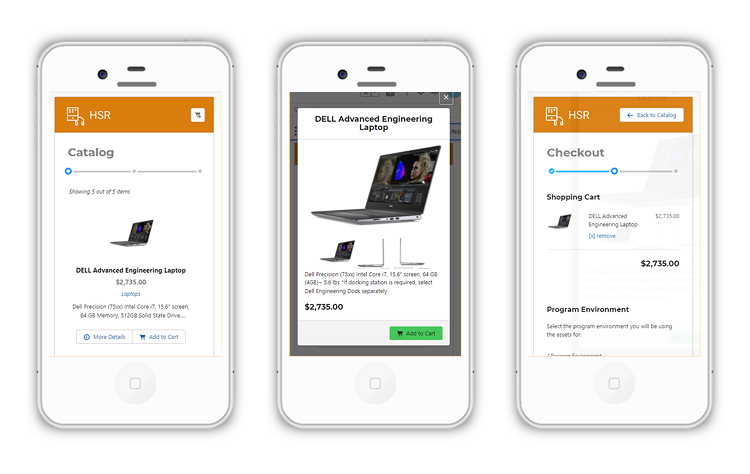
The screens above show how the software looks in a mobile phone. A lot of our users actually order through their phones.
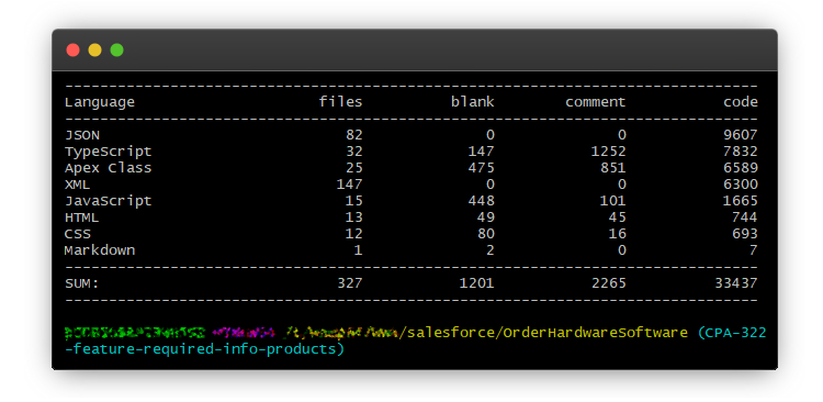
Finally, the image below shows a quick summary of the files and lines of code that make up the application.
The project was a big success. So successful that we’ve added the ability to order software to it as well. Users are thrilled that they can now order hardware easily – a big improvement from the old system.
