Understanding what this framework can do for your next responsive site
The idea of a grid system has been around since the 960.gs framework days. Web designers from all over the world began realizing the importance of pixel perfect alignment, gutter spacing and the rule of thirds. Gone are the days of grid-less web pages. And yes, things were great. Up until recently. Responsive web design was born.

The problem was 960.gs, along with older frameworks had static page widths. Since we are now designing for multiple screen sizes, web frameworks had to adapt quickly.
Enter Zurb Foundation. The first responsive framework that had web designers pee in their pants. Big sites such as Esquire UK, Up Magazine and The Next Web redesigned and we kept resizing our browsers in awe. We were simply amazed on how elements of the pages shifted gracefully. Horizontal scrollbars were a thing of the past and modern web design became – well, more modern.
Now we have the latest and the greatest Bootstrap 3. Despite their awesome documentation, my focus is to elaborate on just the heart of the framework – the grid system.
Let’s dive in and see what Bootstrap’s grid system is all about.
The Basic .col-xx-xx Classes
Bootstraps column classes are what makes up the individual columns of the grid. It’s main purpose is to align your components into – you guessed it, columns. They’re designed to have 3 sections:
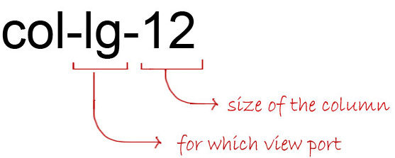
The prefix part “col” – just organizes all the col classes together, sort of like a namespace. And if you’ve worked with other frameworks in the past, the 3rd section “12” just tells us to occupy 12 columns out of the maximum 12. Pretty basic right?
But what about the 2nd part? In our example, it’s the “lg”. This tells the browser to primarily use this for large screens only (default is 1170 pixels and above). Meaning, since we can use multiple classes on any element, we can now design for multiple sizes of the screen. Pretty powerful eh?
So how does it do that?
So if you investigate the css, and look for that particular class (.col-lg-12), you will see that it’s enclosed in a media query:
@media (min-width: 1200px) {
.col-lg-12 {
    width: 100%;
  }
}
As a matter of fact, ALL of the “lg” classes are inside this media query. So the rule only applies to a specific screen resolution. The rest of the sizes (md for 970px, sm for 768px and xs for less than 768px) contains the rules for its respective classes. Pretty forward thinking right?
Show me an example of its usefulness:
A common scenario is a two-column layout, with content on the left and sidebar on the right. With just a single class applied to both areas: red div has a class of col-lg-9 and green div has col-lg-3.
But most of the time – your sidebar’s content is not ready for a full page width in medium and small view ports. So you wish the sidebar doesn’t snap to the bottom right away right?
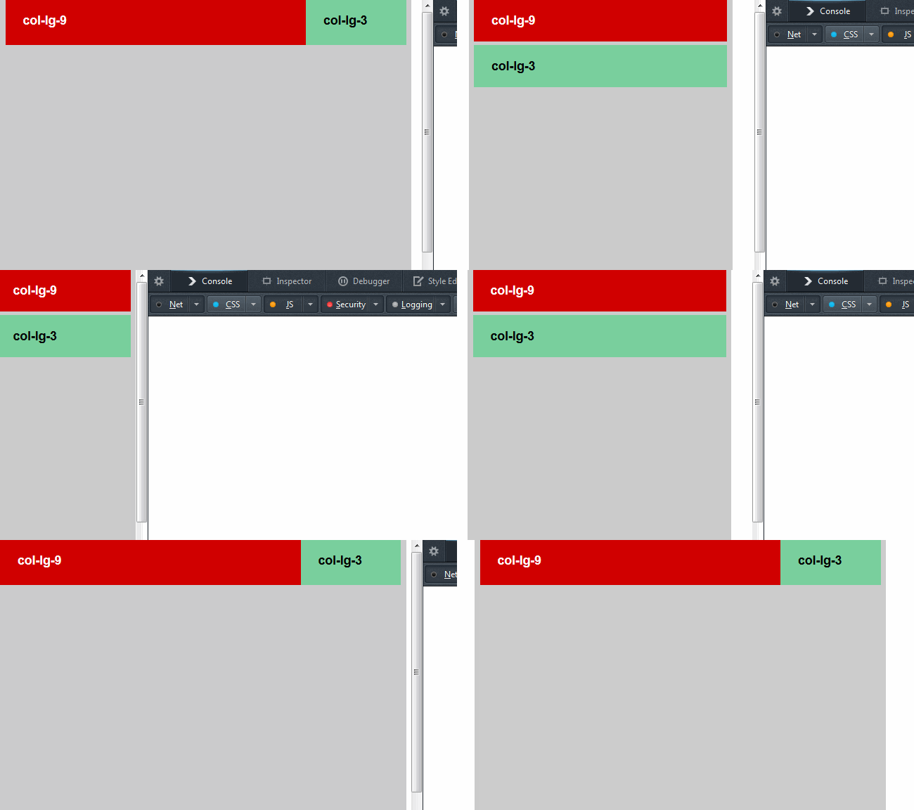
The solution: apply multiple .col classes into the same divs (one for each of the view port sizes). Take a look at the next example – where we apply a different column number ONLY on the extra small (.col-xs-12).
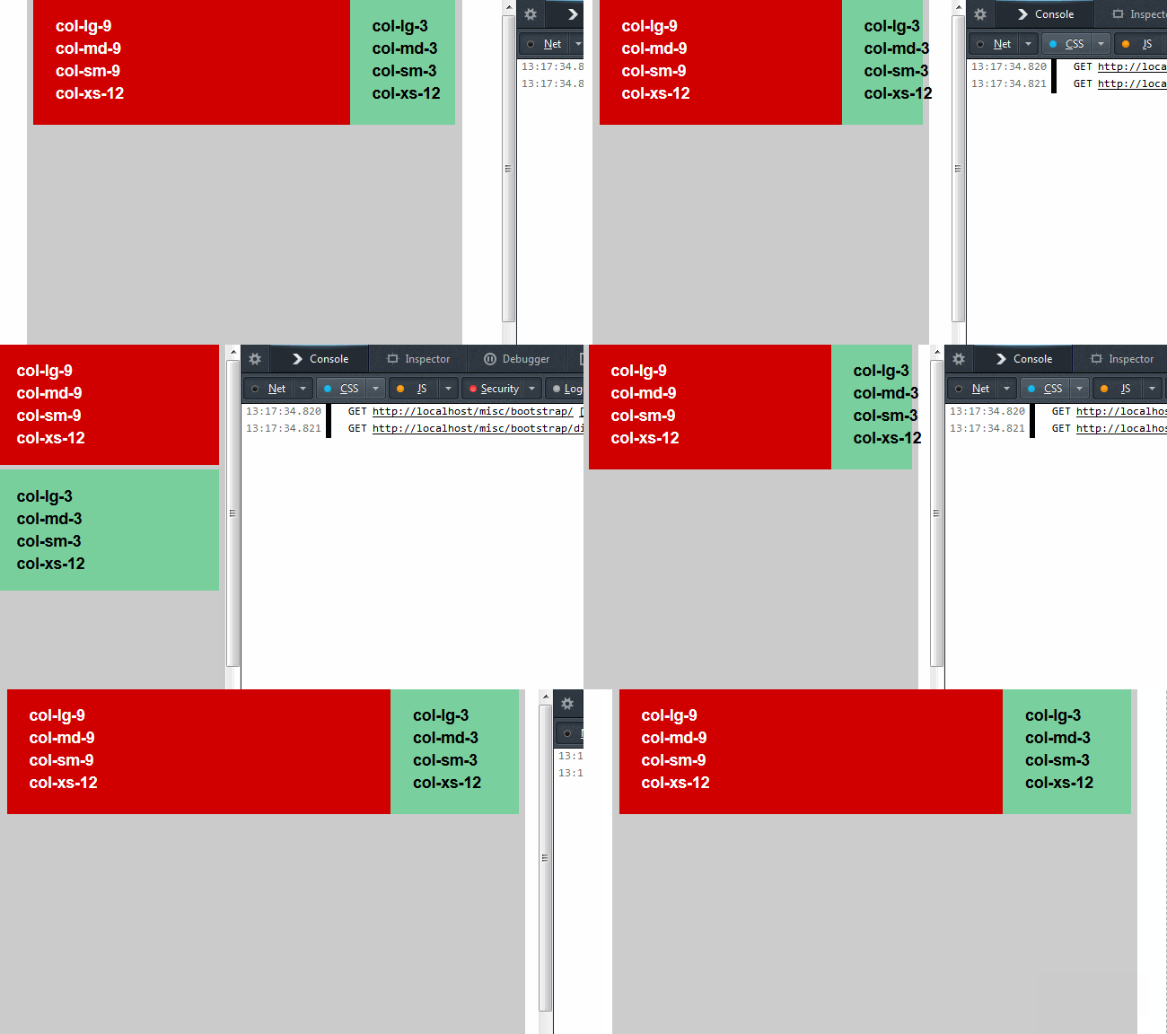
You see how the divs retained their 2 column layout all the way until the extra small view port is reached. Only then, did our sidebar snap to the bottom at full width. So you see how useful this is yet?
Classes “row” and “container”
Let’s jump out of the columns and look at the classes that wrap them. We have two important classes that do just that.
.row
Just as the word describes – a row is something that is on one horizontal layer. Similar to a “record” in a database, or a “row” in a table. In Bootstrap, if you want elements to be in one horizontal layer – use a class .row.
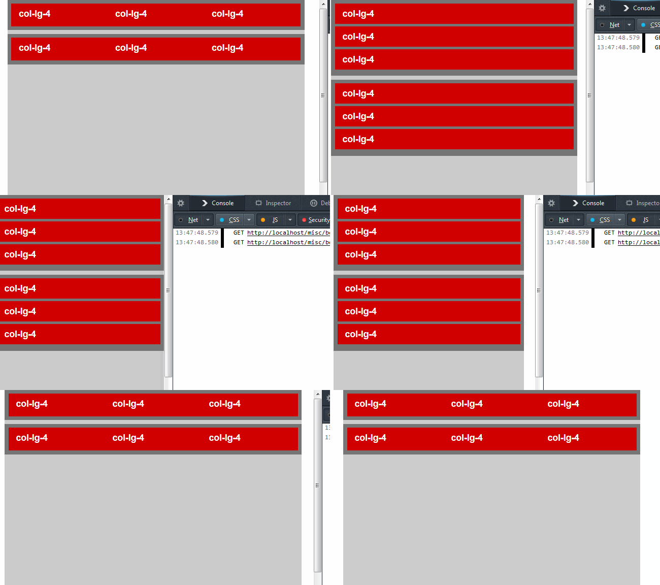
The dark grey divs both have a class “.row”. A row basically acts as a traditional div tag, but instead can be applied as a class. I’ve used class .row on a header or footer tag – and it works really well.
.container
Ideally, you add your HTML elements that need to be grouped together inside a class .container. The “max-width” properties for each break point (the media queries) are defined in this class. It is a very important class. One that is required to make things work the way they do.
According to Bootstrap’s docs, containers are:
Easily center a page’s contents by wrapping its contents in a .container. Containers set max-width at various media query breakpoints to match our grid system.
Containers also follow the default padding rule of 15 pixels on each side. So the contents are automatically flushed together with just the right amount of gutter space all the time.
How does Nesting work?
Nesting means adding more .col classes inside of existing .col classes. Most of the time, you would need to add a .row class first – before nesting your .col divs inside in order to see desired results.
So when do you need to nest?
All the time! If you inspect most HTML documents – it’s already a series of nested DOM elements so nesting your .col classes is already expected behavior. Although in Bootstrap, nesting will save you a lot of work calculating and deciding how wide a column has to be.
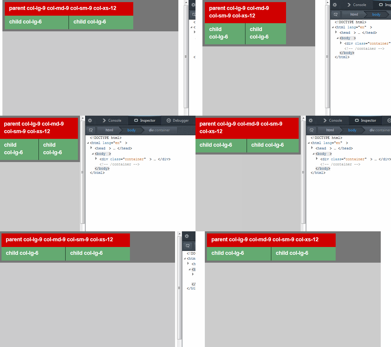
See both green divs have that have .col-lg-6 classes? These are nested inside the red div (the parent div). Also, notice that a nested .col-lg-6 class takes up 50% of the parent div’s width. In other words, all you really need to remember is the 12 grid rule – no matter how deep the nesting goes.
Note that I also applied the multiple classes technique (discussed above) to the child classes shown in the screenshot above. This is so that when resized, both div’s retain it’s 6 column width – until the last view port kicks in.
Pushing, Pulling and Offsetting
For even deeper customization of the grid elements, Bootstrap allows you to shift the columns around. Push and pull classes allow you to move the column # times to the left (also know as pull), or # times to the right (push).
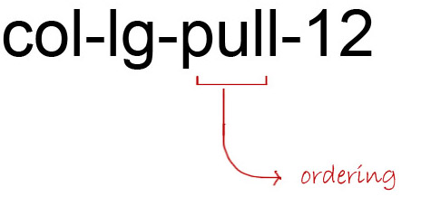
So consider the markup below. Even though the green div is written right above the red div, the push and pull classes allows us to order them as if they were otherwise.
green pushed 4
red pulled 4
The code above makes it so the divs appear in the browser in a different order.

What makes it work?
If you inspect the push and pull classes, it utilizes the right and left property respectively – in percents. Since everything in Bootstrap is positioned relatively, using left and right will automatically just work.
@media (min-width: 992px)
   .col-md-pull-4 {
      right: 33.33333333333333%;
   }
   .col-md-push-4 {
      left: 33.33333333333333%;
   }
}
Offsets
Offsetting classes is similar to push and pull classes – except for the “offset” keyword in the class name. Also similar to push and pull, the number in the class tells the browser how many columns to offset the element.
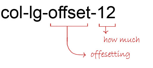
The difference with offsetting is that it uses the margin left property. So if your element is right next to another element – it will simply push itself against it by the designated percentage. See the code below for a .col-md-offset-4 class:
@media (min-width: 992px)
 .col-md-offset-4 {
    margin-left: 33.33333333333333%;
 }
You see how this can be useful? You can simply apply this class to whichever you want to offset and still retain the responsive margins effectively. Pretty good right?
Visibility Classes
Although this has nothing to do with the grid, I thought it is worth a mention. We’ve all worked with a system that has a default class for a “display:none”. Well not only does Bootstrap have this (it’s called .hidden), but they’ve taken it an extra step. I like to call them the “visibility” classes.
These classes do just that – controls the visibility of elements – across multiple views. Now, when designing your web site, you just now have to pick which elements to show, hide in large, medium and small views – then simply apply the visibility classes. The table below (taken from Bootstrap’s website) explains what the classes do in specific view ports.
|
Extra small devices Phones (<768px) |
Small devices Tablets (≥768px) |
Medium devices Desktops (≥992px) |
Large devices Desktops (≥1200px) |
|
|---|---|---|---|---|
.visible-xs |
Visible | Hidden | ||
.visible-sm |
Hidden | Visible | ||
.visible-md |
Hidden | Hidden | ||
.visible-lg |
Hidden | Hidden | ||
.hidden-xs |
Hidden | Visible | ||
.hidden-sm |
Visible | Hidden | ||
.hidden-md |
Visible | Visible | ||
.hidden-lg |
Visible | Visible |
Conclusion
I believe we’ve looked at the core classes that will get you up and running with Bootstrap’s grid system. This alone, if used properly – will save you countless hours of development time. Don’t forget to read up on the rest of Bootstrap’s many features such as the built-in components, Javascript plugins and of course, the rest of the styles. Good luck and have fun coding!
Last of all, I would like to keep this an open discussion. If there’s anything that you would like to add, please leave a comment. I will be more than happy to answer questions or append to the article.

Good beginner’s tutorial.
This is all well and good, but why is it that I can’t find any links that are obvious to download the Bootstrap system? Is this some kind of secret that we’re supposed to find through clues?
I don’t want to be sarcastic here. I really appreciate the interesting code and help, but why isn’t a link to download the bootstrap system available if it is that important to this code? Seems like basic website 101. If there is a link, it is not obvious, because I’ve looked high and low.
http://getbootstrap.com/ Big ol download button in the header for ya.
I meant on THIS page. There is nothing on this page that points to THAT page or THAT link. Website 101. But thanks for the link.
Yeah big mistake for sure.
Billyoldster,
If you find that the major flaw of this article is the missing Bootstrap-download link, you may want to consult this page first and leave bootstrap to more experienced colleagues:
Google Search For Dummies
However, I feel that you would benefit even more from reading this article:
How to leave meaningful blog comments
Hope this helps!
PS: Contrary to you, you hypocrite!, I want to be sarcastic.
Missagaga
Very useful thanks. for other jquery plugins http://www.bootstrap-jquery.com
Thanks! Here I’ve found a really clear description on how Bootstrap works! You’ve saved my day!! THANKYOU!!
wish i could turn off the animations. it stops my reading process. yes, i am old.
Well written. Thank you very much.
Thanks for the article. It is clearly explained.
I tried to use the col-md-12 in a tag as follows:
but it makes the table width only span half the page. If I remove it the table spans the whole width of the page.
I am still new to HTML coding and CSS as a whole but this is making things all the more confusing.
Any help or explanation would be appreciated.
Super helpful article! Bootstrap makes a lot more sense now, thanks! One question I have after reading about the “Visibility Classes”. The .hidden classes actually only hide the content within a specifically styled col but the width of that col stays. Does bootstrap have any type of class that literally collapses the col instead so it removes the whole col space instead of just hiding its contents? The Extra small viewport is a lot of pixel room to work with (768px and under) so within this viewport, at a smaller screen size of 400px, I need to not only hide a cols contents but would like it’s width removed as well. Which you can easily do with any of the other built in viewports sizing down from one to the other (by applying multiple .col classes into the same divs) but since it stops at Extra small I don’t know how to force this to happen with my own @media tag.
yes. it is still the visibility classes that you need. So say you need to hide for xs – you use hidden-xs etc. If you need to hide not just the contents – apply that class to the container itself.
if you have two divs that are both 6cols !!
when you hide one of those divs on XS make sure that the other div on XS is not 6cols but 12cols!
Thanks for this. I was searching for tutorials about the Grid System of Bootstrap 3.0 but I just can’t find something that’s easier to explain to my friends.
Nice article, but you’ve got the nestig complatly wrong 😉
Putting two column 6 in one column 12 it’s a special constalation that will work, but try to make it with for example column 6 within a column 8.
If someone is using SASS or LESS, the calculating can be done easier, but if not than you need to calculate the nested cols yourself.
First of all – putting 12 grid within let’s say col-lg-8 won’t work. The measurement of each column will be wrong. Also no designer will do such a psd file.
Also putting a col-lg-2 and col-lg-6 within a col-lg-8 will not be enough. They need a new calculation, since with this nesting we are creating a new 8-col grid, which will be placed within a col-lg-8.
Example
.col-lg-8 > col-lg-6 {width: X%}
.col-lg-8 > col-lg-2 {width: X%}
Calculation:
((1000 : 8 = 125) * 100% ) / 1000 = 12.5%
col-lg-6 is 12.5 * 6 = 75%
col-lg-2 is 12.5 * 2 = 25%
I appreciate the comment.
Wonderful article