This is the original page for bootstrap-photo-gallery plugin. It started out as a tutorial, then I converted it into a plugin. The README in Github is now the official documentation for the plugin – with a more detailed change log as well as instructions on how to use + options.
This page is now simply an archive of the original tutorial. Note that I’ve been having issues with my syntax highlighter (for the code in tutorial) – so the code in the steps may not show in its entirety.
Update 1/7/2018: The plugin now uses Bootstrap 4 – which is entirely different from the previous version.
Update 6/24/2016: Several enhancements have been made to the plugin. See the following list for the most recent changes:
1) The Modal box that opens is always going to be the large modal. Images will scale up to 100% to fill the entire modal box. You still have the option of having a small thumbnail and linking to a different image for the large size – mainly for performance purposes.
2) A new plugin option called “fullHeight” that allows you to have different heights in the thumbnails inside the grid. Most people want to see uniform heights, so I default this value to “true”. If you want to see dynamic heights, simply set this to “false”. Note that this doesn’t affect the modal images.
3) I’ve separated the styles into it’s own stylesheet. You now have to include this stylesheet in your document, or you can simply copy the contents into your own stylesheet. I tried making everything inline so you only have to include the JS file, but it’s been growing and having an external CSS is the only way to manage.
4) Added glyphicons for the “Next” and “Previous” links in the modal. This just looks better.
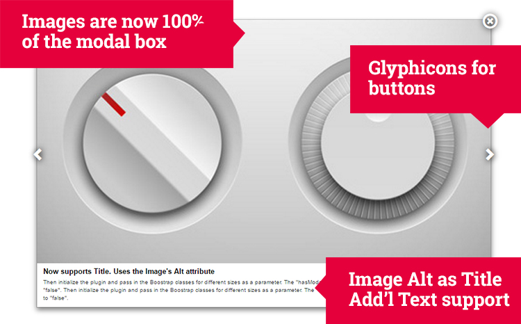
5) Images are required to have an alt tag, so I’m outputting the value of this into the modal as the title.
6) You can have additional text underneath the grid thumbnails by having a “p” tag with a class of “text”. I grab this value and put it in the modal as well.
Update 12/13/2015: I’ve updated the plugin to support linking to a different image when shown in the modal box. Continue reading below for instructions.
Update 11/14/2015: This code for this tutorial have been converted into a jQuery plugin. This means that it’s now easier to create a responsive photo gallery. The original tutorial is still available below (where is says “Original Tutorial”). Note that you don’t need to follow it if you’re using the plugin. But it’s good to know the inner workings of Bootstrap regardless.
How to use the Plugin:
Download the files from Github. Note that you will need to have jQuery and Bootstrap (CSS and JS) in your pages for the plugin to work effectively. It has been tested it with jQuery 1.10.2 and Bootstrap 3.3.5. Then add the plugin file (jquery.bsPhotoGallery.js) right below jQuery.
Please see README in Github for more details.
Then it’s time to initialize our plugin and pass in the options.
$(document).ready(function(){
  $('ul.first').bsPhotoGallery({
    "classes" : "col-lg-2 col-md-4 col-sm-3 col-xs-4 col-xxs-12",
    "hasModal" : true
  });
});
Explanation: We are wrapping the code in a document.ready function so jQuery is available throughout. The selector $(ul.first) is the markup for our images, and .bsPhotoGallery is our plugin.
We need to pass in our Bootstrap classes into the “classes” argument so it’s important to know how the Bootstrap Grid system works. And if you want to have a “modal box” appear with your image when clicked, you simply add the “hasModal” : true agrument.
Benefits of using this Plugin
By using this plugin, you don’t need to manually add the Bootstrap classes to each of the list item that you create. This just gets added dynamically as soon as the plugin kicks in. It also adds the Bootstrap helpers for clearing different heights of images OR if you have some kind of caption underneath (like the demo)
Moreover, the plugin has the “modal” functionality which requires some Javascript to write anyway. So we might as well bundle them all up to one complete plugin.
Linking to a different image in the Modal
In a some cases you want to show an entirely different image when the modal box is shown. Simply add an extra attribute to the image called “data-bsp-large-src“, and the value being the path to the image desired.
Below is the old tutorial – if you choose to follow it instead to using the plugin.
The Original Tutorial Starts Here:
Remember: You don’t have to follow these steps if you’ve gone through the steps above in using the plugin. But if you want to build your own, then the tutorial below is good.
So you’ve been tasked with creating a photo gallery for you website. One that looks good on a desktop, a phone – even a tablet. One that has a grid of thumbnails, plus a modal functionality when the thumbnails are clicked.
This is part one of two series. Part two is where we add “previous” and “next” links to our modal box, click here to view it.
Well you’re in luck. Not only that we’ll show you how to code it – but we’ll show you using the most advanced front end framework yet! It’s called Bootstrap. For those of you living under a rock and have never heard of it – here’s a good start.
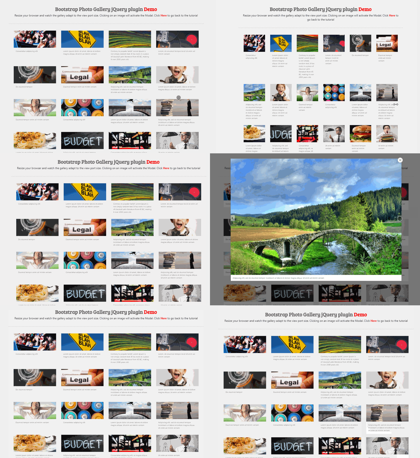
Before we begin, make sure you read our in-depth look of Bootstrap’s grid system. This will make you familiar of the classes we need to make the gallery. Also, if you haven’t seen the demo, below is a preview of what we’re building. See how the grid responds when we shrink the page?
So ready to start? Let’s code:
Create the Markup
Assuming that you’ve downloaded and linked to Bootstrap’s files, let’s create our .container div, along with an un-ordered list. Each list item will contain your images.
Save it and we should have something like below:
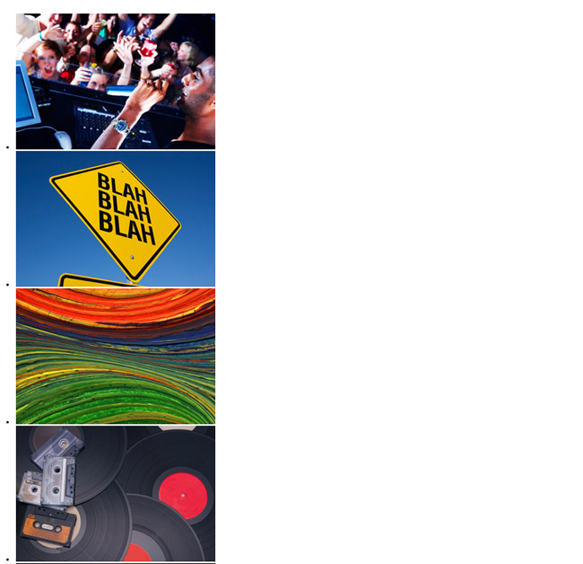
Nothing magical here, just an un-ordered list of images with no styles. Now let’s apply the Bootstrap classes. First, add a “row” to the ul tag. Second, add classes “col-lg-2”, “col-md-2”, “col-sm-3” and “col-xs-4” to each list item.
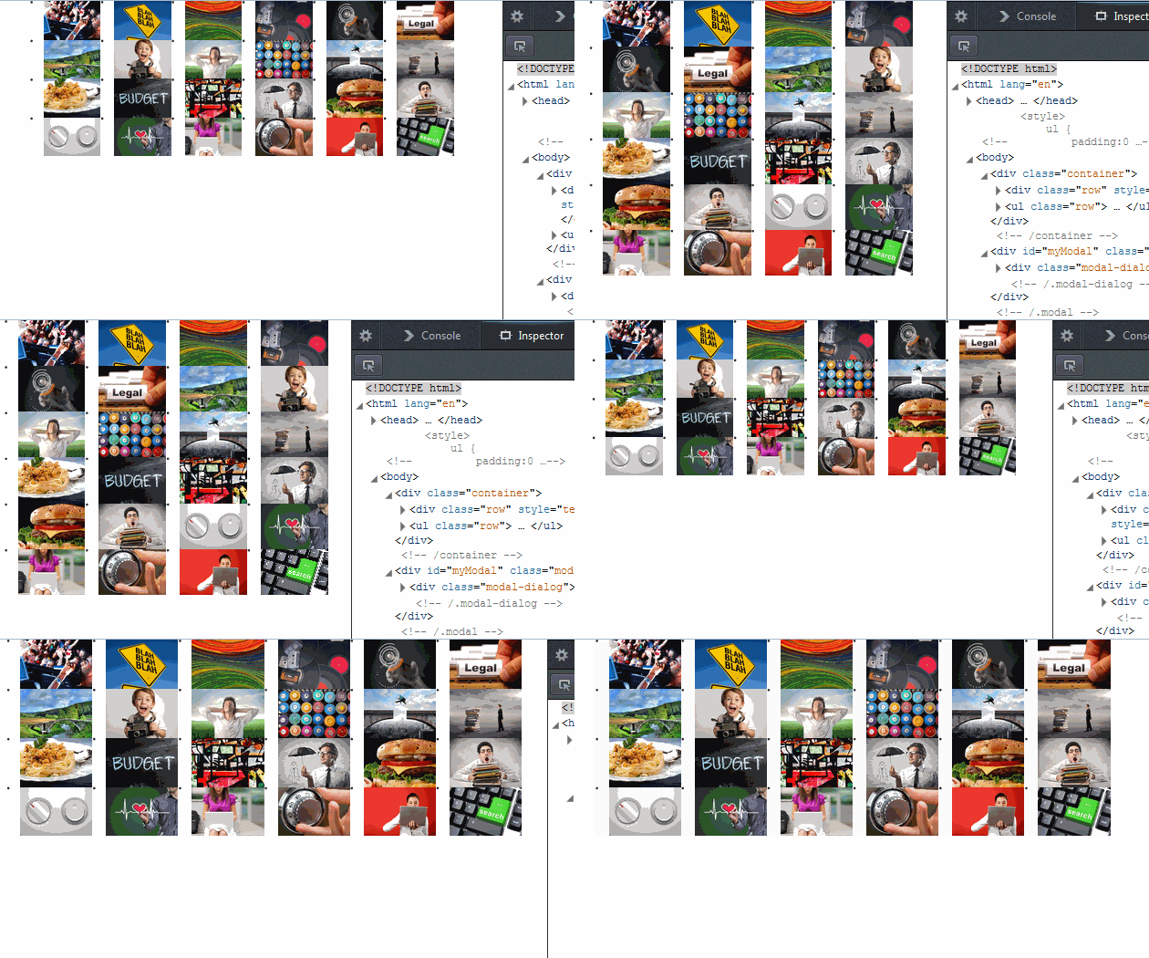
Save and view it in the browser:

Believe it or not, we’re halfway done. Didn’t we say Bootstrap makes front end development faster? Try re-sizing your browser, and see how the thumbnails and the grid behave.
ul {
  padding:0 0 0 0;
  margin:0 0 0 0;
}
ul li {
  list-style:none;
  margin-bottom:25px;
}
ul li img {
  cursor: pointer;
}
Add a few CSS styles just to get rid of the list styles and unnecessary padding and margins.
Different Heights for the Images
In cases where you need to show images with different orientations, additional text or simply just different sizes. The grid naturally breaks with this pattern. To resolve this, basically you need to add an element that will clear the items. Bootstrap has a class for this called “clearfix”.
The element needs to be added where you want them to clear. For example, if you’re using “col-lg-2” (which means 6 columns), right after the 6th image, you add the element.
In addition, you have to add helper classes to only make them appear at certain viewports, such as “visible-lg-block”. So the element will have classes like below:
“clearfix visible-lg-block”
So if you look closely at our markup, there are list items that are inserted just for this purpose:
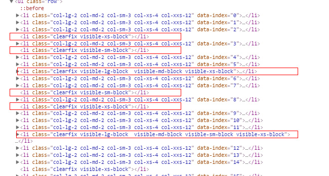
This should solve the variable height issues with the grid. Now we’re ready to move on to the next part.
Create the Light Box (Modal)
So we want the large version of the image be shown in a lightbox as soon as we click on the thumbnail. Bootstrap’s got a pre-built Javascript Modal that makes this easy as well. Add the following to your markup:
<div id="myModal" class="modal fade" tabindex="-1" role="dialog" aria-labelledby="myModalLabel" aria-hidden="true">
<div class="modal-dialog"><!-- /.modal-content --></div>
<p><!-- /.modal-dialog --></p>
</div>
The above code is what makes up the modal pop up box. Now let’s add some Javascript to make our images happen. Make sure you’ve linked to the Bootstrap.js file, as well as the jQuery library.
Then add a new set of script tags, plus the code below:
$(document).ready(function(){
   $('li img').on('click',function(){
        var src = $(this).attr('src');
        var img = '';
        $('#myModal').modal();
        $('#myModal').on('shown.bs.modal', function(){
            $('#myModal .modal-body').html(img);
        });
        $('#myModal').on('hidden.bs.modal', function(){
            $('#myModal .modal-body').html('');
        });
   });
})
The above code simply calls the .modal() function as soon as we click a thumbnail. The contents of the modal box is grabbed from the 2 variables we created (src, img) which is the image tag and original src of the image clicked.
Now test your code by clicking on an image. To close the modal, click anywhere outside the popup.

And guess what? I believe that’s it! It would be good to have a previous and next button on the large image so we can cycle through the images. Maybe even add a “swipe” functionality as well.
Let’s tackle that in part two of this session so stay tuned.
Conclusion
As you can see, we didn’t do much code at all to create our responsive photo gallery. Imagine all the steps we have to take if it weren’t for our amazing Bootstrap framework. Think of all the manual calculations, measurements, css code etc. Thank you Bootstrap!
Let us know what you think in the comments below. We will have a download for this project when we finish part 2 of the series.


In the interest of doing something similar but with a portfolio list/grid of “project” thumbnails as opposed to a gallery of images, is it possible for the large image to open in the same container as the gallery pushing the thumbnails above and below as shown on the attached? When you click a thumbnail the enlarged image has previous and next arrows (swipe function would be awesome too) to cycle through a series of images/description for that project. Or is this a whole different animal?
That’s a different animal. You want this one: http://tympanus.net/Tutorials/ThumbnailGridExpandingPreview/ . the next / previous images will have to be added though.
Grazie!
Hi it’s good but i need the photo moving
hey! it was very helpful. Thank you
Hi,
Thank you very much for that tutorial. it worked for me very well.
I would like to know how can I replace the pictures once clicked (the 100% height ones not the thumbnails) by a youtube video?
Thank you very much again for this tutorial!
Julie
Hi Michael Nice use of bootstrap for the gallery when are you going to do part 2
Part 2 is already done. click the link in the conclusion paragraph. somehow – this link won’t work : http://michaelsoriano.com/next-and-previous-buttons-bootstrap-photo-gallery/
Seems like we have a tipo here:
I think it should be this:
And is it possible to use the keyboard arrow key and not clicking on the next/prev button?
You can bind the keyup events to the control links.
Well in my version the images don’t automatically resize but stay the same size they originally are. And what about the problem of pictures with different heights and widths?
different heights can be tricky. might need some Javascript to recalculate when viewport is resized.
You forgot the “img-responsive” class for the img in your tutorial. That’s why my version did not work! The different heights part will be my step now, which is unbelievable tricky
thanks Carl-Marcus. Let us know how you handle the different heights. I’m interested to see.
I added some css for the
And put a Javascript function in the $(document).ready():
var height = 1000;
$(‘.img-responsive’).each(function(){
height = $(this).height() 30 ? $(this).height() : height;
});
$(‘.img-li’).each(function(){
$(this).height(height);
});
this helps! thanks
Bootstrap provides a class of “img-responsive”.you can simply add this class in every single img tag of your galery
Its a nice tutorial. I like it very much.
May I know from where you use the images to make this responsive gallery tutorial?
I made them myself. Through a software called liceCap
I want to make popup image with bootstrap and but this tutorial not much
but this good for other and thank you! and if other have different let share……
hey, i followed all steps, but when i click my images, nothing happened, please help!
make sure you have bootstrap.js loaded
Hello! This was a very helpful tutorial. I’m using this for my website, but I only want 4 images to be in one row, and for the images to display in just a certain area. Is there a way to do this? I’m 11 years old so maybe you could explain it in an easier way. 🙂
Here’s my code (I solved it, but I’m wondering if there’s an easier way):
<!—->
<!—->
Tester Testy
<!—->
<!—->
/*CSS*/
.images ul {
padding:0 0 0 0;
margin:0 0 0 0;
}
.images ul li {
list-style:none;
margin-bottom:25px;
}
.images ul li img {
cursor: pointer;
}
/*This is the part that I used to solve this*/
.Seperator{
border: solid black 2px;
height: 200px;
width: 500px;
}
Yes you can do it this way – but in order for you to keep the “loop” flowing – you might want to consider running the gallery all the way. Instead of nesting a “ul” inside divs – just nest divs inside divs. This is so you can add a “separator” div inside – with no issues.
Very well written tutorial – thanks! I am stumped on how to extend to be able to use multiple galleries on the same page. The idea is to have multiple separate galleries (“oranges” “apples”, “bananas”) so that when an image from the orange gallery is clicked, only images within the orange gallery are displayed in the modal (and can be advanced previous – next within the “orange” gallery) Just wrapping each individual gallery with its own doesn’t work (of course), as the code still wants to fetch from all of the images on the page. Can you offer some guidance on how to accomplish? Thanks!
it can be achieved by using a single class for your trigger, while using custom attributes to know which gallery to show. More of organizing your markup with enough data for you to write short logic in js.
Great tutorial! But I have no idea where to put this part:
Please help!
it can be anywhere in the page.
Hey ! Thanks for this great tutorial, but where in my code/project should I paste the “$(document).ready(function(){
$(‘li img’).on(‘click’,function(){
var src = $(this).attr(‘src’);
var img = ”;
$(‘#myModal’).modal();
$(‘#myModal’).on(‘shown.bs.modal’, function(){
$(‘#myModal .modal-body’).html(img);
});
$(‘#myModal’).on(‘hidden.bs.modal’, function(){
$(‘#myModal .modal-body’).html(”);
});
});
})”
part ??
And if pasted the ”
”
in my code, does it mean I’m linked to the Bootstrap.js file as well as the jQuery library ?
And last question : when I write
src=”src=”images/myimage.jpg”
instead of the usual src=”images/myimage.jpg” I get all my code commented and it makes the page stop display anything; are we really supposed to write 3 quotes instead of 2 like usual ?
Thanks for your answer !
Is it possible to show the images larger when they are clicked on, maybe even fullscreen?
Larger images can be achieved by adding “width” css attributes to modal dialogs as well tags that we create on image click functionality.
It can be “width:100%;” at both places.
Thank you Arun. Yes – you’re absolutely right.
hello Guy! I follow the tutorial step by step but nothing appear when I click on the thumbnail images. Please could you provide me some helps. Thanks
Thank you very much for creating and posting this tutorial. It is awesome, well written and easy to follow. I like to play around with stuff like this and had a blast making this work.
BTW – I am sure you probably picked up on this, but in the first snippet of markup for the lists I think there may be a typo. Shouldn’t “” be “” ? An extra “scr=”
Great post and sample code! Thanks!
I was able to put this into a Jekyll+Bootstrap site in about an hour. I’m not a JS pro, so it took some experimenting, but it works without modifying your code.
BTW, your update note is dated 2016. 🙂
Hi Michael
Can this code be used within a dreamweaver template?
Regards, Marc
it should work.
Hi Michael;
great tutorial and great plug-in, thanks. And exactly when I really needed it 😉
Two things:
1) In the *How to use the Plugin* code window, the https: is missing in front of the jquery URL
2) Where/how can I control the modal size to show images full size on large enough screen?
Thanks again
Did you mean you want to link to a larger image? If it is, let me update the code to do just that. Stay tuned.
I’ve added support for larger images. However, I just realized your question is making the images show full size of the screen. The problem is, since we’re using the Bootstrap modal box – it’s nature is to constrain itself in a specific width. Let me think about how to overcome this without affecting the rest of the site.
Just ran to the same problem. Any ideas on that? or is there a way to change bootstrap modal box size?
I can’t get the larger/alternate image attribute to work. Is it suppose to be here:
Consectetur adipiscing elit
or in the object literal for the plugin?
figured out I need to update the .js file (mine was from last week) – thanks – works great now
hi..thanks alot for sharing this post.
I Love Bootstrap Framework
Hi Michael
thanks for great plug-in.
how can I disable it grammatically ?
I want to add a button to enable/disable this plugin.
what is the best solution ?
Thank you so much for creating this! I’m a Graphic Designer, but I was recently tasked with some web programming. This tutorial was a lifesaver.
Its missing a nice x cross/close icon at the top right of the pop up image, cant find a bootstrap gallery that has one, that works!
any ideas??
Hi Dee.. if you do another pull, I added the close functionality to the plugin. It’s using glyphicon font for the “X” icon http://getbootstrap.com/components/. So make sure you have the fonts locally.
hi..thanks very much for your share this post.
I Love Bootstrap Framework for my web themes http://omahwayang.com
Excellent article! I’m very new to this and am having major difficulty with images of different width. I’ve tried re-sizing them but loose too much detail…. any suggestions? Keep it simple, I’m a newb!
Thanks
Sometimes the images lose quality especially if you scale them up. But using a larger image may slow down load times. Is this the issue you’re having?
This is wonderful. Is there any way to add a caption to the modal window? Thank you so much for a clear, easy and nice gallery!
That’s actually a good idea. I’d have to add that in the next version.
I was wondering if you had had a chance to think about the caption inside the model window yet?
I will add that functionality for sure. Please keep posted.
This is my photo galary. When I click on Homepage URL, I dont want Model to showup, I only want to go to home page. How can I do it?
Text1
Text2
Homepage
Can you do codepen – so I can run?
very thanks . work perfectly
HI,
I’m using the latest from the github page.
It works great but the images do not display at full size.
Is there a workaround?
30+ days later – can you help me with this please?
Hi Luis,
Sorry for the late reply.
Larger images are supported – but only up to the allowed size for the modal box (which I think is set to a max width of 900px). I’m not sure if I recommend overriding this setting because it’s Bootstrap.
Let me know if this is what you’re looking for.
Yes. Thanks.
The images are 1200 x 900, but the modal box is opening only to 600 x 450.
If I reduce the display size by dragging a browser corner, the image will get larger and fill the browser window (?)
This response gallery not work, waste of time
I was having a problem with images that had a large height in portrait orientation.
For example the image I had was 600×900, when it was opened in the box model the width was being scaled to 898 making the height 1347, which looked quite ugly. I sorta solved it by removing the width:100%; under #bsPhotoGalleryModal .modal-dialog img, in jquery.bsPhotoGallery.css file
So the image does not get scaled width wise, leaves white bars at either side on that particular image but looks better than it did. Hopefully this wont break something later on down the line lol Just thought id post it in case someone was running into a similar issue.
It won’t break – it’ll just have too much white space on the sides for images that are smaller. I’ll look into a better solution. stay tuned.
Mike ,
This plugin looks awesome and this is exactly what I need for the website that I am developing on my own interests. Will this be compatible with angular js ? Could you please throw some lights around it ?
An amazing tutorial, helped a lot! Thanks.
Gread tutorial, Thanks it helped me a lot
Hello,
I would like to know if I can create the video gallery with youtube videos the same way?
And What is the way if I want all the images to be picked from a folder and then work in the same responsive way as above.
Thanks
videos are not supported with the plugin. but yes, you can definitely run through the tutorial and add video support. To scan a folder for images = you would need PHP or another server language. I have an older tutorial that uses PHP’s “scandir()”: http://michaelsoriano.com/create-an-awesome-photo-gallery-with-fancybox-and-timthumb/
Hello, currently I am trying to achieve, when the page loads, it will automaticly show modal window.
Any quick and simple ideas, how to achieve that?
At next step I am going to try to open specific image.
Javascript might help:
document.getElementById(“elementID”).click();
perfect code !!!!!!!!!!!!!!!!!!!!!
Hey Thanks for the tutorial and plug-in. I followed your steps but gallery is not being created for me. All I see is a list of images and their descriptions. Can you please guide me to what I might be missing ?
check the console log F12 – and you should see errors.
Hi,
I get the Error “TypeError: self.port ist undefined” and “Type $(…).bsPhotoGallery is not a function”.
And the LightBox doesn’t open 🙁
make sure the plugin file is included.
The gallery works well with firefox, chrome and edge.
With I.E.11 the images are not resized to thumbnails while clicking on a thumbnail the big image is correct.
What is the problem ?
thank you
gabriele
I love this plugin!! Just one question, is it possible to trigger modal by click on the image rather than li? I tried substituting $(this).on(‘click’, showModal); with $(this).on(‘click’,’img’, showModal);. Reason: to put button and checkbox in the bottom line and be able to click on these without modal appearing.
Thanks
Also could not apply a different larger photo, must be applying your coding wrongly:-
<img alt="xyz" src="” data-bsp-large-src=”https://en.wikipedia.org/wiki/Diego_Rivera” > Most grateful if you can indicate where is error. Thanks!
How come this doesn’t work for me? I copied everything step by step but nothing shows..
can you see what the console says for errors?
Hi Michael,
This post i want to apply to SharePoint Document library.Can you Please change the code for me.
Document libraries have a slightly different setup. I also think that they don’t produce thumbnails by default.
hi there great and helpful plugin !!
althought here is my problem :i m trying to run your gallery from a modal (ie. the thumbnails are in a modal)
the problem that shows up is that as soon as i click the next or previous arrows, then all my thumbnails are replaced by the picture to come.
i understand you need your js to change the image that is displayed in the full size images modal, but could there be a way to make it so that the script makes a difference between the thumbnails modal and the fullsized images modal that pops above it ??
hope i made it somehow clear… you can see it in action here : http://paragliding.earth/?site=6176
“you can see it in action here : http://paragliding.earth/?site=6176 “… if you click the “pictures” tab of course 😉
hi again,
answering to myself 🙂
the js code that changed the image in the modal (and caused my thumbnails in modal to change too) could be found here (on line 122 on current version of plugin) :
$(‘.modal-body img ‘).attr(‘src’, src);
i changed it to : $(‘.img-largesize’).attr(‘src’, src);
so that it would only affect images with class “img-largesize” and modified line 81 that was :
var img = ”;
to :
var img = ”;
so that my big images have the img-largesize class 🙂
for now, it seems to do the job just fine 🙂
i ll post another comment relative to a css issue just next 😉
thanx for the plugin 🙂
Thank you raphael
Does bootstrap 4 affect this?
We’re currently building a site in bootstrap 4 and I think the ‘insert clearfix’ part of the js needs changing- but unsure how to proceed (bootstrap 4 seems to have changed breakpoints..).
Any advice would be appreciated
Shortly after leaving this comment I realised that the issue seemed to be coming from missing styles. To fix this, I just copied the style for .visible-[brkpoint]-block styles from the bootstrap 3 stylesheet, into the gallery stylesheet. Should keep things in order! 🙂
thank you Lewis
Hi,
Great piece of work! Thanks for that.
I am considering trying this plugin in my website update but…
Am I the only one to think that it would be more logical to get the “Title” (alt) below the image on the page instead of the “Description” (class=text)?
This description is perfectly placed on the 2nd line of the modal body but should only appear when the user has cliked on the image (I think)…
As I am not to much into JS (a total newbie actually), I was wondering if there was any possibility to invert some var/functions in the .js file?
Thx.
Yes it’s possible. Note that you can move and re-factor the code around to suit your needs.
Hi,
Thanks,a nice tutorial and easy to understand and implement for beginners . Please inform where thumbnail and corresponding large images height and width is defined in code. How to customize?
what is best/idle possible height,width for thumbnail and corresponding large images for responsive websites?
Thanks in Advance
Thanks,
Naresh
Hi,
I like your framework but I have a questions is this framework works for both images and videos.
Please let me know the changes need to be done to work for image and video format to support.
Regards
Surendra
Hi,
great tutorial. I got it working, but I am facing issues with a slightly more advanced use. I am using pagination to flip through objects which also have images attached. I am updating the data including the images by retrieving JSON data and manipulating the DOM (replacing text, removing and adding the tags with the images). I managed to put the new images just like before, but the gallery modal won’t work anymore. Any ideas?
can you post to jsfiddle?
Hi,
I found a different solution. But after some investigation I found that bootstrap itself scans all elements of the page to provide certain behaviour. This seems to take into account where an element is positioned, so if you move it as child to a different parent, the functionality is lost. I don’t think this is something you need to worry about 😉
Hello,
Could you please help me to integrate this plugin into angular 2 application?
Hello!
Is it work in Bootstrap 4?
Thanks.
Hi Michael,
Thanks for the great work. Very usefull.
But I ran into a problem.
When I change the size of the screen from large to small the number of thumbnail images in one row changes from 6 to 3 to 4 to 3 and to 1. (?) And the height isn’t allways right.
In dreamweaver are the different screensize as follows:
> 1200 the plugin shows 6 thumbnails in a row the height is right.
1199 – 992 it shows 3(?) thumbnails in a row not the right height.
991 – 768 it shows 4 thumbnails in a row, height is right.
767 – 381 it shows 3 thumbnails in a row, height is to small towards the 767 width and gets better towards the 381 width.
< 380 it shows 1 picture in a row but half the size of the height of the thumbnail picture.
What am I doing wrong? Please your advise.
Thanks.
Has the Bootstrap media queries been overridden in any way? What about the classes you had to enter to the plugin – are they correct?
Hi Michael!
I was wondering if you could help me figure out why when the modal is popping up on this page the page is scrolling to the top: http://www.vriresorts.com/redesign/masonry-test2/index-masonry.html
Thank you for your help!
That is odd. looking into it.
Hello Michael!
I would like to know how do I make the text and title appear at the top.
Thank you for your help!
It is not included in the styles at the moment. But you can achieve that with just CSS.
Nice one. This tutorial was really helpful to create image gallery on my business site.
Thanks.
Added this line of code in order to make the thumbnails look nice:
if (settings.fullHeight) {
theImg.css(‘width’,’100%’); //THIS IS THE LINE I ADDED
theImg.wrap(”)
}
thank you Jose. Do you want to do a pull request -> https://github.com/michaelsoriano/bootstrap-photo-gallery
hi, nice plugin, but javascript for on click seems not working and i don’t understand why.
Thx
Hi, the gallery is very good, I was looking for something like this. I have a request: when I open a image, the modal have always the same width that looks like about 900px. You can see your own example, check the 3rd image here https://rawgit.com/michaelsoriano/bootstrap-photo-gallery/master/demo.html. Even if it’s smaller, it will always be forced to 900px. Is there a way to adapt the height of the pic so it fits in the screen, or to open the images to its original size?
I see what you mean. The bootstrap modal has a 900px and by default – it fills up that box. Maybe a flag that says “showOriginalSize” or something like that – that will just show the original size. It also prevents the degradation of quality of the images. I’ll have to work on it, stay tuned.
Awesome! Thank you for the super fast answer, too!
could you tell me how to use functionality of data-bsp-large-src. i cant find any connections to it in new version of js file
Ran it on Bootstrap 4, everything is fine but just the photos displayed are all limited to a height of less then 100px. How can this be adjusted?
whoah this webblog is magnificent i like studying your posts.
Keep uup the great work! You understand, many people are searching around
for this information, you can help them greatly.
Hello.
I want to make it show 2 columns on mobile resolution but dont know how.
would you let me know which file do i have to edit?
( i am a web designer. so i can use html and simple javascript but not familiar with hard code actually.)