I kept bumping into a wall yesterday trying to figure out how to apply the Bootstrap class “is-invalid” into a form field only on blur and if the value is invalid. The “is-invalid” class applies the styles to the field as well shows the “invalid-feedback” div directly underneath it – for inline error messaging. I’m using VueJS, and I’m thinking – this should be simple right?

As it turns out, I was over-complicating things. See Vue is a “Data Centric” platform. All we need to do is focus on the data.
Here is the solution I came up with:
See the Pen Easy form validation with VueJS + Bootstrap via CodePen.
Ready to code? Let’s begin:
Our Component
Let’s start with the “comment-form” component, and slowly add the elements to it. First the shell:
Vue.component('comment-form', {
  template: '#comment-form'
  //WE'RE ADDING STUFF IN HERE...
  }
)
Notice the “#comments-form” template – which we haven’t built yet. This is mostly HTML – with the v directives attached. I wanted to show you the JS side – beforehand, so it all makes sense.
Fill with it with the data object
data: function () {
        return {
            email : "",
            emailBlured : false,
            valid : false,
            submitted : false
      }
}
Each property in our data object serves a purpose. We’re building a form with only 1 field (email), although it can have multiple field and field types. For the sake of brevity, we’re only using one. The “emailBlurred” flag – serves as when the user “blurs” out of our field. The “valid” flag means the entire form is valid, and “submitted” means the form has been submitted.
Our methods:
This will contain the actions that will take when we interact with our component. Take a look below and see if you can figure out what it does.
methods : {
    validate : function(){
      this.emailBlured = true;
       if( this.validEmail(this.email)){
          this.valid = true;
       }
    },
    validEmail : function(email) {
        var re = /(.+)@(.+){2,}\.(.+){2,}/;
        return re.test(email.toLowerCase());
    },
    submit : function(){
        this.validate();
        if(this.valid){
          //THIS IS WHERE YOU SUBMIT DATA TO SERVER
          this.submitted = true;
        }
      } //end submit
  }
So “validate” – is a function that will house all of our validation. Since we only have one field, it’s only doing“this.validEmail()”. It also sets our flags to “true” when validation passes. Also, notice we’re setting “emailBlurred” to true regardless. This is due to we’re calling our method “validate” right on “submit”.
See, we want to show users the error message when they click the “submit” button – if there is one. Finally, we’re setting the flag “submitted” if all is good.
Our Template:
Our template will contain all of our HTML, as well as the “v” directives that map to our component. At first glance, you can almost tell what the entire thing does:
<template id="comment-form">
<div class="form-wrap container">
<div v-if="!submitted">
<div class="form-group">
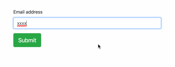
<label for="email">Email address</label>
<input
v-model="email"
v-bind:class="{'form-control':true, 'is-invalid' : !validEmail(email) && emailBlured}"
v-on:blur="emailBlured = true">
<div class="invalid-feedback">A valid email is required</div>
</div>
<div class="form-group">
<a type="submit" href="#" v-on:click.stop.prevent="submit" class="btn btn-lg btn-success">Submit</a>
</div>
</div>
<div v-else class="alert alert-success" role="alert">
<h5>Thank you</h5>
<p>Your validation was a success!</p>
</div>
</div><!--end form-wrapper-->
</template>First thing you’ll see, is that the form field and our button – only shows up when our “submitted” flag is true. Otherwise, our success message is shown instead. Remember our methods “validEmail” and property “emailBlurred” – well that’s binded to our input field – which model is “email”.
Still with me? Then we do an “on:blur” to the same input, changing the “emailBlured” flag to true. The button – is an anchor tag, that has an “on:click” with the method “submit”. The “stop.prevent” are modifiers to the “v-on“, which does wonders to the event.
Finally, we add our component into our root element. And that’s it.
new Vue({
  el: '#app'
})
Again, the checkout the demo in a new window: