It takes a lot of creativity to make a good looking website. However, it takes additional knowledge to turn that website, into a user-centric and friendly interface. This knowledge is known to many of us as UI or UX (User Interface / User Experience) design. It may be true that many organizations have devoted plenty of time and studies into which UI really work, but to others – it is quite common sense.
This article will talk about UI mistakes that we often see in today’s websites, what is good practice as well as how to avoid committing such mistakes.
Mistake #1: Linking to an image that is the same size
This one is a biggie. How many times have you clicked on an image, then you wait for it to load, then behold – it’s the same stupid size. This is a total waste of your viewer’s time. Even worse is when the image loads in a new window. You’d be lucky if your user doesn’t completely close the session.
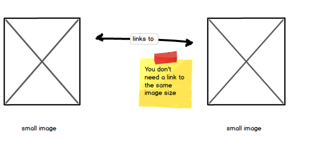
How to Avoid
The easiest thing to do is to remove the link. If you don’t have access to the larger image then what’s the point. If you DO have the larger version – then of course, switch the links.

Mistake #2: Changing the default Right click behavior
I don’t know about you but whenever I go to websites and I try to use the most I can with my mouse and keyboard. Especially opening links and images in new tabs. Saving them or even just copying text.
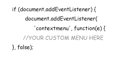
By overriding the default right click behavior you may not have access to these things. And that’s a big mistake. Especially for users like me who have become accustomed to this handy technique.
How To Avoid
Basically nothing. The default right click behavior is already in place. To avoid it is basically not writing custom code that override it (Javascript code similar to above).
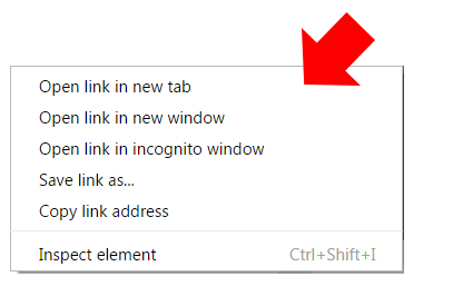
Now depending on your application, you may have no choice but to use this “contextmenu” item. But at least still give users access to “copy” or “open in a new tab” in your custom right click menu.
Mistake #3: Using the Default Javascript Alert Box
You may not see this that often anymore. But there are still some sites out there that use the default (and ugly) Javascript Alert boxes. Web developers resort to this type of notification – because it’s the easiest to implement. The result: an ugly box with a message that looks like below.
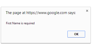
This is mostly used in forms that validate to make sure what you entered in a field is correct. Although it serves the general purpose – which is to “alert” the user. The fact of the matter is – it’s just not a friendly way of doing things. It’s a definite eyesore, therefore, a UI mistake indeed.
How to Avoid
There are plenty of newer ways to present user with “alert style” notification. Plenty of these come in a form of library such as jQueryUI, or modal boxes in Bootstrap.
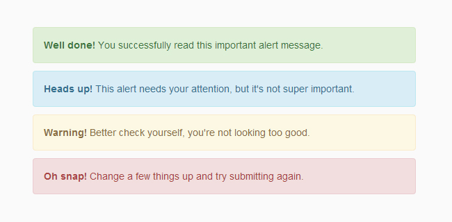
The example above is a much pleasant way of notifying your users. May it be an error, a success or just a simple note – this type of messaging is much easier on the eye. In addition, background colors and styles can be added to them as supposed to the default Javascript boxes – where you can’t do anything to them.
Mistake #4: Not submitting the form on “Enter”
Once again, let’s go back to our desktop users. These are the ones that fill out forms ultra fast. They stick to the keyboard and yes, they will hesitate to make that extra click of the mouse when submitting a form. Instead, they would rather hit “Enter” and see it submit.
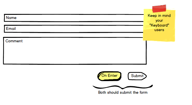
Even though this is not something that you “see” in the page, it is in fact – part of the behavior of the form. Therefore, it is part of good user interface design. Remember, we want to make our user experience as “bullet-proof” as we can.
How to Avoid
Submitting a form by pressing the “Enter” requires a little bit of Javascript. This means that somewhere in your web page, you will need a set of “script” tags that includes code such as below.
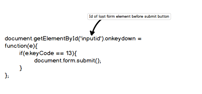
Although a bit cumbersome to write, Javascript will add an extra layer of goodness to your web pages. Javascript is the language that takes care of the events that happen in a web page. So if you want something to happen when you click, press a key or even move your mouse – Javascript will handle it.
Mistake #5: No font style variation between elements
This is more of a style preference but is considered good practice in UI design nevertheless. We normally style elements different from each other because of two things: 1) to distinguish them from each other and 2) to determine their importance.
The screenshot below shows the title, body and meta elements closely resembling each other. If you squint your eyes – you can barely tell where each element start and where they end.
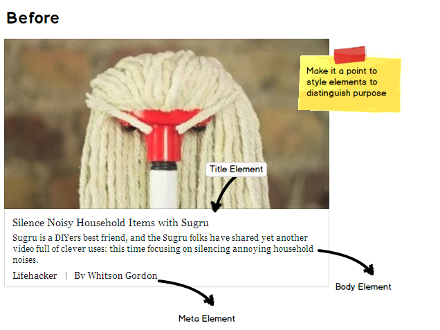
By contrast, if you look below – we’ve styled the elements with the purpose of setting them apart from each other. You see the title is much bigger and prominent. The paragraph is a bit more subtle while the meta is also quite distinguishable.

The interface above serves our two purposes better than the previous example. On top of that – it’s just so much better to look at. Note that the changes may be subtle – but the experience is way better.
Mistake #6: Not “Blocking” the page when there is activity behind the scenes
Supposed you have a filtering mechanism on your page for your search results. Once this filter is clicked, it sends data to the back end and refreshes the content on the page. But the mistake is, when you don’t “block” your page, users can continue to click on your filters – bubbling up more requests, and ultimately crashing the browser.
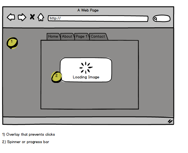
A simple solution is to add an overlay with a progress symbol on the page. Hence, “blocking” the page from further action.
How to Avoid
While you can’t control impatient users from clicking all over the place, you will have to implement a solution similar to above. There is a good jQuery plugin that achieves this functionality real well. It’s called jQuery BlockUI. The plugin’s main goal is to block the whole page so users can’t continue to click when there’s processing behind the scenes.
Now that your page may be blocked from your “clicky” users, you still need to let them know of what’s happening at that moment.
This brings me to the next big UI mistake:
Mistake #7: Not informing your users of what’s going on
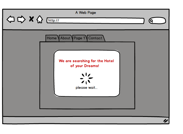
Whenever some kind of processing is going on (form is submitted, filter is clicked or searching for results), it is good practice to inform your users of what the page is doing. This usually happens in conjunction with your blocking mechanism (described above), or with your loading spinners and progress bars.
How to Avoid
As I’ve mentioned, adding these messages means that you will need to find all the places you are using a loading screen or a progress bar and add them there.
Now it’s important to NOT get too technical on your messaging in this area. Your users do not care that you’re parsing through the GET variables and validating each entry. Instead, a more personal status message (like shown above) will get your users excited and ultimately become more amazed on how pleasant your design is.
Mistake #8: Not remembering Form field values
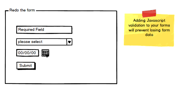
This one can be a real nuisance. This is when your users have gone through the trouble in filling your big form, only to lose it on the next step. This is common in forms that have failed server side validation. If not coded correctly, form values will become empty since the page is refreshed and loaded again.
How to Avoid
While I’m a strong advocate of server side validation, I think adding a front end component to this is even better. A good jQuery plugin called .validate takes care of this scenario. This plugin prohibits the form from submitting until the user fills all the required field values. It also provides nice inline error messages – which can take care of Javascript alert boxes (described in Mistake #3).
For other forms that have subsequent steps (a review page for instance), then you will have to write the form values into a temporary storage such as session. This enables you to refill the form fields as needed.
Mistake #9: Too many form fields
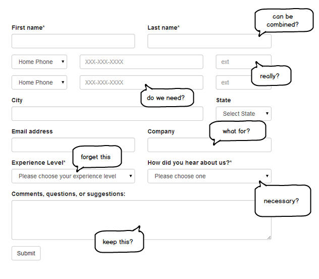
Although you would think that this one is already a given, it’s still a UI mistake I see way too often. A form should never have too many fields. It’s intimidating, ugly and is hard for users to fill in. Really, I don’t think anybody have ever felt joy in seeing a hundred fields to fill out.
How to Avoid
Reconsider your fields. Do you really need a first and a last name? Can you get away with combining them? What about that extension field? Is it really necessary? A lot of thought is required when designing forms. Only the important fields stay, while the rest must go.
In cases where you really need all those fields, you might want to use tabbed content. Divide the form sections into parts where you can hide, and only show them at the right time. This type of UI design especially works on large, intimidating forms.
Mistake #10: Not having a responsive page
And finally, the big UI mischief. Your desktop version might render fine in a PC. But If you don’t have a mobile version of your site, think of how bad the user experience is when your site is accessed through a phone.
Vertical and horizontal scroll bars all over the screen, having to swipe your finger to view the content on the right side of the page. Elements that are so small they’re barely readable. Links so tiny – they’re not even clickable. The list of bad experience goes on. The bottom line: it’s not meant to be viewed on a phone.
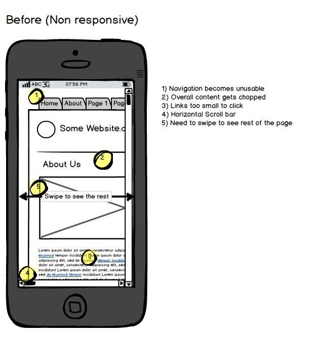
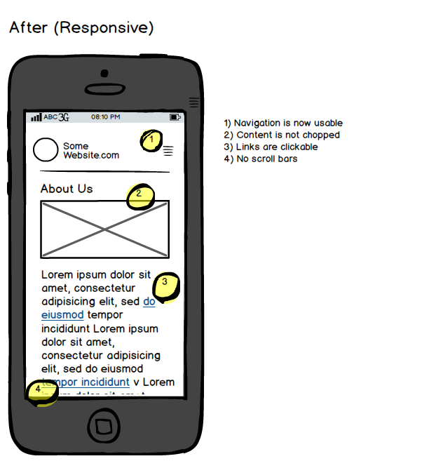
This is what responsive design aims to fix. The same website as desktop is served no matter what device. The pages adjusts accordingly depending on the resolution of your screen. Responsive design takes in consideration these key areas: readability, accessibility and functionality.
How to Avoid
Switching to a Responsive design might need a major rewrite of your code. If you’re running a CMS such as WordPress, this can actually be as simple as installing a responsive theme. If not, then there are responsive frameworks and utilities that will make the rewrite a lot faster. A couple of my favorites are Bootstrap, Foundation and Skeleton.
Conclusion
Keep in mind that many of these mistakes are so small, that you may not even think that anything is wrong with it. But they are mistakes nevertheless. Sooner or later, they will result in some loss. May it be in user retention or goal conversions.
Remember, today’s content is so competitive – that if you don’t give users a good experience, you may have just lost their business.


Good article. Very nice list. I’d be careful with #4. There are components that have a use for the enter key (e.g., text areas) so take care when you override what the enter key does. I’d like to add in two more:
1) Reduce the size of your assets as much as possible (without degrading the quality) so your pages load faster (great for slow internet connections)
2) Test on multiple browsers and browser versions – you want the experience to be as consistent as possible across all platforms.
Great job with this list!
One of the best most actionable UI / UX articles I’ve read lately. Thank you!
P.S We linked to it from this post https://blog.dapulse.com/boom-speed-improve-site-performance/
Thanks a lot. This is really great help to UI/UX design. You did a great job in this post.
Well written article.